Home 3D Art Showcase & Critiques

DM-Windbook (UT3 level)

g0th
triangle
Offline / Send Message
g0th triangle
Just wanted to share my latest work. It's an UT3 level that I submitted to MSU contest.


Looking forward to hear what you all think of it.

Thanks.

wip01.png
wip02.png
wip03.png
wip04.png
wip05.png
wip06.png
wip07.png

Replies

  • SHEPEIRO
    Options
    Offline / Send Message
    SHEPEIRO polycounter lvl 17
    very nice good lighting and forms, spec maybe could do with tightening on the floor stone slabs in image above
  • Dakkon
    Options
    Offline / Send Message
    Dakkon polycounter lvl 10
    Id try and vary the color a little bit here and there. It's a very monotone level right now.
  • Lee3dee
    Options
    Offline / Send Message
    Lee3dee polycounter lvl 18
    looks great! I agree with Dakkon, vary the colors more, also try adding a skylight in the scene and set its values to 0.1, so the shadows aren't so black. I use skylights to help the shadows in my maps.
  • Kawe
    Options
    Offline / Send Message
    Kawe polycounter lvl 8
    some of the materials are a little like.. uhm... very wet. not sure if that is intended.
  • Kovac
    Options
    Offline / Send Message
    Kovac polycounter lvl 18
    I think really pushing the foliage in this piece will help it a ton. Right now it feels like an area that would be covered in vines, with grass shooting up through cracks in the floor (like Uncharted), and beams of light wrapping around some of the larger slabs exposed to the sun.

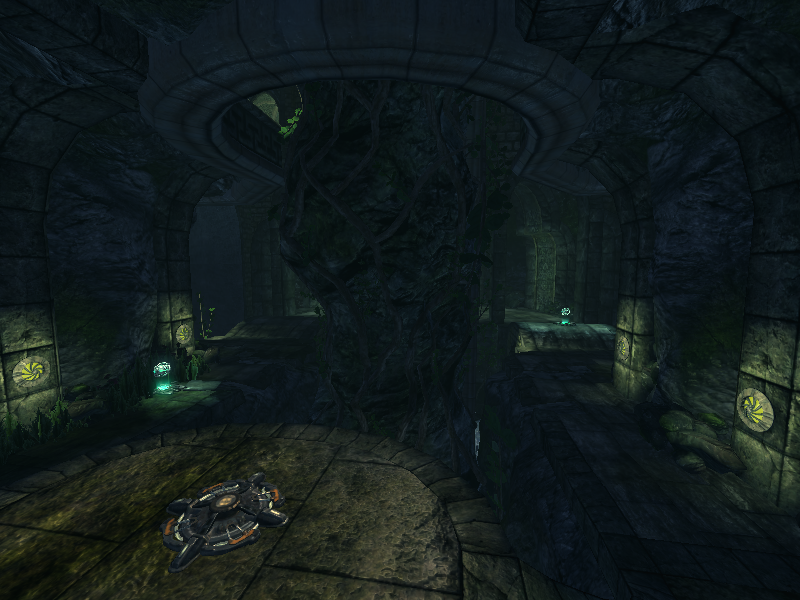
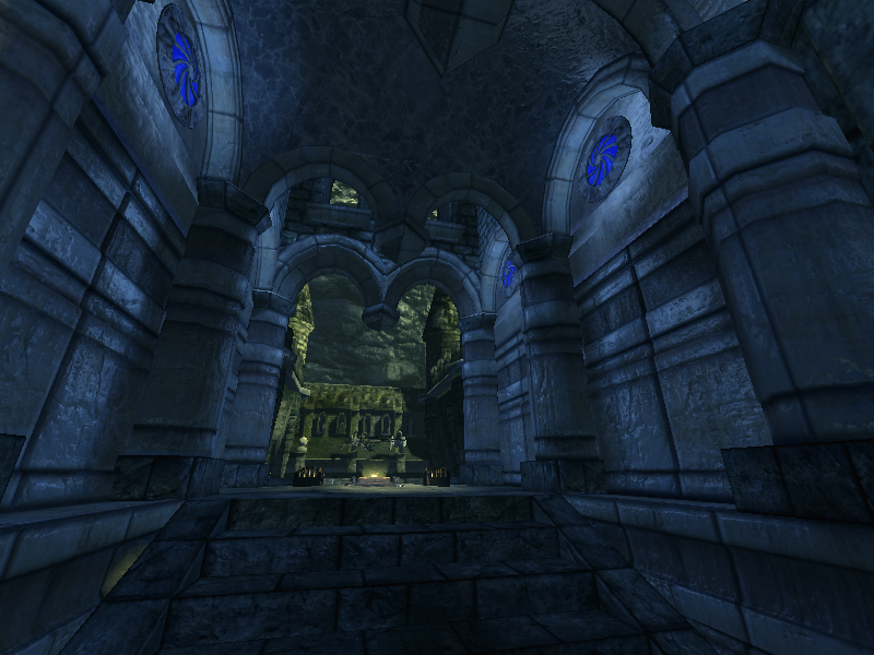
    I also think the blue swirly things could also have a much more emissive and brighter feeling punch to them... right now it feels so cool that it couldn't push out much light at all.

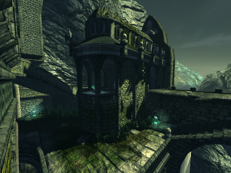
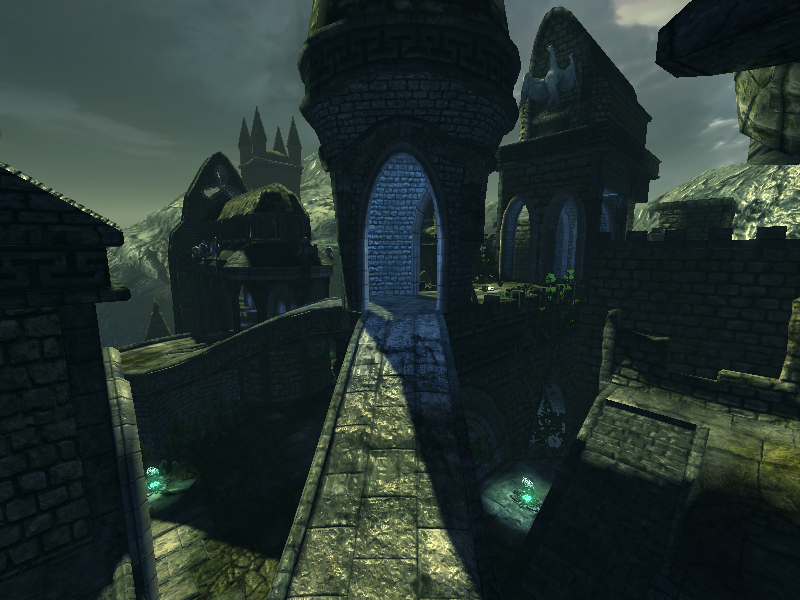
    The shot below also does a good job showing the area has a lot of age to it through its various debris of eroded rock and collapsed pillars/archways.

    http://files.playstatic.com/ps3/uncharted-drakes-fortune/e3-uncharted-drakes-fortune-screenshot-1.jpg
  • Pope Adam
    Options
    Offline / Send Message
    Pope Adam polycounter lvl 11
    Personally I think you've done a great job. I actually really like the monochromatic look you've got, I believe it looks realistic. Some might argue that realistic is uninteresting though.

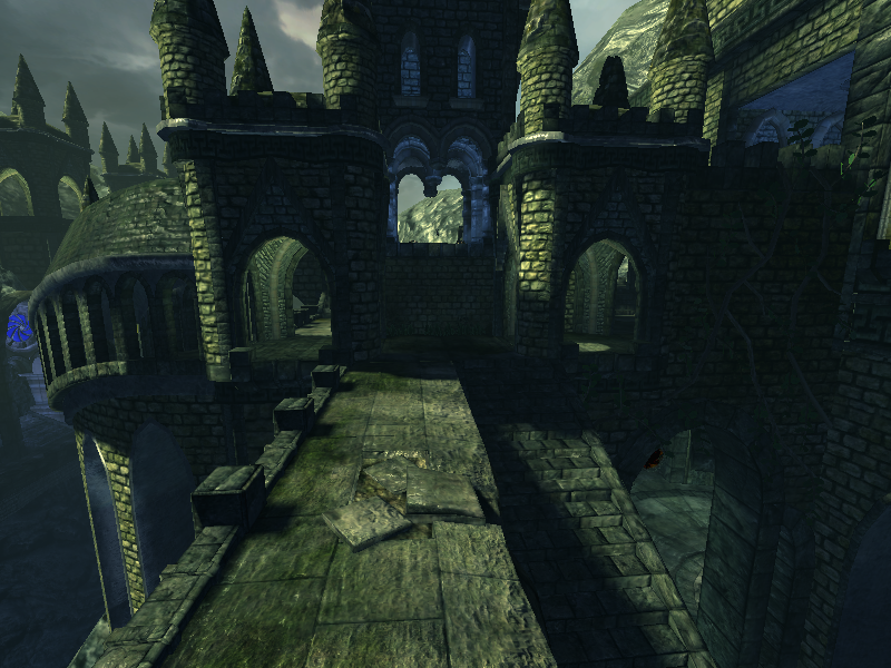
    The dark shadows could use a bit of lightening, it never hurts to show off all of your hard work, no need to hide it in dark shadow.

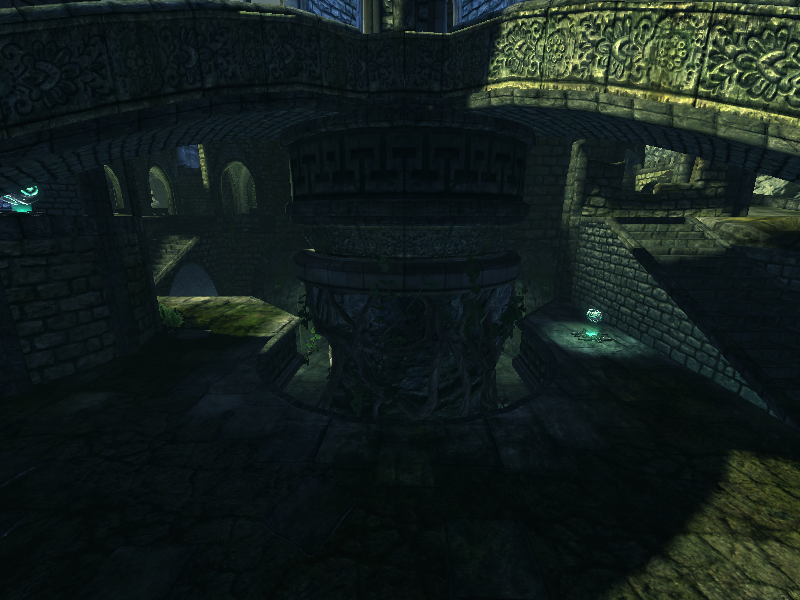
    I like the transition between the blue colored interior light versus the yellow green exterior feel. It helps the eye move around, and in the level I would know exactly where to run next. Good paths.

    Perhaps experiment with light color, because I think your textures looks pretty good. Changing the light could completely alter the mood of your scene though, which mightn ot be what you want.

    a little bit more color saturation and some licks of warm color in here would do wonders for composotion and could be used to draw your eye around the environment some more, not only to make it more interesting, but to further reinforce where the players should be running to while blasting the hell out of one another.

    Looks awesome! cheers
  • Mark Dygert
    Options
    Offline / Send Message
    That looks pretty good, you should be proud of it =)

    But that's not to say there are not errors in logic or room for improvement.
    Crits:
    • Brick structures are stacked which means at most you can hope for a straight or pyramid structure. Some of your towers flare out at the top going against logic. Which would be doable if they where braced by some kind of buttress.
    • The higher the brick structure the more sturdy the base needs to be. I see a lot of heavy towers on whispy arches. Part of designing a good level is taking weight and structural loads into account. Just because UnrealEd is Zero G doesn't mean the world we are depicting is also...
    • Some textures look to be diffuse only with lighting painted into them? Which gives some parts an Unreal 1-2 feel.
    • Some things might be better made as props and imported, like the chunky pillars in the blue interior shot.
    • Some of the indoor lighting isn't easily explained. The center dip in the M arches would make a great place for some hanging lanterns.
    • The center piece (the organic root/rock piece) is dimly lit, kind of odd for a center piece?
  • SHEPEIRO
    Options
    Offline / Send Message
    SHEPEIRO polycounter lvl 17
    Vig- i think points one and two could be stylistic choices maybe, i know what your saying, but a fantasy feeling can be acheived by discarding such things as gravity. or at least relaxing the rules.... but it should still be beleivable and if you relax the rule or strength of gravity it should be reflected in everything and not just used as an excuse for a funky shaped building, if you had other things obviously too heavy being held up on thin structures or maybe builinding parts held up by balloons....
  • g0th
    Options
    Offline / Send Message
    g0th triangle
    SHEPEIRO: Thanks, agreed on the specular map.

    Dakkon: I was going for a monotone typed of lightning but I have probably overdone it a bit.

    Lee3dee: Yes the shadows are a bit to black, Thanks for pointing that out.

    Kawe: nope that was not intended :)

    Kovac: I really agree with all you said and thanks for a good reference picture.

    Pope Adam: I'm glad you liked the lightning and it's funny you mention that realistic is uninteresting as I have gone through that hole though process during this map. Thanks.

    Vig: Thanks for the many crits. I really appreciate it and I agree with them all.
  • Mark Dygert
    Options
    Offline / Send Message
    I'm all for curvy fantasy style buildings but then that's a universal style choice not just something that can be selectively used and ignored without it looking off. I agree, if someone chooses to toss those rules out I'm fine with it, as long as its a universal change and semi-explained. But it shows they thought about it.

    More times then not this type of structural neglect is not a style choice. It tends to highlight a very common disconnect when a person creates the shape and later applies a material. They create a cool looking shape, and slap a brick texture on it because "castles are made out of brick".

    When you think about those types of things while creating you come up with different solutions. So instead of very real world brick structures being held in place by "magical forces" you might choose to use a mix of wood and metal that also fits the theme and the shape. I think it make for a deeper world when these things are taken into account.
  • Minos
    Options
    Offline / Send Message
    Minos polycounter lvl 16
    wow an Unreal 3 map with no visual pollution... good shit!
  • commander_keen
    Options
    Offline / Send Message
    commander_keen polycounter lvl 18
    looks pretty good, but like others said the lighting is all within about same 45 degrees of hue and most of the blue is too saturated. Also it looks like you are using an ambient light (i guess its called a skylight in ue3). Thats evil, remove it at once and brighten the dark areas with real lights.

    I recognize you from #unrealed >:[g0th]
  • g0th
    Options
    Offline / Send Message
    g0th triangle
    Minotaur0: Thanks man

    Keen: I actually using 5 different directional lights as ambient with a slightly different color to them, but yeah you're suggestion would surly look better. Thanks and I see you in #unrealed :)
  • commander_keen
    Options
    Offline / Send Message
    commander_keen polycounter lvl 18
    yeah i probably wouldnt use that many direction lights. probably 3 or 4 tops, also you should make sure they each have quite a bit of difference in color and brightness, for example a bright warm color for the key light, low brightness cool color light(s) coming from the sides and a slightly brighter cool color coming from about the opposite direction of the key light.

    I think the biggest problems right now is that the shadows are too bland, the blue is too saturated, and the localized lights such as the yellow lights in the first shot are not bright enough and the light sources need MOAR BLOOM.
Sign In or Register to comment.