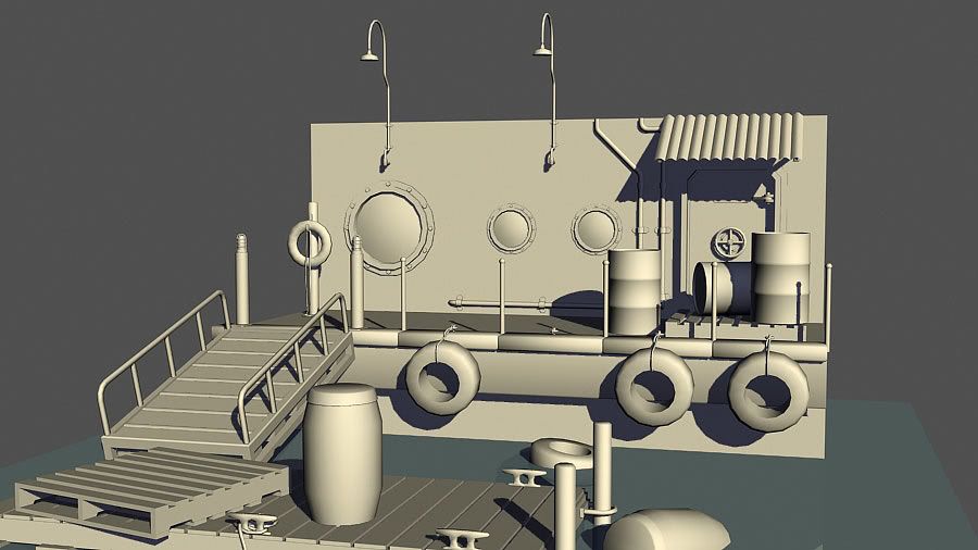
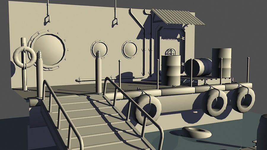
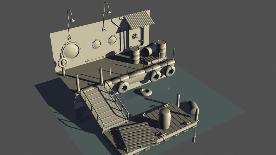
Having a go at Splash Damage's enviro art test. I've got 20,000 tris to play with, I'm at 13,970 at the moment. No info on maps sizes, but I won't go overboard. I have yet to do a damage pass and break things up. Lighting is just a test and very much a WIP. C&C welcomed!
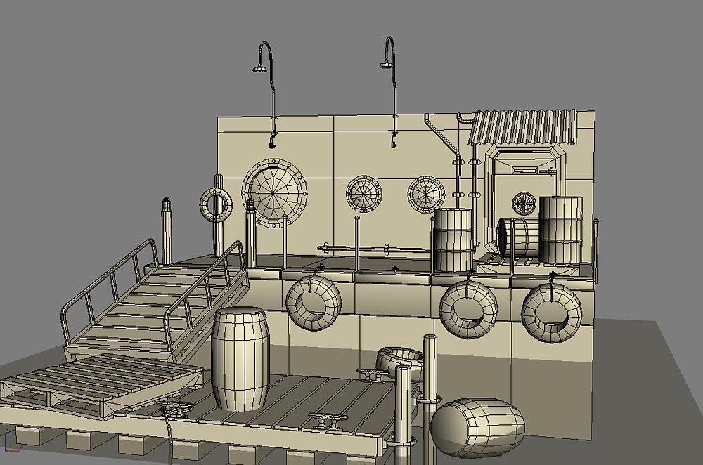
looks good! that concept drawing is hilarious, i think you made it out well. I dont know why but I like the dock-post retainer ring things hanging off the very side end of the dock. I think its a Nice touch. Id say if you have polys to throw around do the inside of the tires a bit more?
I bet nobody spends polys on having the water splash up on deck. could be wrong i guess. DO IT!
yeah id say uv got a pretty solid translation from that concept i would have said optimize the polycount but from the sound of it your well within limits. gonna be interesting to see the normalmap and texture work you do, and maybe render out two different lighting situations, daytime and nighttime ?
some cargo netting in there somewhere would look pretty cool along with a small boat tied off. Might have to get rid of a pallet or barrel but the polys saved on those small repeated props would give a nice budget for a cool boat.
UPDATE MOSTLY! I think I covered what I said I would. I made a boat! It's ok. Broke things up, not much though. Chains! Almost forgot. 18,966 tris now. Those chains gobbled em up. NOM NOM NOM. I think I'll start textures now..
Yea, ditch the chains, render them down to planes or switch them out for ropes or cable. Modeling them is just way too expensive. All that detail could be put in so many other places.
Coming along really nice. In addition to the chain comment, it looks like the little steps on the ramp are a waist. That could easily be normal maped and noone would be the wiser. the wall where the tires are leaning up on, as well as the bar across the front of the dock would use a few cuts to uneven those long beams. Especially since the wood planks are all moved around and beat up, but that one is prestine and perfect. Its an area those few tris you save off the chains could be used to help sell it.
Along the lines of removing unneeded geo and putting in the normal map - remove the bolts on the round windows and put that in your normal map w/ some supporting AO.
Few things:
- proportions on the wood pallet look a bit off. Its kinda chunky, a little too tall, and maybe a bit to large overall.
- Lights on the wall are a bit high. They lead the eye up to.... nothing. Maybe bring them down a bit and add some upper wall detail as suggested, or even better, a simple slanted roof w/ a killer normal map to portray corrugated metal!
- an extra edge ring of geo on the inside of the tires would help break that sharp edge.
- lastly, watch your smoothing groups. Lots of areas could use some hard edges.
yes, alpha plane chains dude. but if you must have modeled chains [which do look nice] there are much more efficient ways of going about it. interlocking solid rectangles, for instance. you don't need to have the hole in the center for it to read as chain.
take all the extra polies from that and make a giant squid attacking. or a mermans having tea. or something equally awesome.
Also keep in mind where the player would walk through your level.
Right now you have the dock a little cluttered and it feels blocked off (which you may have done intentionally).
If you wanted the player to be able to walk on the dock you will want to move the wooden palette off to the side and the oar as well, so that it feels open and the walkway is unobstructed.
Got some stuffed textured! Just a viewport grab, no fancy stuff. I've got Crazybutcher's Generic IBL shader in there. Still a lot of stuff to do yet. I need to make the ramp hinges and what not. Gotta make some signage to spice things up a bit. Need to get the chains in there. I'll be taking this all into Unreal at the end so I can project some decals on things and play with the materials more.
I'm not sure about the rust on the metal siding and I'm debating whether or not to give the metal some more color. The pallets are kinda meh to me as well. What do we think about the yellow door?
As I am not in the industry I'll probably get smacked down for this, but shouldn't all the "marking numbers" in the scene be exactly the same size? Liking the progress overall.
caseofchill - No, the different scales just show how much priority has been given to each asset / wall etc. Some things dont need as much texture space so can be smaller on the uv. Looking good btw, look forward to the lighting.
Overall I think its pleasing to the eye and I like it so far. Theres a few things that stuck out when I looked at it.
Looking at the tires I notice theres no inside to them, I would definetly consider hollowing them out or at least adding some make shading to give them the illusion of being hollow. Im not sure but I think just like the walls, the tires might have some moss growing on them due to the fact their in such a humid area. I would make them all a little lighter in color since they get so much sun exposure as well. Since their textures are all shared I say flip the one in the center so it brakes up the repeat a litte.
I guess I like tires or something...but thats all Iam focusing on atm.
looks like this is progressing pretty well. I would reccomend some type of trim or baseboard style thinger to break up the hard transition from the wall to floor. it would seem more natural i think and add some minor detail. the barrels look really saturated so maybe tone that down as well. i really like the tires element and like others have said, some roatation and flipping will help a lot. nice work, cant wait to see this finished.
I like that Splash Damage lets anyone do an art test for them. I need a new project to keep my mind off resume submitting, I think I'll try my hand at this also. Thanks Erik
Never know my British citizenship and eligible to work in the UK, might work out for me.
This could just be because of the lack of lighting (since like everyone else said, it makes a huge difference) but the reds in your scene seem too towards the pinkish side, I'd work those more towards the deep maroon end with faded areas. Like I said though, kinda hard to crit the textures too much without lighting. Keep it up!
those wood pallets are usualy moved by one of these http://www.af.mil/shared/media/photodb/photos/050925-F-2907C-018.JPG or by a motorized fork lift. both of which could not be navigated down that small ramp. so unless they are just for unloading stuff off a large boat (by crane then unloaded by hand) they seem to not fit the area
I wasn't liking the red on the barrels since it seems a bit pink. But I'm liking how the whole scene is coming along. The yellow color on the door seems a bit off as well. Keep it up.
Oh geez I let this thing slip to page 10! An update is in order! Screen grabs from Unreal. Still need to do that damn boat, though I don't really like its shape/type of boat it is. Got some decals I want to toss around along with some sinage and maybe a little grass where the wall meets the ground. I keep forgetting to make the hinges for the ramp so it properly connects to the dock/curb. Oh and WATER. Colors? Lighting? WHAT SAY YOU?
*just noticed the life preserver and pole are practically glowing. Whoops.
I second Harry, whats your setup in unreal, because that looks great (lighting etc.)
Also, you're getting some weird shadows just below the roof line (looks like it its 1 sided material maybe? or 1 sided faces).
If anything, I would say (to add a more dramatic mood) is maybe make the scene based during nighttime, you have those awesome over hanging lights that could create some really cool shadows, or if you're set on keeping it during the daytime (some nice base lighting) maybe add some "cooler" colours to balance some of the "white".
Either way I think it looks great man, looking forward to more updates.
renderhjs - mentalRay with exterior daylight and default settings"
In unreal? (sorry for dumb question).
It just kinda reminds me of the Beast lighting system.
Really nice, I'm really liking all the nice texture work in this scene. But I'm noticing something I'm surprised nobody else touched on - that would be the windows - the look like subwoofers or something - going by the texture-less model, I sort of expected them to be ... you know ... glass.
Pangarang has as point, they do look strange. You can do some pretty cool stuff in unreal with shaders to make the glass look really kickass too, check out the Eat3d Unreal Materials vid if you get a chance.
Also, i was thinking about scale here... Those windows are at like, crotch height almost - errr, maybe not... they seem a bit low to me t hough for the type of window they are. I could see a square window extending down to the hip-height area, but a port hole type window I think would be located a scoche higher, so the viewer wouldn't have to bend at the waist every time to look out of it.
Things look good here man, The textures really have come together, but I don't think the textures really show that this is a dock sitting in water. Some more grimey buildup, algaes, dock spiders, seagull shit, and other unique types of grunge to super moist-dockey areas would help sell it more. like the following photos
you know,,, textures that show obvious 'near-water'-ness This is only a suggestion, I haven't seen the concept art for this art test, but I think it would help sell the scene more :P
Replies
I bet nobody spends polys on having the water splash up on deck. could be wrong i guess. DO IT!
The concept art is intentionally very simple.
im intriqued! i kinda wana do this test for the fun of it
keep it up Eric. Good luck!
For some reason.
SHEPEIRO: I'll do that
zerafian: you may be right, I'll double check those
IronHawk: I thought about a boat actually. Maybe, we'll see!
Oh, I plan on having chains connecting the thin posts on the edge of the concrete. I'm planning on doing them with alphas. Any objection to that?
Nice use of detail btw.
Yea, ditch the chains, render them down to planes or switch them out for ropes or cable. Modeling them is just way too expensive. All that detail could be put in so many other places.
Few things:
- proportions on the wood pallet look a bit off. Its kinda chunky, a little too tall, and maybe a bit to large overall.
- Lights on the wall are a bit high. They lead the eye up to.... nothing. Maybe bring them down a bit and add some upper wall detail as suggested, or even better, a simple slanted roof w/ a killer normal map to portray corrugated metal!
- an extra edge ring of geo on the inside of the tires would help break that sharp edge.
- lastly, watch your smoothing groups. Lots of areas could use some hard edges.
Keep going!!
take all the extra polies from that and make a giant squid attacking. or a mermans having tea. or something equally awesome.
other than that, it's looking good!
Right now you have the dock a little cluttered and it feels blocked off (which you may have done intentionally).
If you wanted the player to be able to walk on the dock you will want to move the wooden palette off to the side and the oar as well, so that it feels open and the walkway is unobstructed.
Got some stuffed textured! Just a viewport grab, no fancy stuff. I've got Crazybutcher's Generic IBL shader in there. Still a lot of stuff to do yet. I need to make the ramp hinges and what not. Gotta make some signage to spice things up a bit. Need to get the chains in there. I'll be taking this all into Unreal at the end so I can project some decals on things and play with the materials more.
I'm not sure about the rust on the metal siding and I'm debating whether or not to give the metal some more color. The pallets are kinda meh to me as well. What do we think about the yellow door?
He Speaks the truth!
Looking at the tires I notice theres no inside to them, I would definetly consider hollowing them out or at least adding some make shading to give them the illusion of being hollow. Im not sure but I think just like the walls, the tires might have some moss growing on them due to the fact their in such a humid area. I would make them all a little lighter in color since they get so much sun exposure as well. Since their textures are all shared I say flip the one in the center so it brakes up the repeat a litte.
I guess I like tires or something...but thats all Iam focusing on atm.
Never know my British citizenship and eligible to work in the UK, might work out for me.
whats the tri count on this at the moment?
Just finished this test myself. I really like your direction youve taken this!
*just noticed the life preserver and pole are practically glowing. Whoops.
Also, you're getting some weird shadows just below the roof line (looks like it its 1 sided material maybe? or 1 sided faces).
If anything, I would say (to add a more dramatic mood) is maybe make the scene based during nighttime, you have those awesome over hanging lights that could create some really cool shadows, or if you're set on keeping it during the daytime (some nice base lighting) maybe add some "cooler" colours to balance some of the "white".
Either way I think it looks great man, looking forward to more updates.
renderhjs - mentalRay with exterior daylight and default settings"
In unreal? (sorry for dumb question).
It just kinda reminds me of the Beast lighting system.
A system that cost about 10k and only for companies XD
Also, i was thinking about scale here... Those windows are at like, crotch height almost - errr, maybe not... they seem a bit low to me t hough for the type of window they are. I could see a square window extending down to the hip-height area, but a port hole type window I think would be located a scoche higher, so the viewer wouldn't have to bend at the waist every time to look out of it.
Things look good here man, The textures really have come together, but I don't think the textures really show that this is a dock sitting in water. Some more grimey buildup, algaes, dock spiders, seagull shit, and other unique types of grunge to super moist-dockey areas would help sell it more. like the following photos
you know,,, textures that show obvious 'near-water'-ness This is only a suggestion, I haven't seen the concept art for this art test, but I think it would help sell the scene more :P
CHEERS! :P