The BRAWL² Tournament Challenge has been announced!
It starts May 12, and ends Sept 12. Let's see what you got!
https://polycount.com/discussion/237047/the-brawl²-tournament
It starts May 12, and ends Sept 12. Let's see what you got!
https://polycount.com/discussion/237047/the-brawl²-tournament
Fantasy/Medieval Street Project
Hello people, decided i will post this just to get some critique from you guys before i do the finishing touches. Right now its pretty plain and simple, havent completed the diffuse, have some dirt,decals and other tear to add and a specular is missing, but im gonna fix it by tomorrow(2:00am here in Sweden now!)
Then I`m planning some deformation with a latice deformer to add some more personality to the house. Looked at Fable 2 houses to get some inspiration. Textures are 2048 now, with a normal map too, but would probally be 1024 at the end and the mesh is 2500 polys. Any tips would be greatly apreciated. Btw, this house is one of the many in a Medieval/Fantasy street project that I work on with 3 other friends. Worked on this house for 4-5 days now.
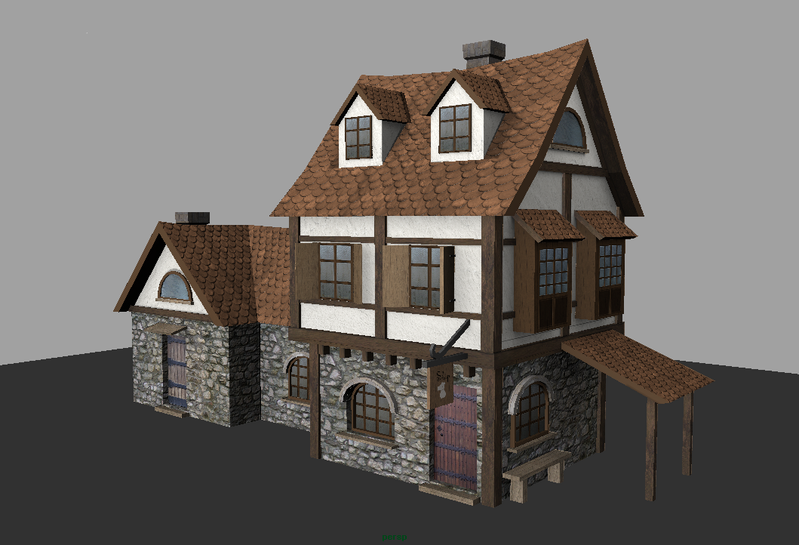
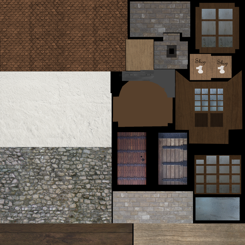
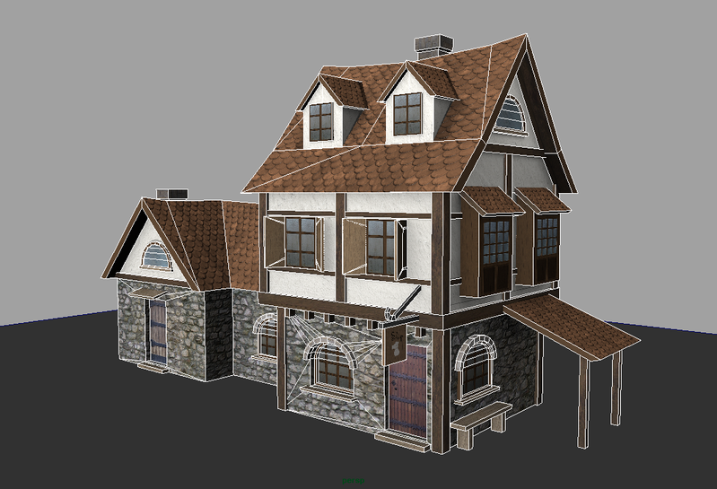
Then I`m planning some deformation with a latice deformer to add some more personality to the house. Looked at Fable 2 houses to get some inspiration. Textures are 2048 now, with a normal map too, but would probally be 1024 at the end and the mesh is 2500 polys. Any tips would be greatly apreciated. Btw, this house is one of the many in a Medieval/Fantasy street project that I work on with 3 other friends. Worked on this house for 4-5 days now.


Replies
your roof texture noticeably repeats within itself. CRIME. If you're not tiling textures, there's no excuse for repeats. Hell, if you're tiling textures there's little excuse for noticeable repeats either
it looks to me like you've unwrapped the chimney stack, pulling out each side as you'd unwrap a cube, yeah? But then you've slapped on a straight grey brick texture. If you're gonna unwrap, your texture should follow the contours of your UVs to create the correct layout of bricks. Otherwise you may as well just overlap all the UVs for each face
are you having 2 different designs for each side of the shop sign? If not you only need the one on your texture sheet
Thanks for the critique people, I´m gonna fix the things mentioned as i have to get this done now on Sunday
Fixed on this version: weather and tear/grunge/dirt, tiling and optimizing of uv set and finished the specular.
A rough paintover to show some of the areas that need attention. I can't be bothered to dirty all the areas that need it but what I have done should give you the idea of how and where to add dirt.
Decals are your friend
Besides the textures I would maybe add just a little more geometry on the right places and maybe deform some vertices. At the moment the house seems to have perfectly straight Walls, roofing and scantling. By adding some devisions at the right places the house would get a more leaning look.
One thing I'm unsure about is from what perspective is the player supposed to see the house. At the moment the polys seem to be equally distributed, which isn't bad. But if the house is intended to be viewed from a certain perpspective, you could brush those areas a bit more than others which aren't in the field of view.
If it's from above (RTS-Game) I maybe would add only a few polygons to the roof.
If the player is supposed to see the buildinng from first or thirdperson you could add just some polygons to the walls of the house, to deform the silhoutte a little.