Maps for Vision game engine (image heavy!)
Some months ago game engine developer Trinigy gave me the chance to show my level design skills. They needed 2 new maps for their engine SDK which would demonstrate some next gen engine features like dot3 parallax mapping, radiosity and geometry instancing.
All modeling was done in Softimage XSI, but I had to transfer all objects to Maya for export, because a vision exporter for XSI does not exist yet. The lighting and shader fine-tuning was done in vForge, the vision game editor.
The textures are done in Photoshop, based on own photographs and material from some texture libraries.
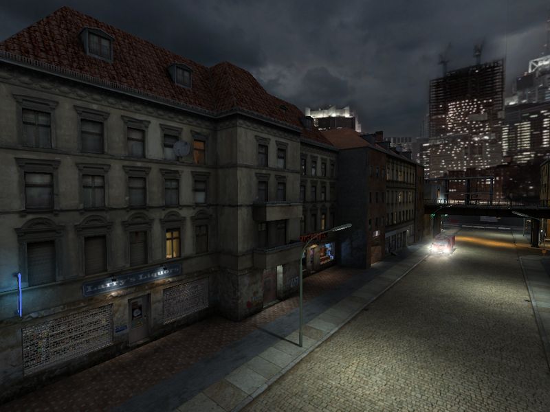
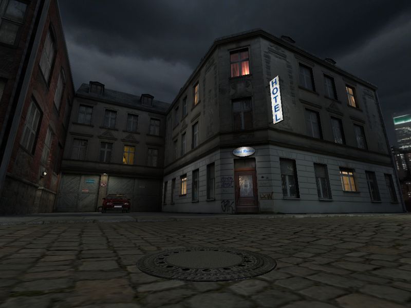
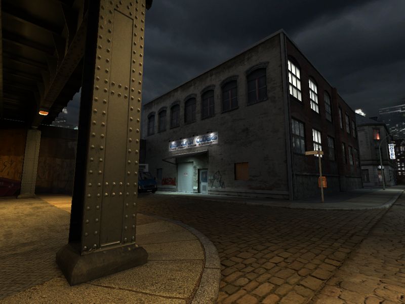
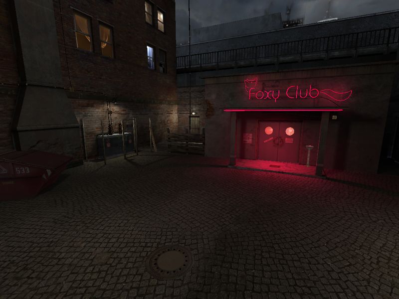
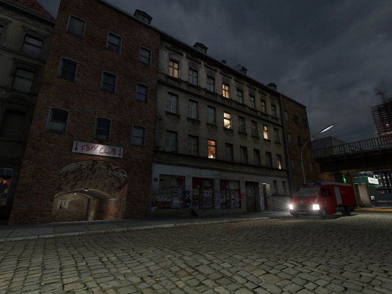
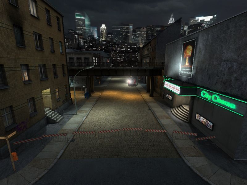
The first map should have the atmosphere of a not-so-rich, big, american city at night. I was heading for a realistic look, therefore specular and bump effects are subtle. They don't jump in your eyes, but add some plasticity where it's needed.
At some point, I ran into schedule and texture memory limits, therefore, after spending alot of time on important details, I had to rush other things (like the roof) and couldn't add plants anymore.
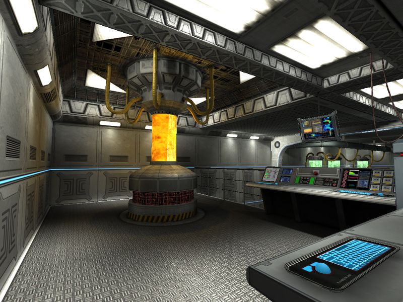
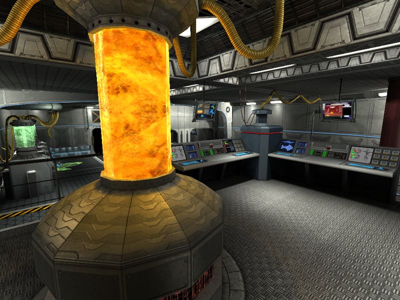
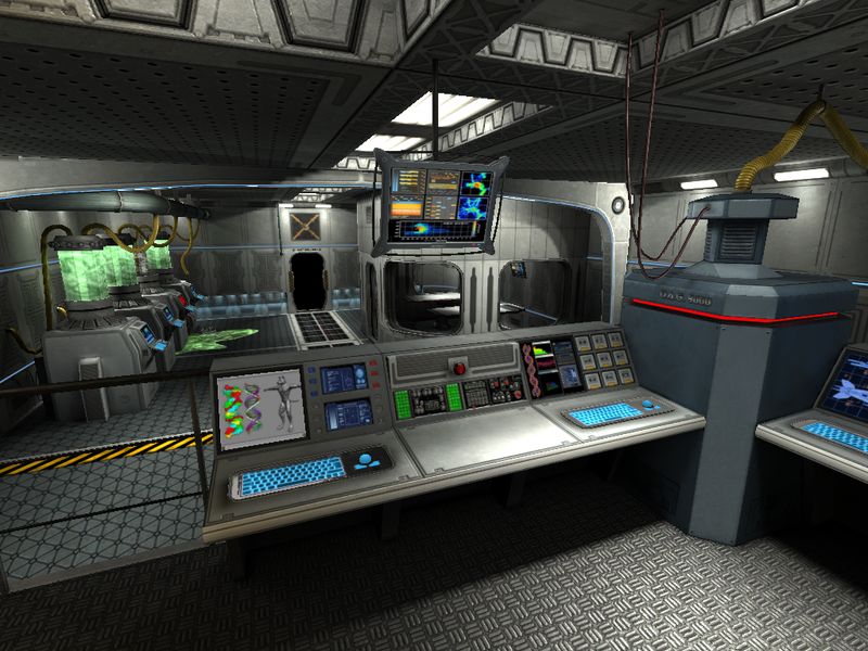
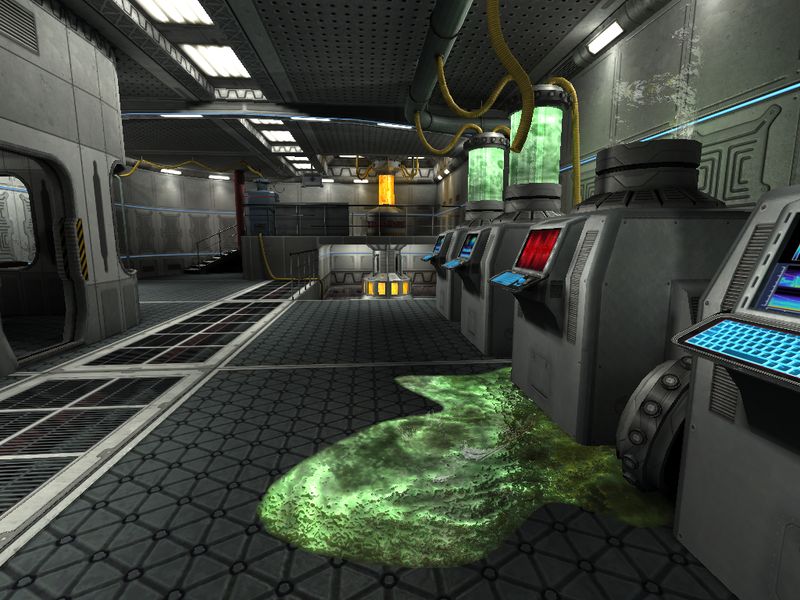
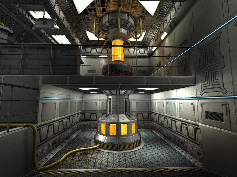
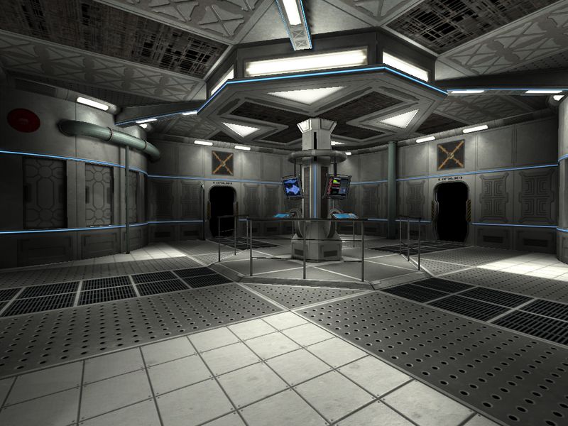
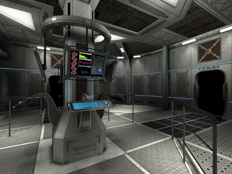
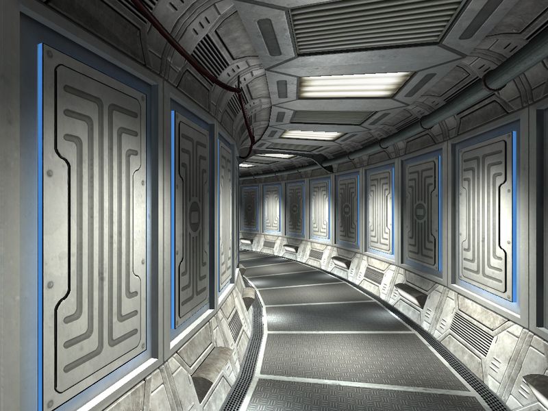
The second map should be some sci-fi themed construction kit for maps, predefined elements should be instanced to build large maps in a very efficient way. The screenshots show only some rooms, but not the final map, therefore there are no doors and movable entitites.
To see more screenshots, just browse this folder:
http://www.bb3d.net/media/Map_Screenshots
If screenshots aren't enough, you can watch some fly-through scenes of the city map in my demoreel.
Creating those maps was alot of work, but also alot of fun
All modeling was done in Softimage XSI, but I had to transfer all objects to Maya for export, because a vision exporter for XSI does not exist yet. The lighting and shader fine-tuning was done in vForge, the vision game editor.
The textures are done in Photoshop, based on own photographs and material from some texture libraries.
The first map should have the atmosphere of a not-so-rich, big, american city at night. I was heading for a realistic look, therefore specular and bump effects are subtle. They don't jump in your eyes, but add some plasticity where it's needed.
At some point, I ran into schedule and texture memory limits, therefore, after spending alot of time on important details, I had to rush other things (like the roof) and couldn't add plants anymore.


The second map should be some sci-fi themed construction kit for maps, predefined elements should be instanced to build large maps in a very efficient way. The screenshots show only some rooms, but not the final map, therefore there are no doors and movable entitites.


To see more screenshots, just browse this folder:
http://www.bb3d.net/media/Map_Screenshots
If screenshots aren't enough, you can watch some fly-through scenes of the city map in my demoreel.
Creating those maps was alot of work, but also alot of fun
Replies
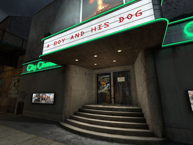
Psst, the movie sign letters go between the lines
http://farm1.static.flickr.com/231/491366190_753c766ad8.jpg?v=0
When and if you google ref, make sure it hasn't been heavily photochopped.
You could also define the transparent plastic edges of each letter, or 3d the letters, right now it looks very "font on texture".
Does the engine support texture blending?
Can you do any bloom/glow effects?
On my monitor it looks pretty bright and washed out. Especially the outdoor night scenes, you can use near darkness to imply detail in areas without having to get really specific. But you might be working on a CRT monitor? The sky looks a bit bright almost like you took a daytime sky and turned it darker? You could also work in some blueish colors into your ambient light, and put some yellow in your street lights, the two colors will play well off each other.
Also when doing lighting take some screen shots, shrink them down and see what the major colors and lights are doing. Use lighting to heard people to important places.
Blur and fog the background.
Increase the spec on quite a bit of the materials, it could have a really nice effect on the street cobble stones. It can really help sell the lighting also.
paint over
also where is the parrelex mapping i cant see it, i have a suspicion that its in the sci-fi panels but i almost cant tell, this is an expensive effect, why not use it on the cobbles with a decent heightmap they could look really good and the shapes would benefit much more from the parrelexing than the flatish sci-fi panels
Great stuff.
@Vig:
Your hints are helpful and will help me to improve the map, when I will have some time for it.
I agree, that the lighting could use more contrast in some places, but what you did with your postpro effect is not, what I wanted. Yes, the engine supports glow, bloom and even motion blur, but as I mnetioned above, I used effects subtle to help some materials look more realistic.
Yes, I use a CRT on my workstation, but I noticed, that the lighting looks brighter on my laptop's TFT.
I hate the default graphics in UT3 with all that glow and blur. Since I disabled those effects the game is playable for me.
@Shepeiro:
In the SciFi map, parallax mapping is nearly on every surface, but I didn't want it like in Doom 3 - "Look, we can specular and bump, so we have to use it everywhere and crank it up, so everybody will notice it!"
Furthermore, if you increase parallax strength too much, it can produce artifacts and then looks very ugly.
The cobbles in the city have parallax mapping, this screenshot shows it pretty well:
-Woog
First off, good job getting two full environments / levels done by yourself, I know that's not easy for one person to do fully.
I agree that the parallax effect is not very noticeable in a lot of these screenshots, maybe you should really push the heightmaps or change the shader parameters so it is more noticeable? I know it probably looks better in motion though, sometimes a static screenshot can be hard to judge how well a parallax texture is working.
I also agree that a lot of the lighting seems a bit "boring" ... the urban scene is pretty good, Vig's paintover is quite interesting and could be a good direction to push it in if you had the chance.
The lighting in the sci-fi complex is making everything look a bit flat and greyish, i know it's probably meant to be a clean futuristic lab sort of setting, but the amount of different colours in the textures would imply that more colourful and contrasting lighting could be used without looking out of place.
Cool stuff though, keep it up!
Hehe, I love to put "easter eggs" in my work and it's a well known secret, that I have an affinity to dogs
@MoP:
Yeah, it's been a while, but I will never forget the Polycount community
Thank you for your input, more colored lighting might be a good idea.
You can believe me, that I tried to push the height of the parallax mapping as much as possible, but if you push it too far, it starts to look ugly. It produces artifacts and tends to swim.
If you are going for the bright clean scifi env, use cubempas on a lot of the surfaces.
Did you bake a AO map? Ao works great on clean surfaces.
if your making your cobble map in PS and have a basic height difference between the cobble and the mortar, i would suggest duplicating that layer and bluring it and halfing the op, do this a few times blurring it more with each layer. then play with the opacities to get a nice rounded heightmap on the cobbles, this will look much better, will catch the light better and importantly for you, you will be able to push the parrelexing on it whith less artefacts
All the input I got here will help me to improve the quality beside that, so thanx again for the comments