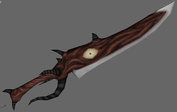
Home 3D Art Showcase & Critiques

Soul Edge

polycounter lvl 17
Offline / Send Message
Lord McMutton polycounter lvl 17
An original Soul Edge I've been making
06.jpg
05.jpg

He's for this guy, who I'll be updating in time.
MBnightmare.jpg
Nightmaretex-1.jpg

I'll need some help with texturing the blade, and making the flesh stand out more.

Replies

  • J533Hale
    Options
    Offline / Send Message
    Hmmm... texturing really isn't my strong suit... but I'd say push the saturation of the brighter parts up a bit, to make them stand out against the darker shaded areas. I'd also add a few large and thick veins to the eye, to give it a bit of extra appeal. All the small veins just kinda blend together from a distance.
  • Lord McMutton
    Options
    Offline / Send Message
    Lord McMutton polycounter lvl 17
    I'll look into that suggestion about the eyes. But first...
    SEMBlnk.gif
    ...blink...
  • Michael Knubben
    Options
    Offline / Send Message
    Do you have a tablet? If so, you need to seriously rethink your texturing. There is no depth to your textures, and it's all terribly monochromatic. That may sound disheartening, but I wouldn't bring it up unless I thought you could improve it a lot with some small adjusments.

    For inspiration, check out this texture by Barry Collins:
    2dThouskinL.jpg
    It's somewhat similar to yours in that it uses blue metal, but it does so much more convincingly. Don't focus on the blue metal, though, as it actually has very little shading. Yours would need a lot more highlighted edges (as you can see on other parts of the texture I posted)
    You need to study how metal responds to light. It doesn't have a velvety sheen with soft highlights. It actually has very concentrated highlights on top of softer shading, and the nature of metal means it's hard to have perfectly soft bends and such.

    Then, the flesh:
    It has -much like the rest of the texture, really) hardly any lighting, and what lighting is present doesn't have much of a unified lightsource. This goes for the body as well as the organics on the sword. You need to stop randomly detailing, and start thinking about where these tendrils attach, where they bulge, which forces pull at it and where they'd be tense.
    You can find a good example of something similar to what you're doing with the flesh in here:
    http://boards.polycount.net/showthread.php?t=53960

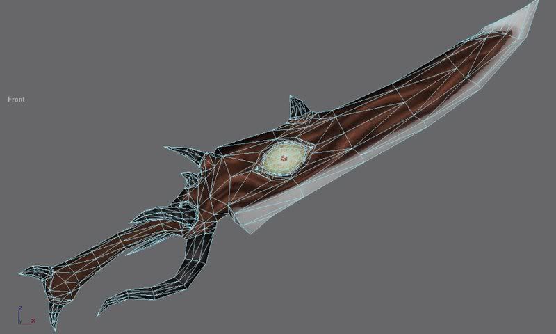
    Also, are your uv's stretched? On the character, the texture seems very wobbly, and it's not helping any.

    I hope this helps, and I'm looking forward to seeing what you do with it!
  • Lord McMutton
    Options
    Offline / Send Message
    Lord McMutton polycounter lvl 17
    Hope it helps? Of course it helps! That's one of the best crits I've ever recieved! I don't own a tablet, and I don't have any money to buy one, so I'm stuck with a mouse. I was going to start over on Nightmare's texture, so thanks for that reference. What can I do to make the textures less monochromatic?
  • SHEPEIRO
    Options
    Offline / Send Message
    SHEPEIRO polycounter lvl 17
    dont worry about not haveing a tablet sure it helps but you can still acheive the same result with a mouse. id say the big thing you need to get right is to start drawing in the specular and reflections.

    i use overlay an overlay layer seperatly for both these effects, specular is quite simple just imagine a render with a generic (from above) highlight and paint those in, do it roughly at first then smudge to get a better shape, dont use this a s final though, i will use this as a base, maybe take it down to 50% op hen use that as a mask on another layer where i add more precise bits (use the pencil and layer it up)

    with reflections, obiviously you dont want anything too sharpe as it wont move. i start by making a block of gradient usually in blues, greys and whites with a few bands in. take that and copy/paste deform it to the shapes you have again as overlay layers (make a group with an overlay filter and just keep pasting into this)

    what your also missing is micro detail, little dents etc in the armour, you can acheive this with another overlay layer, just select the base colour and darken it by half then paint this in to the dark sides of the dent, do the same with the highlights but make this half lighter and possibly less saturated (depends on the material)
  • Lord McMutton
    Options
    Offline / Send Message
    Lord McMutton polycounter lvl 17
    Thanks for the mini-tutorial, SHEP. I'll have to try that out once I get started on this again. What can you guys tell me about skin tones? How are the colors of flesh affected when in shadow or light? More purple hues in darker areas and such?
  • Lord McMutton
    Options
    Offline / Send Message
    Lord McMutton polycounter lvl 17
    I looked at Nightmare's model, and found it to be unsatisfactory. So I'm starting again.

    Basemesh so far.
    NMB.jpg

    Any tips on modelling elbows correctly?
  • John Warner
    Options
    Offline / Send Message
    John Warner polycounter lvl 18
    I <3 MightyPea's 8==D

    yeah man, remove those highlights and add a spec map.

    add some larger shaddow gradients to the diffuse. don't be afraid of making areas darker.

    play with your spec to get the surface looking like steel, then add grunge, dust, dirt, scratches, blood, greese, dents, etc. here and there.
  • Michael Knubben
    Options
    Offline / Send Message
    I wouldn't say a specmap is absolutely necessary . Sure, it looks nice, but it can be good practice to just paint in the specular highlights.
    Shep's advice is good, go for it :)

    About colours in shadow: it depends on the environment, so you'll need to have a virtual environment in mind as you texture him.
    This tutorial gets posted a lot, that's for a good reason: http://www.itchstudios.com/psg/art_tut.htm

    It's really good, and tackles the subject of shadow-colour, among many others.
  • almighty_gir
    Options
    Offline / Send Message
    almighty_gir ngon master
    a spec map isn't absolutely nececery, no. but for the target engine, it is.

    when you have dynamic lighting like you will have in the jka engine, being able to have specularity of an object adapt to that lightning is much better than painting in static spec for your object.

    it's also a handy skill to know.


    if your model were to go into dawn of war, like that thousand sons texture. then spec maps would be useless, and painting in the spec would be very useful.
  • Thegodzero
    Options
    Offline / Send Message
    Thegodzero polycounter lvl 18
    wow, i remember hyper as being much better...
  • Lord McMutton
    Options
    Offline / Send Message
    Lord McMutton polycounter lvl 17
    So the question becomes: How much highlighting information is necessary on the texture when a specular shader will be used?
  • Lord McMutton
    Options
    Offline / Send Message
    Lord McMutton polycounter lvl 17
    More stuff. The head is just a placeholder.
    NMB2.jpg
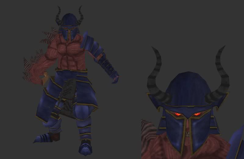
    This looks like a spine, right?
    NMB3.jpg

    -Forgot the concepting I did today.
    Nightmare-1.jpg
  • John Warner
    Options
    Offline / Send Message
    John Warner polycounter lvl 18
    specmap isn't necessary?

    how..... how fucking dare you?? :'( really tho, i disagree. yeah, it's neet to paint some shininess into your textures but is it really worth it nowadays? you're going to get a more realistic result with a spec map.. now mind you... if you don't want realism, then.. so be it... i'll be the first to support you.

    Marshal Banana -- i would say no broad highlights. like Pea suggested, it's a good idea to take a super-thin brush and hit the edges of your metal with like bright friggin white, and then go back and break up those highlights a bit with the eraser. if you get a good specmap with some nice contrast in it, you should get some very interesting highlights appearing on your metal. if you DO want to try that, post your maps when you've got something and i'll do an adjustment to them, if you'd like.
  • Lord McMutton
    Options
    Offline / Send Message
    Lord McMutton polycounter lvl 17
    His helm is a bit strange in some places. Need to fix that.
    NMB4.jpg
  • John Warner
    Options
    Offline / Send Message
    John Warner polycounter lvl 18
    torso is too thick and pudgy. turn on sof selection and push the lower back in a fair bit. if you do that it'll fix it like 200%

    oh. no soft selection in maya. well, push the lower back in somehow.
  • trevor87
    Options
    Offline / Send Message
    If you are using Max try using paint deformation while in polygon mode to slim down the torso. I use it for organic models.
  • Lord McMutton
    Options
    Offline / Send Message
    Lord McMutton polycounter lvl 17
    Didn't realize how small the picture was. Close up of the helm.
    NMB5.jpg
  • Lord McMutton
    Options
    Offline / Send Message
    Lord McMutton polycounter lvl 17
    1490 verts so far.
    NMB6.jpg
  • Lord McMutton
    Options
    Offline / Send Message
    Lord McMutton polycounter lvl 17
    Got some armor done.
    NMB7.jpg
  • Lord McMutton
    Options
    Offline / Send Message
    Lord McMutton polycounter lvl 17
    More. The vert count stands at 2368.
    untitled.jpg
  • rooster
    Options
    Offline / Send Message
    rooster mod
    I think the legs are kinda short. I used to draw short legs so I know where you're coming from.. just make em longer and see how it looks (make them *too long, and then start scaling them back)
  • Lord McMutton
    Options
    Offline / Send Message
    Lord McMutton polycounter lvl 17
    Is that based only on the current shot, or did you look at the base as well? It could be the position of the armor.

    Rawrg, horns.
    NMB8.jpg
  • Steve Schulze
    Options
    Offline / Send Message
    Steve Schulze polycounter lvl 18
    He has the proportions of a person around 5 feet tall. Having such a short guy is kinda neat - it's not often you see a character that doesn't stick to the usual 7.5 heads tall, but it's probably not the look you're actually after.
  • rooster
    Options
    Offline / Send Message
    rooster mod
    his legs look too short m8 :). same advice. extend them until they look way too long, and then pull them back until they look acceptable. then you've probably got it
  • Lord McMutton
    Options
    Offline / Send Message
    Lord McMutton polycounter lvl 17
    rooster wrote: »
    his legs look too short m8 :). same advice. extend them until they look way too long, and then pull them back until they look acceptable. then you've probably got it

    Alright, I'll fix that.
    Jackablade wrote: »
    He has the proportions of a person around 5 feet tall. Having such a short guy is kinda neat - it's not often you see a character that doesn't stick to the usual 7.5 heads tall, but it's probably not the look you're actually after.

    Good. Nightmare's only 5' 6", after all.
  • Lord McMutton
    Options
    Offline / Send Message
    Lord McMutton polycounter lvl 17
    Just need to add a face.
    NMB9.jpg
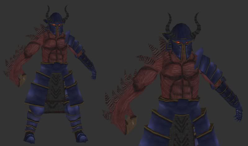
    Do the legs look right now, Rooster?
  • Smirnoffka
    Options
    Offline / Send Message
    Smirnoffka polycounter lvl 17
    I must say Marshal, your modeling has come a long way in the last little while. Lets see if you can match it with a nice texture. Also, you could probably optimise the mesh quite a bit, but it is looking quite nice.
  • Lord McMutton
    Options
    Offline / Send Message
    Lord McMutton polycounter lvl 17
    Some base textures.
    NMB10.jpg
  • renderhjs
    Options
    Offline / Send Message
    renderhjs sublime tool
    he has proportions of a pig, a big chest with smal arms and legs. Legs and arms should be longer.
    The t-pose leg wise looks also a little bit odd- maybe a to big angle,- also the knees could use a slight bend. Right now the legs look like metal pipes. Same for the arms- a slight bend to the front would give it a little bit more natural pose/ look.
  • John Warner
    Options
    Offline / Send Message
    John Warner polycounter lvl 18
    the proportions of a pig.. that's certainly... blunt.

    i would have to agree, unfortunately. that whole torso is way too thick.

    i like the base colors. i'm really hoping this thing turns out awesome dude.
  • renderhjs
    Options
    Offline / Send Message
    renderhjs sublime tool
    just so that I dont hurt anyone,- its my way of giving crits- the model alone is progressing well - so dont be offended of what I just said.
  • Lord McMutton
    Options
    Offline / Send Message
    Lord McMutton polycounter lvl 17
  • GeneralAtrox
    Options
    Offline / Send Message
    I like your work mate, textures look pretty good considering they are basic colours, a low colour pallette on games is great some times, like Team Fortress 2 :) I think it was like 36 shades of colour were used...

    Awesome... well lemme have a quick look at your model...

    You have said that you were modelling after Nightmare from Soul Calibre right? Well if so, 5.6ft is correct, so the legs to start with are perhaps a tad short, just a little bit, perhaps a small increase by about 15% should be fine (I know he's only 5.6, however if you have him exactly 5.6 and you have set the units up right then okay leave them)

    Not sure how Maya works, but stick a Smoothing Group on (if you can) or a mesh smooth, i'm interested to see what it looks like.

    i wish i had your inspiration :( Insted i created this Chromehound lol

    Chrome_Hound_by_Kronos9000.jpg

    I hope it looks okay, i don't texture models at all, merely because they look bad.

    Good Work either way! keep it up.
  • Lord McMutton
    Options
    Offline / Send Message
    Lord McMutton polycounter lvl 17
    Thank you, General. I dunno how Maya works either, so I use Truespace.

    More
    helmtex.jpg
  • Lord McMutton
    Options
    Offline / Send Message
    Lord McMutton polycounter lvl 17
  • Lord McMutton
    Options
    Offline / Send Message
    Lord McMutton polycounter lvl 17
    evenmoretex.jpg
    Need opinions on the metal. And can I remove the areas of the basemesh that are under the armor and still weigh him correctly?
  • almighty_gir
    Options
    Offline / Send Message
    almighty_gir ngon master
    are you going to be using a specular map for the metal? if yes, then for now basic colouring is ok, just put some scratches etc, into it.

    if not, then you need to work a lot harder on it.

    you can remove anything you want.
  • GeneralAtrox
    Options
    Offline / Send Message
    Truespace? Hmm... i haven't heard of that program.. what is it like?

    I like the way you've done the eyes... i REALLY need some inspiration.
  • Michael Knubben
    Options
    Offline / Send Message
    Atrox: seriously, forget about mesh-smoothing, and don't tell other people to use it.

    As for the texture, it's an improvement over the earlier one, and now looks much like metal. It still needs more texture, contrast and wear, but you're getting there. It still looks a bit like satin at this point, you know?
  • System
    Options
    Offline / Send Message
    System admin
    Looking kind of cool Marshal B, he does look a bit short though, the head looks okay so if you could detach the body and scale it up height wise that should fix the problem. Echoing MightyPea on the metal, it does seem like a soft material and not a metal, there's simply no detail in the diffuse or specular, glossiness to determine the composition of surface types throughout the model, although as said it is early days.
    On a side note he kind of reminds me of a now cinematised boss in resident evil 2 :)
  • Harry
    Options
    Offline / Send Message
    Harry polycounter lvl 13
    whole thing looks too stocky mate, you don't have to ditch what you've done, just hide all the apparel and work on the base figure more.

    edit: I'm an idiot. Didnt realise there was a second page, now i look like a nagging dickhead. I still reckon it looks stocky though.
  • Lord McMutton
    Options
    Offline / Send Message
    Lord McMutton polycounter lvl 17
    Attempted to dirty up the armor
    grunge1.jpg
    grunge2.jpg
    grunge3.jpg
  • SHEPEIRO
    Options
    Offline / Send Message
    SHEPEIRO polycounter lvl 17
    your not thinking about where he dirt would be, its far too uniform, dirt collects in places where its disturbed less
  • Lord McMutton
    Options
    Offline / Send Message
    Lord McMutton polycounter lvl 17
    I was going more for rust than dirt.
  • SHEPEIRO
    Options
    Offline / Send Message
    SHEPEIRO polycounter lvl 17
    well again rust happens where moisture collects not just randomly, around joints, hinges etc
  • Joao Sapiro
    Options
    Offline / Send Message
    Joao Sapiro sublime tool
    use refs man , dont try to pull something as complex as rusted metal out of your head, study it instead of dropping overlays in the texture. heres one i got for quickly searching in google :) just gather lots and lots and lots and lots of refs .

    2909542950083605549LuPLAc_fs.jpg
  • renderhjs
    Options
    Offline / Send Message
    renderhjs sublime tool
    I still think that the legs look just wrong,- just give them a more relaxed pose instead
  • Lord McMutton
    Options
    Offline / Send Message
    Lord McMutton polycounter lvl 17
    johny - Hey, that's not fair! My Google searches bring up nothing of use.
  • SHEPEIRO
    Options
    Offline / Send Message
    SHEPEIRO polycounter lvl 17
    try flickr then there is planty of good source out there, take your time to find it, finding the right refs can mean saving alot of work in the end
Sign In or Register to comment.