I always love seeing complex machinery models like this. As of the moment, it looks kind of odd just hanging out by its self. I think props such as this (crazy sci-fi Generator Things) look better when there placed together in a scene. Perhaps it gives it a better identity than just by itself.
I hope you do a low poly of this.
Senior year in san deigo, huh? By chance are you an AI student or what?
Indeed Mike, I'm an AI student. gonna be finishing up in about 9 months. This is the first object that I"ve started to model for my senior project. I will be populating an entire scene with objects of this nature. I'll post some more of the concept arts as I go along within this thread and as I continue to model these objects.
sweet. Iam in my junior y@ in Portland. A good friend of mine just transferred to san deigo to finish her BFA in accessories&design. Ive heard Good things about sanD.
As always it depends on if it was in game and where it would be in the players view. If it was a hub or something very close that the player would interact with then 1024 or 2048. If it i off screen and the player wont see it very much then 512 or so. If this is a portfolio piece then I would build the texture out at 2048 and shrink it down to 1024 and have 2 versions available. Some people may not agree with taking a 2048 to 1024 becausr they say the pixel density will not be as crisp as if you were working at a straight 1024 resolution, but to me the difference is very small. So, the best thign to remeber is what is this objects purpose, how oftena dn clear will the players see it etc. The closer to the player and if it is important in the game then you want to give it a bit more love.
Here's the high and low. Probably not gonna capture the normals today, still have a few hours of unwrap to do.
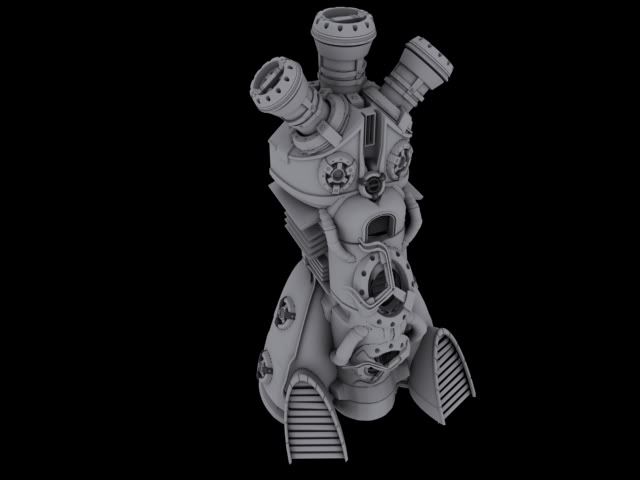
Any suggestions on the geometry before I jump to the next step? On the circular objects that are placed on several different parts of the generator, I've used a rather elementary cylinder... but the high poly version is much more complex... should I add in a few more blocky pieces before I move on or just see how it turns out like this?
\
\ oh yah, low poly is 4082 polys
2k al the way ;-) takes about as long to paint IMO and would be nice for renders then show it at 1k in engine, 128 texels per metre is generally thought of as reasonable for 360 therefore you could show it as 2k for high-end PC and 1K for 360
conducted a quick test to see how the model will look left as is with a normal map applied. Looks like a successful shot so far, so I'm not going to modify the geometry any further unless someone on this board can give me a good reason not to within the next 12 hours or so :P
low poly left, high right... goo-tube is shown with captured normal map applied.
looks pretty nice man. Has a bit of a steampunk feel to it, this would look great done up with oxidized brass and steel fittings.
One important thing to keep in mind is stacking and mirroring uvs. A symmetrical, segmented piece of machinery like this is ripe for an uber-efficient UV map, and doing so would really show potential employers you understand how to make the most of a game engine's capabilties and limitations. You may already be doing this, but I thought it should be mentioned just in case. Solid model.
hell yea homie! Youve deffinately steped it up a notch or two! Bring on those sexy textures. The model is looking solid, normals too. Are you shooting AO to go with this? i would think you are, but just making sure
careful going too far down the character line with this one. Its koo to do bits here and there, but when the piece starts to get too much into the character art realm people will instantly up there requirements. you will still start getting more crits on anatomy and cloth folds than actualy env prop crits. Just something to keep in mind lookin sharp! i wanna see texture on the last one!
careful going too far down the character line with this one. Its koo to do bits here and there, but when the piece starts to get too much into the character art realm people will instantly up there requirements. you will still start getting more crits on anatomy and cloth folds than actualy env prop crits. Just something to keep in mind lookin sharp! i wanna see texture on the last one!
This is a pretty silly comment, if your main element is a character, statue whatever, its entirely relevant to give critiques on anatomy and cloth folds. Just because its not a character model that will be animated and run around doesn't mean you should all of a sudden just drop your expectations. The concept has a cool, full featured and detailed human in it. Creating enviro art isnt some silly NOOO CANT MAKE A CHARACTER contest or something, as an enviro artist, if you've got a statue thats part of your environment, its your responsibility to model it accurately, same as if you were modeling a fire hydrant, or an ornate pillar, it doesn't matter what the subject matter is.
my point is valid, and not silly in the least bit. His focus has been environment art. where i understand status and such are env artist responsibility. My suggestion was not that he should give up, but rather go into it trying to do a simplified possibly stylistic version of a char. Because if you get too detailed people will start popping outa the woodworks with retarted comments about pores, and fatty buildup under the earlobes or something.
Please dont take this as a "you should give up" b/c its not. Im meerly stating that this will be a challenging piece, and you will be judged on the weakest part of it when an employeer looks at it. If tyour strongest leg is hard surface modeling, tossing in a very organic item that is sub par to the rest of the piece will pull the focus instantly to it.
it was meerly an opservation statment. And ment nothing offensive by it. perhapse i used the wrong words earlier. anywho keep goin man, it looks good like i said before. larger images will help when crit time comes around.
aye. I'm jumping in to the generator texture as we speak.
Thanks for all the advices as well. I'll keep this all in mind as I continue to model the figure. My goal is to keep it simple, and representative of a figure. Shrouding a figure in cloth is kindof a cheat to avoid modeling a full character.
And yes, Stimpack, it will be a very stylized character.
looks good but a little flat, spec isnt doing nearly enough, id also kind of expect paint on a machine like this not to be matt, but thats a choice for you to make, think its making it a little toy like ATM and not like heavy machinary
kk, update with the spec working properlly... err... closer to properly anyhow. I had to turn my max material setting up to 900 to get it to show properly... i must be doing something wrong here.
Hey man this looks great. I'm also a student at the Art Institute, but in the OC. I still have over a year so hope I am this good when I 'm close to graduating. Anyways where is the alpha and illumination being used? Also is this in game?
First - it's good that you're on this forum a year before graduation... I see lots of students try to start posting right after graduation and it's not usually very pretty, so thumbs up on being proactive!
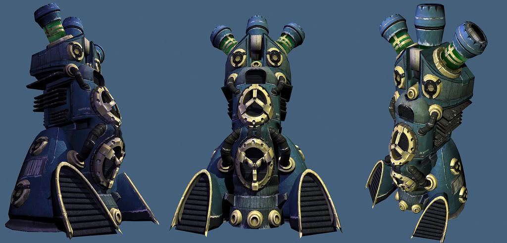
This is not in game, this is sa 2048 shown in max. I'll be putting it in Unreal3 as a 1024 texture soon, after I iron out all the little shitties.
The alpha and illumination are being used on the green tubey tanks on top. The illumination will be much more apparent when I put it into unreal (seeing as how unreal has as badass illumination)
Probably gonna make the liquid tanks a little less greeney and a little more yellow as well.
cheers!
p.s. your modeling will improve vastly if you use this forum a lot, and do lots of practice OUTSIDE of class. :P
some of the material definition comes across as being quite hard to read. Currently the vents at the front are kind of bugging me. They look like a black matte colour with noise applied which makes them look like fuzzy felt. As shep said, its still looking flat. Nothing really pops out at me. I dont know if the blue background is causing some of the confusion, i know its not really relevant as you will show it in game but its not helping crit the textures.
this is lookn dope man! how bout them flats? Im not sure the size u were going for, but if I were to guess id say a persons head would be level with top tri spoke thingy. If you want to make it feel larger or smaller, you would just have to tweak the size of your noise. Like scratches and such would be alot smaller if you wanted the object to seem bigger. make sense? I think whats also selling it as a toy is that the paint is alot shinnier than the underling metal. I enjoy the way it looks, but that could be something to check into and see if it does anything for ya also might wanna go around with the desaturate brush and kill back some of the saturation of the blue in areas that would collect dust. cracks, corners ect.
lookn realy good tho! big step from your last one.
my point is valid, and not silly in the least bit. His focus has been environment art. where i understand status and such are env artist responsibility. My suggestion was not that he should give up, but rather go into it trying to do a simplified possibly stylistic version of a char. Because if you get too detailed people will start popping outa the woodworks with retarted comments about pores, and fatty buildup under the earlobes or something.
Please dont take this as a "you should give up" b/c its not. Im meerly stating that this will be a challenging piece, and you will be judged on the weakest part of it when an employeer looks at it. If tyour strongest leg is hard surface modeling, tossing in a very organic item that is sub par to the rest of the piece will pull the focus instantly to it.
it was meerly an opservation statment. And ment nothing offensive by it. perhapse i used the wrong words earlier. anywho keep goin man, it looks good like i said before. larger images will help when crit time comes around.
Weather its a stylized or hyper detailed version of the human form the same basic principals apply, you need to understand anatomy, form, etc. What i'm saying is getting/giving crits on those fundamental skills is most definitely relevant, and suggesting otherwise is *quite* silly. Getting critiques on the anotomy of a statue, and creating environment art are far from mutually exlcusive.
I think this is a good base. I would suggest adding some gradient over the larger areas, just a little, to add more depth to the model. Also the textures just seemed to be added and masked to put the right texture in each area. They don't seem to be interacting with the model to me. Those vents would be dinged on the edges. Drips would be coming down seems in the metal, etc. It looks like you have the foundation there and now you need to customize it to this model. I hope that makes sense. Also more AO and a dirt pass could help ground it more. Right now it looks flat.
Hey looking good Adam. I'm trying to remember if I knew you from school or not. It's been all most two years now so I don't think so heh.
You have some good stuff coming out of this model. I realize your some what finished with it at this point, so I won't go to far. If your objects main color is blue dont make your background blue it's harder to read, put it behind a dark grey or black background so your model will read better.
Your little statue deal has some good stuff coming out. I do however agree with EQ about the figure. As an environment Artist you should be expected to do it right. No worries though practice makes perfect I'm srue she'll end up looking solid. Looks like your way ahead of the curve at AI. Btw is Asa Enochs your instructor? Just wondering heh. Keep up the good work.
Replies
I always love seeing complex machinery models like this. As of the moment, it looks kind of odd just hanging out by its self. I think props such as this (crazy sci-fi Generator Things) look better when there placed together in a scene. Perhaps it gives it a better identity than just by itself.
I hope you do a low poly of this.
Senior year in san deigo, huh? By chance are you an AI student or what?
Thanks for the crits! more to come!
cheers!
moving on to low poly, then on to the normals. Wish me luck!
Any suggestions on the geometry before I jump to the next step? On the circular objects that are placed on several different parts of the generator, I've used a rather elementary cylinder... but the high poly version is much more complex... should I add in a few more blocky pieces before I move on or just see how it turns out like this?
\
\ oh yah, low poly is 4082 polys
Cheers
ADM
low poly left, high right... goo-tube is shown with captured normal map applied.
One important thing to keep in mind is stacking and mirroring uvs. A symmetrical, segmented piece of machinery like this is ripe for an uber-efficient UV map, and doing so would really show potential employers you understand how to make the most of a game engine's capabilties and limitations. You may already be doing this, but I thought it should be mentioned just in case. Solid model.
high poly - 1.5million polys
low poly:
3710 Polys
1x2048 Normal map
;-P
edit.
turns out it was a smoothing group error conflicting with the normal map... new screenies tomorrow, possibly with first pass texture.
SHEP - thank for following my thread btw.
Statue is very WIP.
The Generator will be textured and complete by Friday, I'll post it up as I get s tarted.
the flow and theme the two pieces share is great
touch
This is a pretty silly comment, if your main element is a character, statue whatever, its entirely relevant to give critiques on anatomy and cloth folds. Just because its not a character model that will be animated and run around doesn't mean you should all of a sudden just drop your expectations. The concept has a cool, full featured and detailed human in it. Creating enviro art isnt some silly NOOO CANT MAKE A CHARACTER contest or something, as an enviro artist, if you've got a statue thats part of your environment, its your responsibility to model it accurately, same as if you were modeling a fire hydrant, or an ornate pillar, it doesn't matter what the subject matter is.
not gonna put any time into good edgeloops though. this statue will never move or be rigged.
Please dont take this as a "you should give up" b/c its not. Im meerly stating that this will be a challenging piece, and you will be judged on the weakest part of it when an employeer looks at it. If tyour strongest leg is hard surface modeling, tossing in a very organic item that is sub par to the rest of the piece will pull the focus instantly to it.
it was meerly an opservation statment. And ment nothing offensive by it. perhapse i used the wrong words earlier. anywho keep goin man, it looks good like i said before. larger images will help when crit time comes around.
Thanks for all the advices as well. I'll keep this all in mind as I continue to model the figure. My goal is to keep it simple, and representative of a figure. Shrouding a figure in cloth is kindof a cheat to avoid modeling a full character.
And yes, Stimpack, it will be a very stylized character.
Cheers :P
2048 textures
diffuse
normal
spec
1024 texture
alpha
illumination
(let me know if i should scrap the alpha or illum)
thinking off adding some glowy bits to it.
First - it's good that you're on this forum a year before graduation... I see lots of students try to start posting right after graduation and it's not usually very pretty, so thumbs up on being proactive!
This is not in game, this is sa 2048 shown in max. I'll be putting it in Unreal3 as a 1024 texture soon, after I iron out all the little shitties.
The alpha and illumination are being used on the green tubey tanks on top. The illumination will be much more apparent when I put it into unreal (seeing as how unreal has as badass illumination)
Probably gonna make the liquid tanks a little less greeney and a little more yellow as well.
cheers!
p.s. your modeling will improve vastly if you use this forum a lot, and do lots of practice OUTSIDE of class. :P
lookn realy good tho! big step from your last one.
Weather its a stylized or hyper detailed version of the human form the same basic principals apply, you need to understand anatomy, form, etc. What i'm saying is getting/giving crits on those fundamental skills is most definitely relevant, and suggesting otherwise is *quite* silly. Getting critiques on the anotomy of a statue, and creating environment art are far from mutually exlcusive.
You have some good stuff coming out of this model. I realize your some what finished with it at this point, so I won't go to far. If your objects main color is blue dont make your background blue it's harder to read, put it behind a dark grey or black background so your model will read better.
Your little statue deal has some good stuff coming out. I do however agree with EQ about the figure. As an environment Artist you should be expected to do it right. No worries though practice makes perfect I'm srue she'll end up looking solid. Looks like your way ahead of the curve at AI. Btw is Asa Enochs your instructor? Just wondering heh. Keep up the good work.