The BRAWL² Tournament Challenge has been announced!
It starts May 12, and ends Oct 17. Let's see what you got!
https://polycount.com/discussion/237047/the-brawl²-tournament
It starts May 12, and ends Oct 17. Let's see what you got!
https://polycount.com/discussion/237047/the-brawl²-tournament
A Minotuar!
Hey there! So after winning Best Game Character at the 2008 Academy of Art Spring Show with Walter Sobchak , graduating, getting married, and interviewing until my eyes popped right out of my head, I've been told numerous times that developers want to see some more realistic characters, or fantasy characters (or sci-fi, or this or that, blah blah blah). As such, I decided that my next portfolio piece will be a realistic Minotaur!
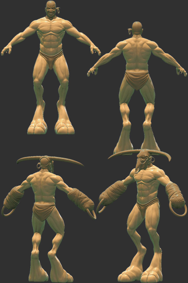
So here he is, in all his WIP'd glory:


So the idea is a minotaur in a more realistic sense, ie, King Minos fathered a deformed child that resembled a bull, and out of shame, he chained and locked the poor bastard within the Labyrinth. The model will also have a ton of scars on his face and body, a broken column strapped to his back, and chains connected to broken cement blocks attached to the rings in his hands-- all modeled, but I've yet to edit them in ZB...
C&C welcomed as always. I was hoping for some feedback on the bindings around his hands especially-- any ideas as to good ways to sculpt the straps that are wound numerous times around his forearms and hands?
Thanks for looking!
So here he is, in all his WIP'd glory:


So the idea is a minotaur in a more realistic sense, ie, King Minos fathered a deformed child that resembled a bull, and out of shame, he chained and locked the poor bastard within the Labyrinth. The model will also have a ton of scars on his face and body, a broken column strapped to his back, and chains connected to broken cement blocks attached to the rings in his hands-- all modeled, but I've yet to edit them in ZB...
C&C welcomed as always. I was hoping for some feedback on the bindings around his hands especially-- any ideas as to good ways to sculpt the straps that are wound numerous times around his forearms and hands?
Thanks for looking!
Replies
rhoymand-- thanks as well! And this forum is an excellent spot for feedback and resources. I've yet to complete a current-gen (360/PS3 spec) character, but hopefully this'll be it! Once I'm done with him, I can go back to game-ifying my witch...
Please, folks, keep the crits coming!!
i'm voting for a tiny tail, and larger cow skull.
looks good! love the proportions of his feet
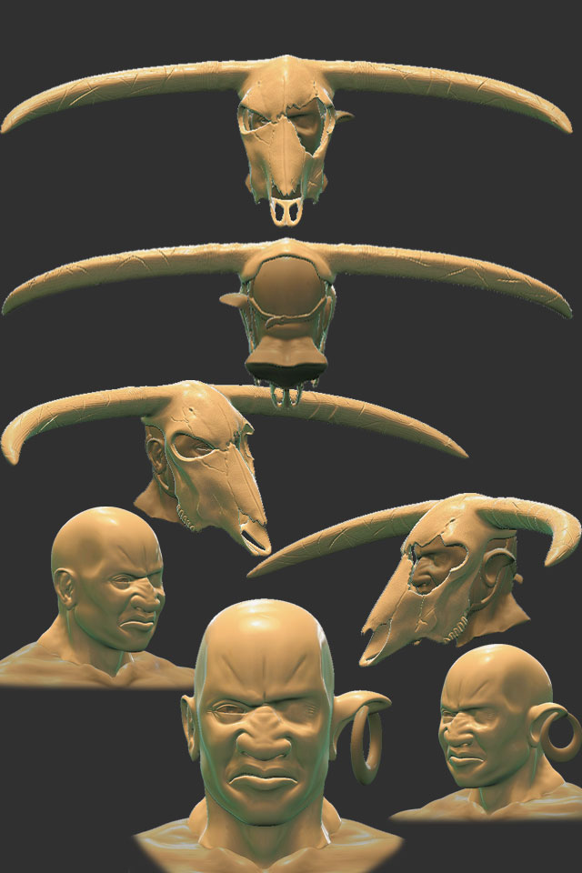
WIP so far:
Dekard-- Good call. I was thinking of embossing something on the earring and thought there would be no point if it was so small, but I can figure out something with that later! Shrank the earring so the ear would look pulled down appropriately.
Mechadus-- I kind of see what you mean, and a friend pointed out a similar issue with the proportion of the knees to the feet, so I reduced the size of the feet a bit. I'm going to leave the knees alone for now, and if it still looks odd without the mask after he's rigged and posed, as I plan on rendering him with the mask & bindings and without, I'll go back and adjust them a bit. Thanks for the crit, I'll keep it in mind
Sectaurs-- I did exactly what you suggested with the hands, although it's hard to see in the original post, so here's a close-up:
I did blow up the skull a bit more, too. I'm going to take it further as you suggested, though, and throw in some gimpy toes and maybe a tail as well. I thought about it before when building the basemesh, but for whatever reason I decided against it at the time. Aside from that, I had flattened and broadened the nose quite a bit in the original sculpt, thinking his face would somewhat resemble a bovine's, but I'm thinking of taking that further as well, with extra hair and a cleft in the nose as well. I was hesitant to go too far with it, though, because I don't want him to end up looking like this and every iteration thereof...
EricV-- thanks, man! I was really trying to maintain something ripped but believably so. I may still broaden the shoulders a bit and make him more barrel-chested, but I'm going to sit on that for a bit longer as well...
Please keep the crits coming, fellas!
looking at it again, i think the horns could have a more interesting shape. perhaps something a bit more aggressive? hrmm...
If you want to go Ancient Greek
Honestly though, the idea behind the pillar is that he was bound to a column in the middle of the Labyrinth, with hands bound and chained to a wall. He broke the column but it remains strapped to his back, pulled the chains from the wall but they remain strapped to his arms, and he now roams the Labyrinth, thus keeping with the original myth. I started damaging the column today, I'll post pics when I get home from work tonight. Plus, I'm thinking of putting him in UT3, and so I would like all the bindings, mask & column to be removable so I can show him with and without those pieces.
My issue now is with the "mitts"-- they're supposed to be leather straps wrapped excessively around his forearms and hands, but when I color in the leather it looked too much like his skin color. So I tried red leather, but that just throws the color palette off. Now I'm wondering if the mitts even read as leather straps-- do you guys think it'd look cooler to have fewer straps wrapped around his hands making a lower profile, or do the mitts read already?
Comments and critiques are encouraged & welcomed as always.
You may want to change his eye to either a more realistic color (I do not believe many dark skinned people have bright blue eyes) or make it gold to match the earring a bit and make it pop.
about the mits, it doesnt really make sense, I would expect shackles around the wrist to read better and be instantly more readable and recognizeable, plus then you could have a few links of the busted chain hanging which could look dope.