nulo.
hey everybody, i've been around checking out the forums for some time, but never posted anything.
i've never worked with games yet, but its something I really want to try out.
so what better way than getting feedback from the pros right?!
to start out ill be making 2 characters i came up these days, a young boy that lives in a post-apocalyptical world, surviving how he can. and his "bodyguard", a frog that grew a little too much (toxins of this post-apocalyptical world), so the boy makes a horn headband for the frog and hopes that this way he will look a little more menacing (besides the size) for possible enemies (wild animals and stuff. no evil monsters and zombies sorry!!)
well bla bla bla and all that. just for you guys to get a little idea.
ill post some of the drawing to give a better idea latter on.
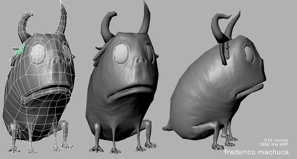
this is where i am with the frog atm. i was hoping to make a wii game res model (something between old-gen and next-gen) only body has normal map, the horn headband will be next.

some technical issues.. the whole texture is mirrored, except for his face. how would you guys approach this? (having the high-res model and extracting normals to the mirrored UV's, and handling seams and all)
well ill keep you guys updated!
i've never worked with games yet, but its something I really want to try out.
so what better way than getting feedback from the pros right?!
to start out ill be making 2 characters i came up these days, a young boy that lives in a post-apocalyptical world, surviving how he can. and his "bodyguard", a frog that grew a little too much (toxins of this post-apocalyptical world), so the boy makes a horn headband for the frog and hopes that this way he will look a little more menacing (besides the size) for possible enemies (wild animals and stuff. no evil monsters and zombies sorry!!)
well bla bla bla and all that. just for you guys to get a little idea.
ill post some of the drawing to give a better idea latter on.
this is where i am with the frog atm. i was hoping to make a wii game res model (something between old-gen and next-gen) only body has normal map, the horn headband will be next.

some technical issues.. the whole texture is mirrored, except for his face. how would you guys approach this? (having the high-res model and extracting normals to the mirrored UV's, and handling seams and all)
well ill keep you guys updated!
Replies
aesir - about the details on the normal map. my intention was for him to be "blobby" like, and not have any defined muscles or anything like that. if you check some frog close-ups you'll see what I mean. but thanks anyway, glad you like it!
well, some update on the little friend. i added some polys to smooth some areas and added the rope tying his "headband" to his head. now i need to decide how ill "glue" the horns to the wood sticks. any ideas?
what you guys think about the color?! tried to make something happy but still strange, to accompany his stupidness.
512 normal and difuse unfiltered.
I see a texture seam near the middle of the mouth though. Might want to fix that up. With the colour - is it supposed to be painted on, like camo-paint? If so, you might want to hit up some references and get the paint looking more believable, make it look like someone smeared it on, or he stuck his head into some mud, something to make it looks believable to how and why he has it on!
the idea behind the color is something like this
http://www.seaworld.com/assetrepo/media/images/sandiego/Press_images/large/Aquarium_4frog.jpg
supposed to be his own skin, not some paint or something.
one thing i forgot to ask is what you guys think is better fitting the character
the small eye texture or the big one?? (the big one gets closer to reality, but i like the extra stupidness that the small eyes give.) what you guys think?
now to the "hunter boy"!
Maybe larger feet (back especially) just to help clarify he's a frog.
I think the normals and skin are good.
I kindof like both eyes. Would be cool if they were small, maybe when he's in danger the pupils 'swell'.
the lighted screengrabs are from maya's viewport, any ideas of a better way to get nice lighting on the viewport? or even another program? (has to run on mac os x)
heres the start on his partner, the bug catcher. also the concept for you guys to have an idea of where ill be taking him.
try this
http://www.3drender.com/light/3point.html
with your point light as the key, and dont use white lights, maybe a yellowish key, greenish fill and blueish back
for lighting, is the spot light the only viewport shadow casting light in maya? or is there a trick or something? and also, the shadow artifacts, is there a way to get crisp shadows without them?
im not sure atm if the best way to present game models is in the viewport or should i just render it with mental ray.
some detailing of the bug catcher, his body is still very wip.
what you guys think?
lowpoly with difuse and normal. still have to work some more on the difuse of the rest of the body.
still have to model his teeth
baking the normal of the accessories.
5202 tris atm. still need the net thingy to catch bugs and the bottle-stick thingy too.
i was kind of hoping for some ideas of how to make the hair. im starting to try smaller hair pieces in bigger quantities but it just gets to chaotic and doesnt work so well on the silluete.
love the style, definitely cool work
Awesome work
actually his hair is supposed to be something for like the concept, and is somewhere like this right now:
im going to try larger pieces of poly to get fewer pieces of hair. there are no spec map still, only difuse and normal.
One thing I would suggest is bumping up either the colour of your shadows or the emissive a bit. At the minute the shadows are pure black which makes the characters look a bit dead - also if you render on another colour than pure black we will be able to read the silhouette better as a tthe minute the pure black shadows are merging into the pure black background.
tekkonkinkreet rulz. watched it twice this month!
ill definitely pay attention to the background and shadow color. and also ill smooth out the normals on his armpit. still have to finish him off, but work is killing all my time.
and to get my mind off of him this is just something im working on:
sylvia from "no more heroes" completely plagued by umbrella's virus
i wanted to go diffuse only to practice my texturing skills.
well, any comments and critics are very welcome.
Because both are awesome.(model and gamestuff)
just finished playing no more heroes, so i definitely wanted to make a sexy zombie out of sylvia.
i kept the gore and bones to a minimum to not loose completely the sexy woman that's inside her. =D
any ideas about the model and or texture?
and to continue with the little boy
what you guys think about the hair? im not completely happy with the silhuete on the front view yet.. any ideas?
5532 tris with hair and eyelashes.
also, ill probably separate both arms on the uv because of that nasty seam im getting on the left arm.
don't forget to blend just about every edge of poly hair with opacity maps. Along with some well painted flat scalp hair you can really make the most out of what you have.