Submarine-Game Room
My idea.
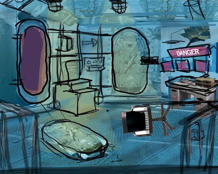
Basically an advance computer lab room in a submarine.
The purpose of this room is to help start a mission in a video game, basically the room is used to keep important scientific research on an advance computer. There is only one scientist that uses the computer and knows the password to it. Unfortunately the scientist has gone missing !
As you first enter the room you see a broken submarine door thrown on to the floor. Beyond that is the door way, it is filled with a dark red light. The red light represents danger. On the walls are pipes going vertically ( some of the pipes will be modeled, but a majority of them will be made of normal maps and textures). The pipes lead your eyes to see the second door which is closed and untouched. Next to that is a large computer setup with multiple monitors with the words DANGER on them. In front of the computer is a chair on its side on the ground. Behind the is a set of stairs (the railing are view able in the concept) there are only three steps. The door is sightly ajar, with light spilling out of it.
There are two main light sources the two on the ceiling, the colour of the lights will be a washed out mustard yellow. There will be red light in the door way, which represent danger .The room will be primarily dark blues tones. The floor is be a metal grey with yellow stripes. The overall feeling is dark, cold, and unwelcoming.
And here are some renders.
The final project will have 3 rendered out camera angles.(Last three pics)
(below)
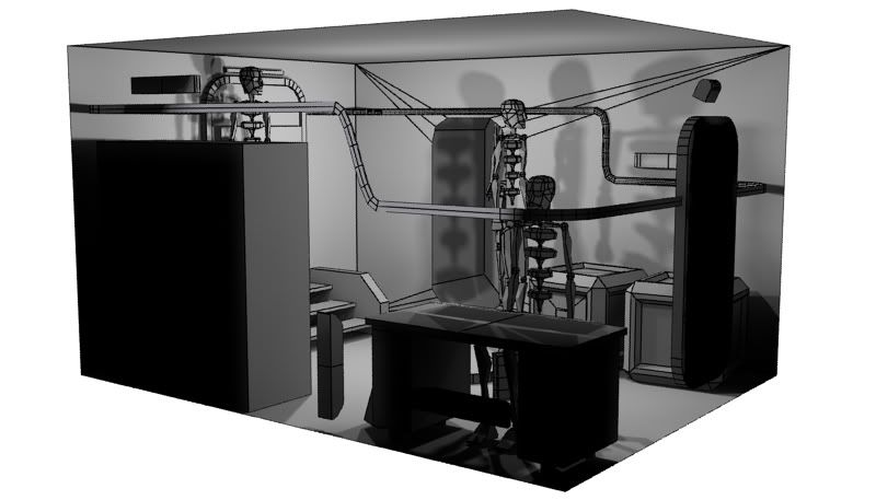
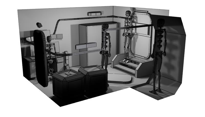
Camera angle :
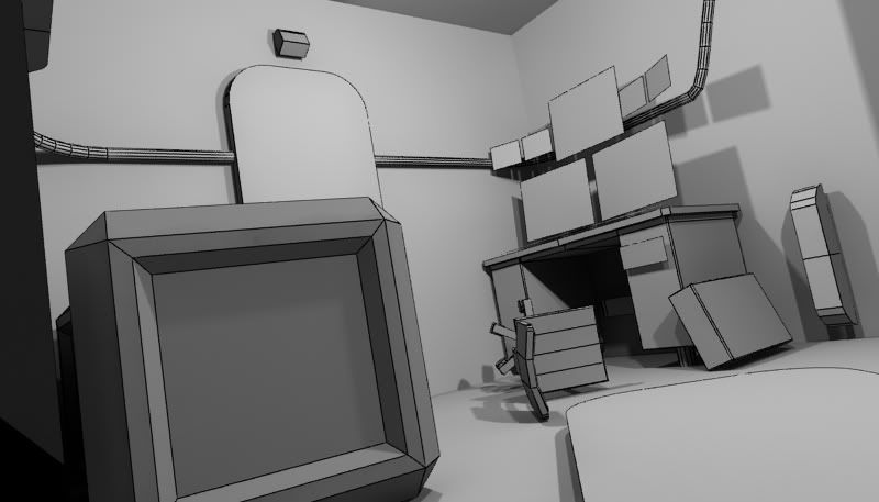
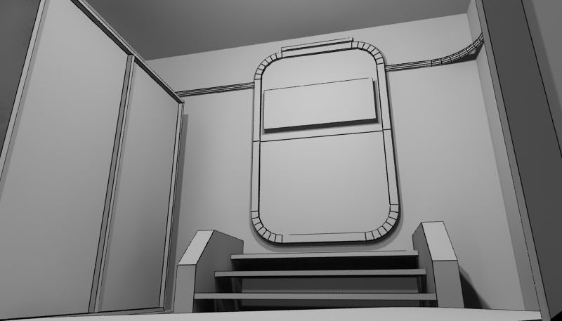
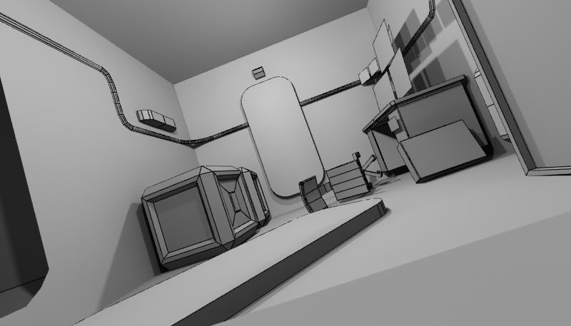
And i've started some texturing.
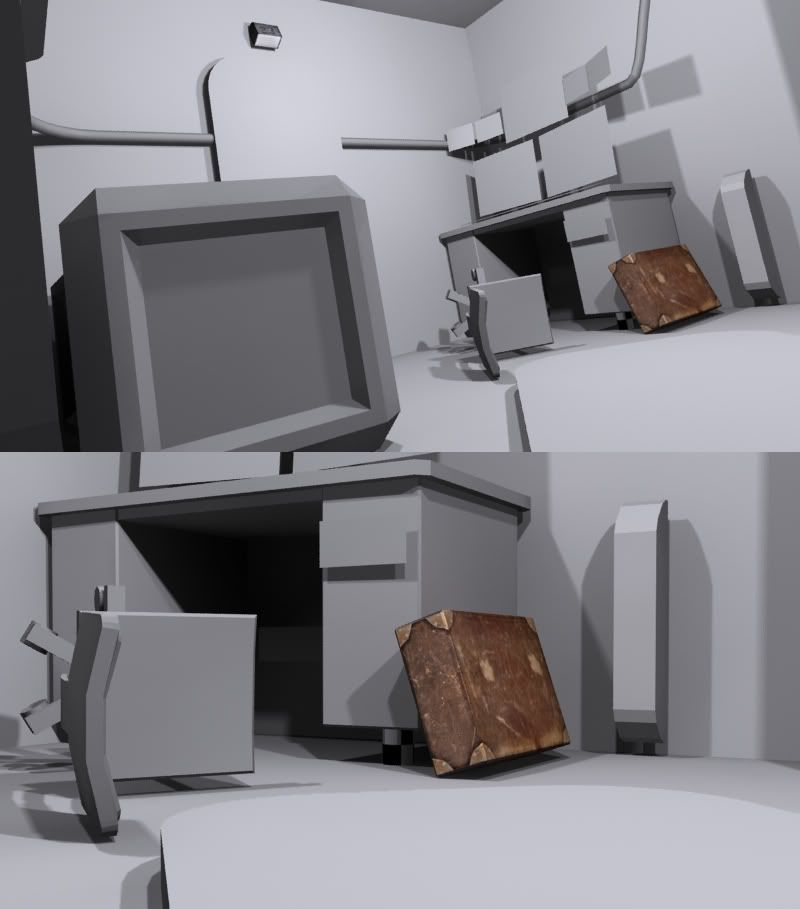
Basically an advance computer lab room in a submarine.
The purpose of this room is to help start a mission in a video game, basically the room is used to keep important scientific research on an advance computer. There is only one scientist that uses the computer and knows the password to it. Unfortunately the scientist has gone missing !
As you first enter the room you see a broken submarine door thrown on to the floor. Beyond that is the door way, it is filled with a dark red light. The red light represents danger. On the walls are pipes going vertically ( some of the pipes will be modeled, but a majority of them will be made of normal maps and textures). The pipes lead your eyes to see the second door which is closed and untouched. Next to that is a large computer setup with multiple monitors with the words DANGER on them. In front of the computer is a chair on its side on the ground. Behind the is a set of stairs (the railing are view able in the concept) there are only three steps. The door is sightly ajar, with light spilling out of it.
There are two main light sources the two on the ceiling, the colour of the lights will be a washed out mustard yellow. There will be red light in the door way, which represent danger .The room will be primarily dark blues tones. The floor is be a metal grey with yellow stripes. The overall feeling is dark, cold, and unwelcoming.

And here are some renders.
The final project will have 3 rendered out camera angles.(Last three pics)
(below)


Camera angle :


And i've started some texturing.


Replies
More details/objects will be added in 4sure
update:
I would suggest at least roughing in the wall and floor texture so you can create objects with a similar color pallete so everything jives nicely, since walls and floor are usually 80% of the screen space.
The boxes seem a bit out of place as well, im not sure about this but i figure submarines would have a special cargo room? and finally.. do they fit through the doors? they seem a wee big.
Here's some to get you started.
http://www.gwpda.org/naval/hclaspht.htm
http://www.mackinnon.org/gato-diagram.html
You'll notice a lot of metal and not so much char'ed beat up wood. Wood wasn't used that much because if it was wet, it would swell and warp.
With subs every inch of space is used, instead of a desk in the middle of a semi large empty room that desk would be in a tiny area like this. http://www.mackinnon.org/PearlHarbor-Bowfin-YeomanRoom.jpg
Also its going to help if you really dig into the hatches and model them fully, think about seals and overlapping pieces where the hatch needs to fit into the doorway. You have a lot of chances to practice some simple high poly models and bake them into low. Lot of hoses, wires, pipes and misc equipment on the walls.
It looks like you scaled your bipeds to your scene and your scene is pretty big. The thing with biped is that the larger the biped gets the more its proportions change. If you set it to figure mode under structure you can change the size and shape. I suggest going with a biped that's 5'5" -6'2" and switch it to Male not skeleton. With the setting you have now you'll have a crew full of basketball players.
Also give the bipeds fingers, the extra 3-5 inches of visual representation helps get the scale of small objects like nuts, bolts and wires.
the only thing that i notice about this piece so far is that it doesn't seeemm to have a point of interest. maybe try adding a story and frame it nicely? perhaps an old telephone hanging over the chair, with the head-piece dangled down on the floor? i dunno. i think that would make this thing really interesting.
keep going man, it's great.
thanks ! yeah i'll be sure to put a rough impression of my textures on all my objects =.
yeah, your very right. I noticed i gave the desk a hardcore beat up look, i'll re work the texture on that and more details (objects) will come
The monitors are like a HUD. I'll just gonna leave the rest of the objects the way they are now
lol, i'll glad u like my textures (still trying to improve my skills).The story will unfold after a fix the lighting, there will be alot more dark blue and green tons. I'll be compositing this in After Effects , so i
ll be able to add in some extra effects and colour coorection
Stairs and cabinet are done.
-Added the Door
-Fixed Bump/Diffuse Map on Stairs
Fixed the Desk (if think it looks alot better then my first attempt)
Chair was re done as well.
Im still reducing the overall texture, lowering the grunge/stain layers
and i'll be colour correcting the 'cube'.
get some wall textures on there and itll really help make it feel like a big jump in progress.
that crate looks a little rushed and could use another go over also, and finally, what is projecting a holo computer thing? given the disarray and general oldness of the current props i dont think it really fits, i would go for like a 1970s comm radio or something, but thats just me.
nice progress man.
do you mean i can model on my low poly model ? :poly122:
I was planning to Crazybump to make some of my normal maps
the crate will be re worked. i'll post an major update on friday
as for as the objects, i'll just gonna stick with what i have and just try to finish the room
small update:
fine tuned the rust.
toned down the grunge.
and the purple thing on the side will be removed on my next post.
I think the feeling is that if the object is uniquely unwrapped there's really no excuse to not have a high poly version to bake from. It generates the proper highlights and cleaner lines.
Something as simple as your cabinets could greatly benefit from the vents, and dials and gauges popping out on a normal map. Which were baked from a high poly version.
I use CB to add things like rust detailing or cracks and other micro details that I'm not good at sculpting directly on a high poly.
Just my thought though, I like the idea of the room!
You could possibly save some polys for something else if you take the steps in front of the hatch out. Most submarines, wouldn't have any steps leading to the hatches simply to save room, it also saves weight and even money. If you must have some sort of step, maybe a couple ladder rungs sticking out of the bulkhead.
Here are some good refs of the interior of the USS Cod which was in service during WWII.
http://www.pbase.com/tremont/usscod
thanks for the refs. As for the stairs im gonna leave the objects the way they are, im just gonna push forward and try to finish.
here is the first pass for my wall texture.
there is much more to add, the black lines represent the pipes.
lots of objects to fine tune.
the floor and ceiling will change.
the only thing that I see awkward is the hologram screen.. don't think it makes too much sense when the whole room is old and rusty.. except for that high tech computer.
keep it up dude
Use the sweep modifier on a spline for easy trim, you can even sweep a custom shape over the spline.
Keep it up, looking pretty good so far!
yeah, i need to learn a lot more about lighting. I added more objects in this post
o the wires were just a template for me to i can put in the pipes
update:
changed the lighting.
added more objects to the wall.
the final image will be comp in AE.
still more work to be done.
IMO.... too many stracthes. they seem.. too much, and pointless. also, the scene seems kinda flat. it's a little monocrome. if that digital display was blue, it would help.
also... what's the deal with that display? and this crate, taking up so much room.. i'm not sure what to focus on. i feel like the crate is spilling off the left side of hte image.
this is really close man. IMO if you change around the composition and remove some of that crazy detail (so my eye has a place to rest) this could be cool.
so im done !
here are the final 3 shots.
i'll be learning for my mistakes, and move on to other projects in mind.
thanks for all your help guys !
c&c welcomed.