The First Chapter
Well with all the Warhammer stuff going around i figured i'd play around and make something from the army i play as the Table Table top.
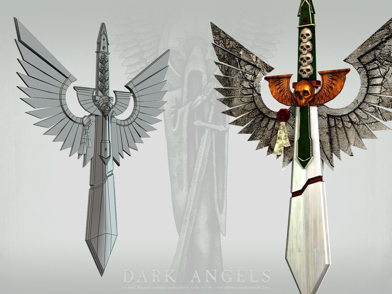
So i made the crest for the Dark Angels. need to clean up the polys a bit and resize a few of the UVs such as the stone wings. but this has inspired me to make a little space marine scene at some point when i have free time.
Was thinking of also changing the copper wings to alpha cards instead of just the high poly bake. Not sure yet though. None the less enjoy.

Replies
The model is ok but there are lots of places where you can save triangles
the texture details and color variations are now fine and not so rough as it was in the beginning. Most shapes now really shine through the texture- good job
just a last critical note:
the background shield has to much contrast again
good job on improving
That said, this is an impressive improvement without much actual criticism to inspire it--why didnt you do it like that in the first place?
Looks good, bud.
The wings bug me a bit though. They are obviously carved from one big piece of stone.
But it probably wouldn't handle having all those seperate feathers. I think it would be more convincing if there wasn't space between them.
Part of the problem is that the large stone slab must've been cracked in a few key spots before it got carved. Most likely they would've looked for a better stone. It would've broken when they started carving it.
If it cracked AFTER it was carved then the cracks wouldn't continue through to the next piece. Maybe the cracked piece would only be half there.
I think maybe instead of cracks having crystal grains or different rock grain flowing through it would be better.
And/Or change the cracks to look like they are from where on the carved piece, not a prexisting condition.
I think that making the 'blade' into stone would further help it stand out as a large piece of rock embelished with metal.
Too me the blade still isn't quite convincing material wise.