Home 3D Art Showcase & Critiques

Unreal 3 Warehouse Scene

easterislandnick
polycounter lvl 17
Offline / Send Message
easterislandnick polycounter lvl 17
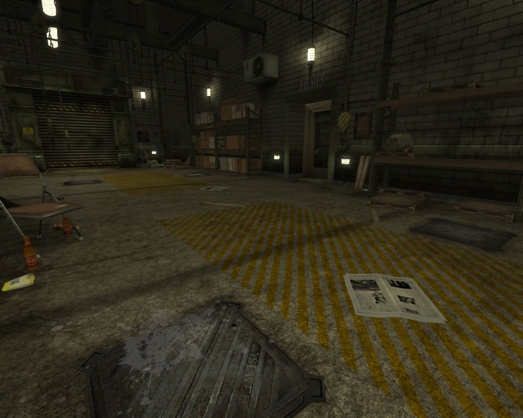
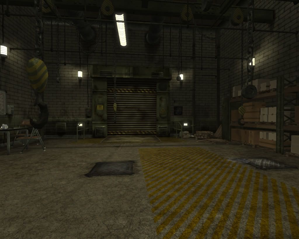
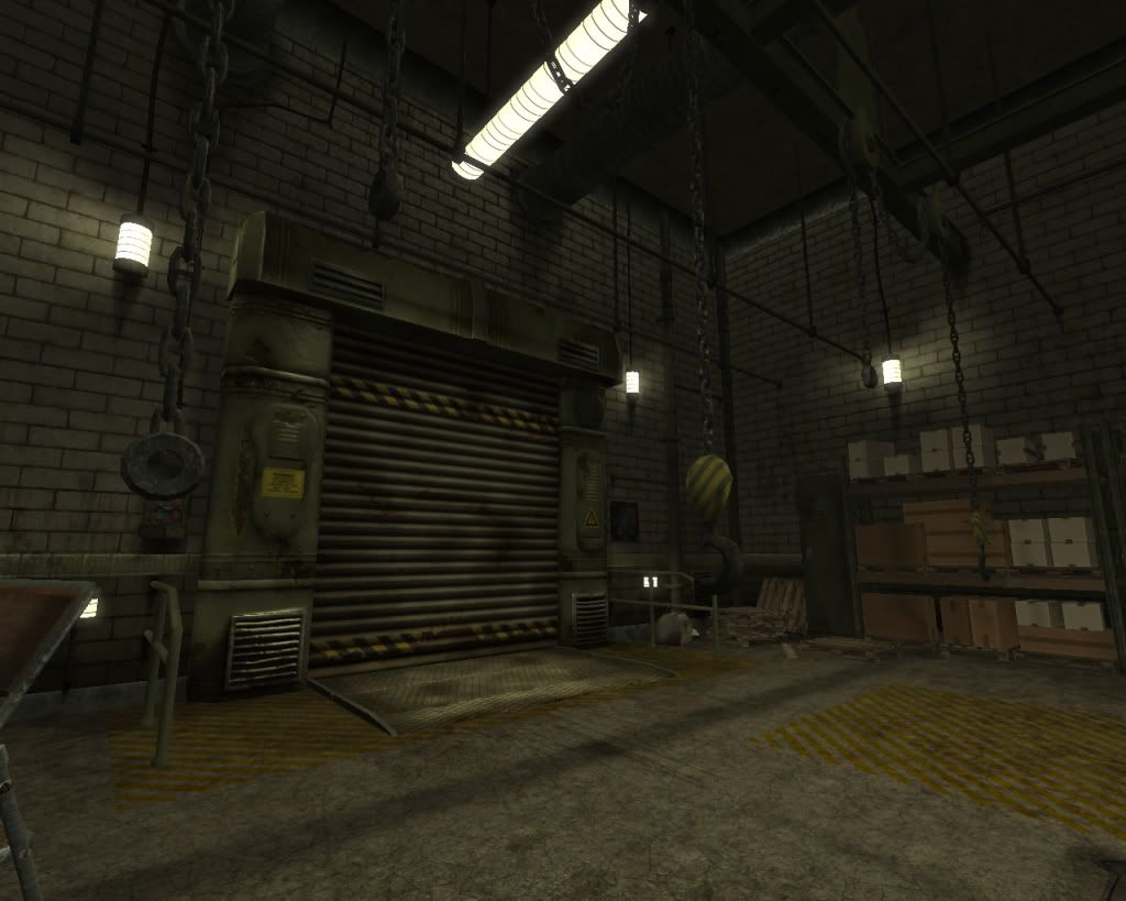
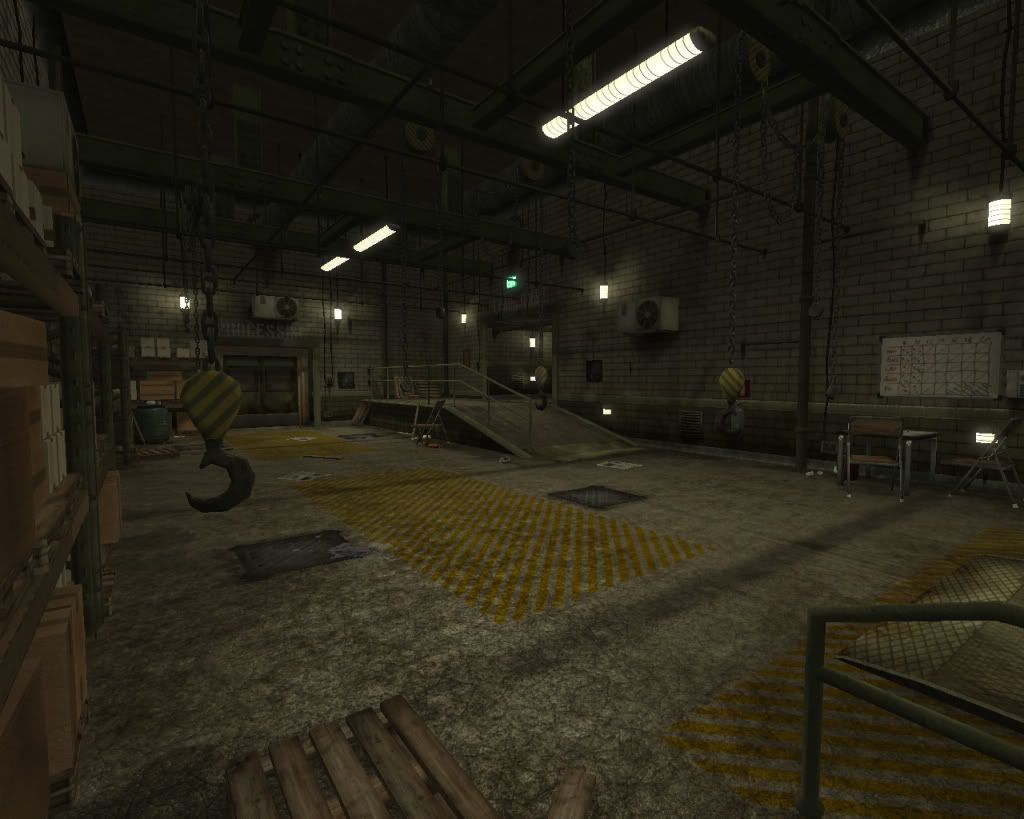
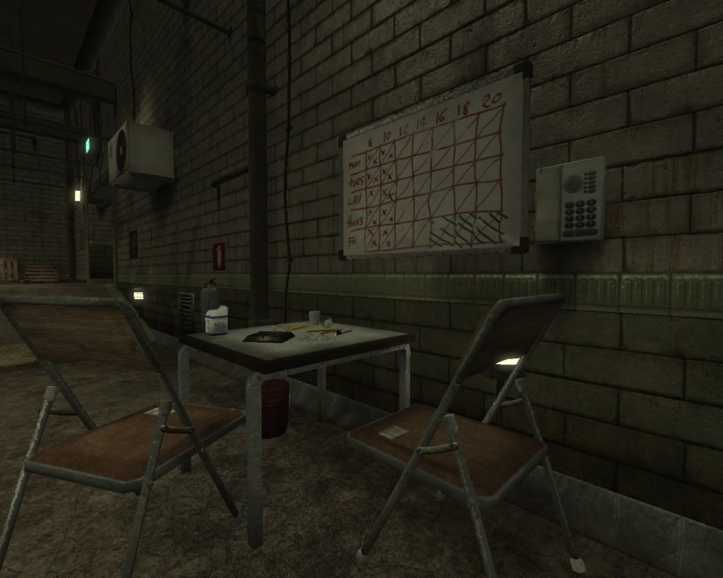
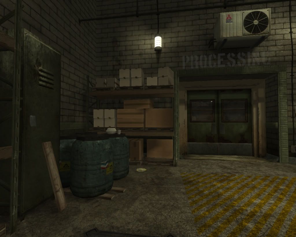
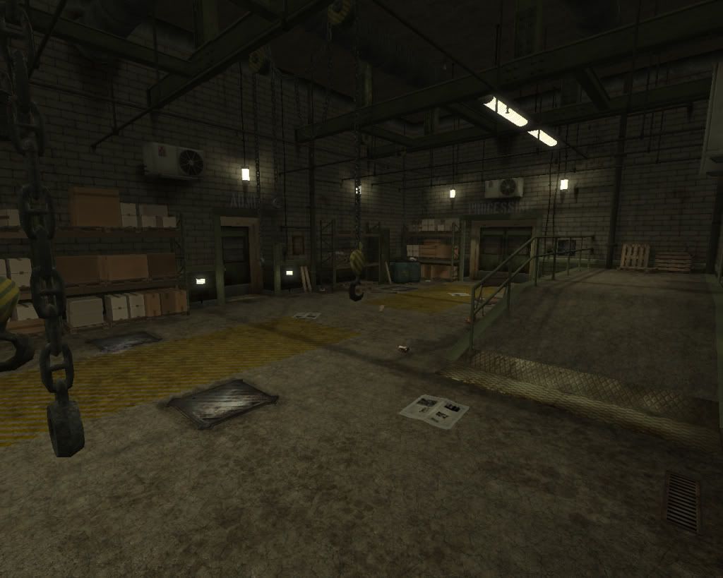
Hi, This is my first pimp even though Ive been browsing for a while! Its a real time scene in theUnreal 3 engine. A warehouse that's being used for no good! Let me know what you think!

ScreenShot00016.jpg

ScreenShot00017.jpg

ScreenShot00018.jpg

ScreenShot00019.jpg

ScreenShot00026.jpg

ScreenShot00027.jpg

ScreenShot00030.jpg

Replies

  • easterislandnick
    Offline / Send Message
    easterislandnick polycounter lvl 17
    Woah, they might be a little big! How do I thumbnail them???
  • SHEPEIRO
    Offline / Send Message
    SHEPEIRO polycounter lvl 17
    not sure, maybe just provide links for the rest?

    one crit id up the contrast in your lighting, everything else looks pretty sweet
  • glottis8
    Offline / Send Message
    glottis8 polycounter lvl 9
    Oh, i like how this is looking! very gritty! You should start playing a lot more with lights. Make them more dramatic so your textures stand out more. Maybe some of the materials you can add to their network to make them read better. But so far its coming along.
  • JordanW
    Offline / Send Message
    JordanW polycounter lvl 19
    Not bad, I agree with the suggestion to add more contrast to your lighting, right now there's just way too much ambient light. Also try slightly varying the color on the different types of lights and tweak the post processing, it wouldn't hurt to do some color adjustments on the darks/lights of the scene as well as maybe a small amount of DOF. Also try adding some fog planes, I believe they're used a bit in UT3 so you could see some examples of how to create materials for them, right now the room is lacking atmosphere. It also wouldnt hurt to add some floating dust in the air, especially hanging out in light cones from the hanging lights. You can do this with particles or a static mesh made of triangles and a dot texture.
  • Mark Dygert
    1) Modeled chains but boxed i-beams?

    2) Those types of hooks normally have a pulley installed. The second pulley helps lift heavy objects. http://www.howstuffworks.com/pulley.htm
    2a) Instead of more hooks, how about some pulley controls?
    2b) Instead of more i-beams and sprinklers how about a proper under-slung crane?

    3) There is a lot of visual noise, just for the sake of having visual noise. Texture sizes get larger and all of a sudden everyone wants to include micro cracks in concrete. Most of the time floor concrete is the hardest type of concrete and it is sealed and indoors. It's not really prone to micro cracks. The crete you have looks more like ryno skin then it does concrete.
    http://www.rideons2.com.au/Photos/cleaning%20equipt%20and%20go%20kart%20day%20018.jpg
    http://www.floorepoxy.com/images/warehouse_001b.jpg
    http://www.floorepoxy.com/images/epoxy_peid_415x273_001b.jpg
    http://lh4.ggpht.com/_nwjZF-B23fk/RqBfHgsxcOI/AAAAAAAAAPg/DFqH_-nltho/DSCF0070.jpg

    4) What kind of "garage" is it? What about maintenance pit?
    4a) How does the place handle exhaust?
    4b) Where is the diagnostic equipment and tools?

    5) The table doesn't match the chairs. The table looks to be built in UE, but the chairs done as a prop?
    5a) The trim looks kind of odd and out of place, again it has a lot of micro scratch detail that's just reading as noise. You have to consider how the piece would actually take damage instead of just overlaying a bunch of scratches and cloudy greasy smudges.

    6) Gathering ref, can help fill up empty spaces in ways that make sense and are visually pleasing.
  • Razorb
    Offline / Send Message
    Razorb polycounter lvl 15
    yea the whole scene looks real nice ! just need to get a little more dynamic with that lighting :D gj !
  • easterislandnick
    Offline / Send Message
    easterislandnick polycounter lvl 17
    Hi everyone! Thanks for the crits so far, keep them coming.

    I'm not really sure what I'm doing when it comes to lighting, has any one got any tips? Are there any good books that anyone knows?

    What I have at the moment is four big spots pointing down from above and a sky light which has a brighter lower brightness than the upper brightness. The rest of the lights have a low influence and are really only there for show. What would any one suggest to improve this rig as I have little experience in this area?

    Hi Vig, you have some great stuff there! Thanks for taking the time to give such concise crits. I have a few questions if you have the time to reply...

    1 The I beams do have modeled inner sections but the lip is pretty small, I think I need to look at them if you cant see the lip!
    2 The pulleys are a real mess, they don't look as thought they would work, thanks for the reference! That's an ace 'how stuff works' site.
    3 I agree about the floor, are there any other textures that are too noisy? Are the walls okay?
    4 I hadn't meant it to be a garage, it's a loading bay for a small goods factory. Maybe I need more shelves etc?
    5 The table is a prop too? Any idea why it doesn't fit the scene?
    6 Which trim? The green one or the floor one? I'm not sure what material the green trim is, I think it needs and overhaul....

    And I thought I was almost finished ;-)
  • glottis8
    Offline / Send Message
    glottis8 polycounter lvl 9
    Concerning lights you can use as many static lights as you want and bake the shadow maps for performance. So just place lights that have a low radius... from 256s to 512s and play with the brightness.. which should not be more than 1... i keep them 0.6 or lower... bouncing light should be 0.2 but it's up to you. also i find the decay of the lights really important.

    I think you should look at some reference for 3 point lighting which is the most basic for of lights. Your main light, your back light, and contour one. This makes everything look real. Since objects have contour and nice shadows. I'll look for some good links and post them around for you, with some nice ideas on some material shading networks.
  • easterislandnick
    Offline / Send Message
    easterislandnick polycounter lvl 17
    new_light_editor.jpg

    I've only played with the lights so far, what do you think? Much tinkering with fog and post processing as well as all the noise issues with the textures.

    This is only an in editor shot so the lights are a little harsh but is it the right direction?
  • JordanW
    Offline / Send Message
    JordanW polycounter lvl 19
    :D I wouldn't use a skylight to bright things up, that's just going to ambiently fill your darks with a solid color of light even if it is biased from above or bottom. Go ahead and set up your lights for your primary lighting, then create "bounce" lights off the surface where the light hits, and for its color give it a mix between your light's color and the surface color. It's intensity should be lower than the primary light but do whatever looks good. What you're trying to simulate is light hitting the surface and reflecting off, absorbing the color and filling the darks.
  • glottis8
    Offline / Send Message
    glottis8 polycounter lvl 9
    look at that... already more dramatic and it's looking better. There is something about the color black in shadows that i don't like... you should tint them... like purples and ur palette has a lot of green and browns... so maybe add some more colors around with the lights to make it have more contrast... some dark yellows would accentuate stuff.. purples, colors :3 ... and it would make your composition a lot more intereting to look... eye candy u know.... i could recommend some back light on the beams up there and some of your assets... that comes once you are satisfied with the lighting in general. But its coming along =] I don't know if you really added much or how complex your materials are, but you should look into them... really Unreal materials are seriously really powerful.
  • SHEPEIRO
    Offline / Send Message
    SHEPEIRO polycounter lvl 17
    what about a focal point. i was thinking an interesting object hidden under a tarpualin or something, under a bright light
Sign In or Register to comment.