advice needed on vehicle design
So I've been modeling this vehicle for a class, I wanted a mix of streamlined vs gritty mechanical. The problem is some people have told me they couldn't even tell which end was the front. My instructor is also telling me I need to rethink the idea of the exposed mechanical parts, since it looks like it's being repaired at a shop rather that in flight.
Right now I'm just frustrated trying to think of ways to make the design make more sense without losing too much of the silhouette which i kind of like. I was hoping it would make more sense once I've textured everything(right now I just applied different color materials). Just looking for some other talented eyes to give me some suggestions, they would be greatly appreciated, thanks!
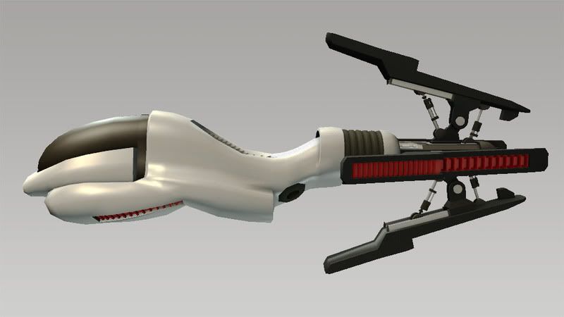
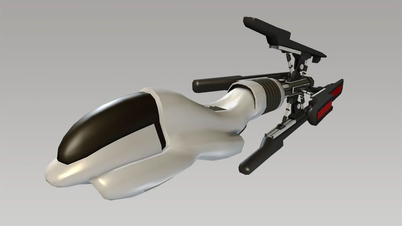
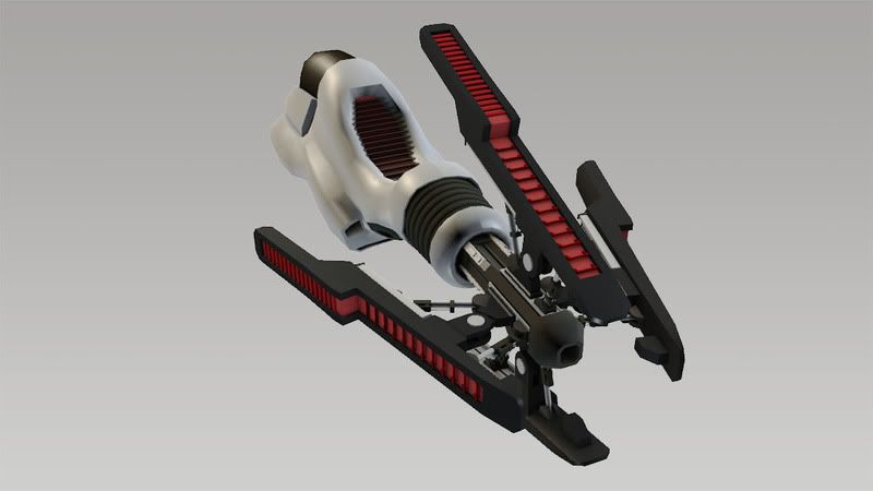
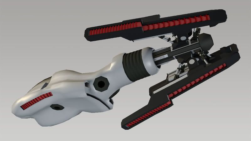
Right now I'm just frustrated trying to think of ways to make the design make more sense without losing too much of the silhouette which i kind of like. I was hoping it would make more sense once I've textured everything(right now I just applied different color materials). Just looking for some other talented eyes to give me some suggestions, they would be greatly appreciated, thanks!


Replies
Personally, my solution to this would be to turn it into a hover bike of some sort. Add some kind of handle bar and instrumentation to the section just behind the black glass. Then make the black glass section into some sort of funky looking techy widget.
Also the front could do with some different material definition. So if you where to sit on the middle then make the white thruster which would be down by your legs a different material, more inkeeping with the back to help the flow.
I'll second that. I was like where the hell are the handgrips and footpegs at when I first looked at it.
And a motorcycle.
I think part of the issue is the mid looks like a seat. Plus the back looks like it would create wind drag. It's opposite streamline back there.
It almost looks like it could be a tether ship or something, I dont think it looks like it could fly in open space, but a commuter ship running on a light tether right through it, like in tron, or in a tunnel where the red panels are keeping the craft from hitting the tunnel walls and then simple boost engine to go forwards..
thats my 2 cents, but ive never designed a vehicle...
Right now I dont see how it could fly in any one direction for longer than a few seconds, and it looks totally uncontrolable.
try foot/handholds for climbing into the cockpit, maintainance hatches, stuff like that.
oh and you havent really mixed streamlined and mechanical, you've got half steamlined and half mechanical. not the same thing!
Sport bike?
Futuristic racer with a cockpit?
I like the exposed mechanical parts, but I think they need to be capped with some sexy stream lined pieces. Almost as if it powered down and folded up the mechanical pieces it would be 100% sexy steamline.
As it sits right now the two ideas aren't blending. The first is one thing, the back is another. Personally I would change the black bits on the blades to semi-organic white composite then round out and bulk them up a bit. Keeping the red vent detail will help it tie into the red vent in the front which is also surrounded by white composite.
Maybe give the front some smaller fins of the same pop out design.
If you can spend the polys on the vents, you can properly round out some of the curvy parts.