The BRAWL² Tournament Challenge has been announced!
It starts May 12, and ends Oct 17. Let's see what you got!
https://polycount.com/discussion/237047/the-brawl²-tournament
It starts May 12, and ends Oct 17. Let's see what you got!
https://polycount.com/discussion/237047/the-brawl²-tournament


Replies
P.S: Sorry about the large image size.
http://www.gvzoo.com/files/u2/Ibex.jpg
http://www.asianibexhunt.com/Midasian-Ibex-Kirgizstan2.jpg
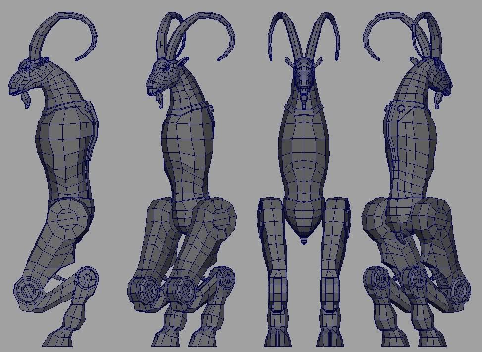
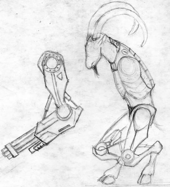
I think whats making this weird, is you need to try and commit to some proportion conventions. - tall and slender, bulky and stout, etc.
right now the upper torso has a really classy, regal- tall and slender thing goin on. and the bottom doesn't really match. I`d either scale up, and elongate the lower half, or shorten, and make the upper torso more hunched over to match the scale, and weight on the lower half.
First a view of the shoulder from the fornt, then from the back.
The hip joint from the back.
I think this will help sort out the perspective of the neck and torso as well cause I think something is amiss there... but maybe not...
Now that you've got the length for the upper arm adjusted, I'd consider thickening it up to match the lower arm. From the frontal view it looks fine, but from the side view ... not so good.
Can't wait to see this finished! keep it up mang, good luck!
looks neet. don't go too overboard on the texture size. that unwrap looks a little bit wasteful. also, it looks like the pixel density of those different sections are largely uneven. this is generally a bad idea unless you're doing it for a specific reason.
it looks like some of the polies on the model are useless. that small ridge you have running around the metal section on his back is a good example. it won't change the silhouette and it'll probably just end up looking jarring against your normal map. don't normal map something that should be done with geometry, and don't model something that can be done with a normal map hehe.
his leg anatomy looks awkwardly constructed, actually. do a google image search for Unguligrade legs and take a look at how they're constructed, how they support their weight and move.
his head could be a bit wider, as well. the arc of his neck-to-shoulders could be smoothed out, making it a bit more pleasing to the eye.
i like what you did with his spine.
you've got a pretty good start, but some extra love could really push this model into something special.
with that said, this is a pretty quick and dirty paint over, I gave him more human proportions which might be what your trying to get away from. Its pretty important to model and pose all this stuff with some sort of sense of balance and sense of rhythm, otherwise the end result will end up looking stiff. Also I liked the big arms too- keep those!
Like Sectaurs said, "you've got a pretty good start, but some extra love could really push this model into something special."
Try to suckup everything people said, and mix it in there.
Keep going buddy!
Now apply that same sense of rhythm to the front view- Try angling out the legs, so that the knees flow away from one another, and the inner heel joints come in towards each other.
Also, I like how thin your torso is, especially if your still going for the goat body, (Might be cool to have 2 goat legs coming out of the chest to slam this concept home.) but the shoulders are just far to close together to accommodate how wide your legs make the hips, so either do something about the width of those, or pop the shoulder joints outward, maybe making some sort of mechanical joint assembly to make it make sense.
Also your original horns were way cooler than my crappy paintover =P
I wasn't sure about how the legs should be placed, as I didn't like the fact that they're all facing forward, etc. Also, I thikn I'm going to make the shoulders bigger, as now it seems a bit too thin for my taste. Thanks again for the paintover.
get some color variations, logical wear and tear, dirt and stains, different materials and colors. slap on hazard stickers, screws, bolts, vents, wires. have some fun with it.
also I see you have a ways to go on your texture, but it looks like a fun model to practice on at least!
http://forums.cgsociety.org/showthread.php?t=373024
the skin looks very monochrome right now, and looks like some photo copying. would be nicer if you'd paint it in.