Templer's Hideout
Well, first post here... so hallo everyone 
Inspired by Assassin`s Creed, here's a little scene made in 3ds max with different light settings. It's about 80.000 tris, average texture resolution for the objects is 512x512, for the buildings 1024x1024. Texture ressources are mostly from cgtextures.com, a few from google. I'll call that piece done for now, but is there anything you would have made different/better?
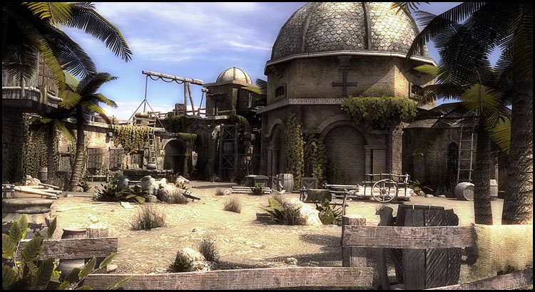
http://www.bja-design.de/different/bluesky_final_rand.jpg
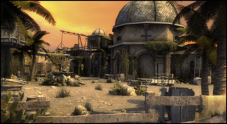
http://www.bja-design.de/different/yellowsky_final_rand.jpg
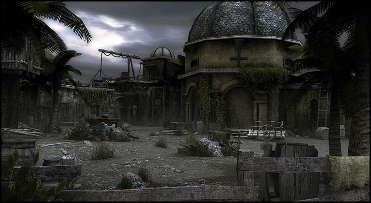
http://www.bja-design.de/different/blacksky_final_rand.jpg
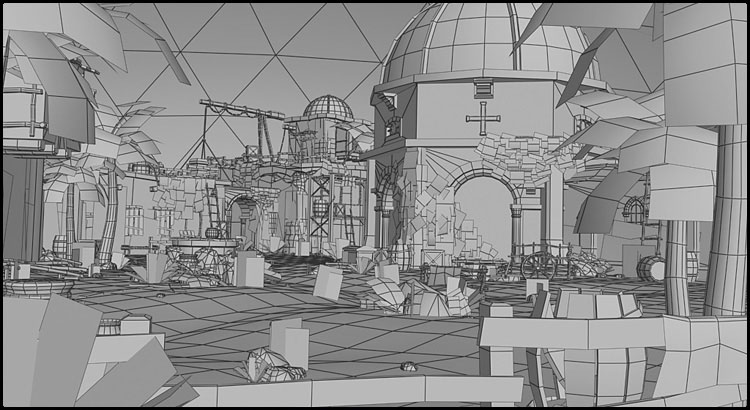
http://www.bja-design.de/different/wireframe_final.jpg
Inspired by Assassin`s Creed, here's a little scene made in 3ds max with different light settings. It's about 80.000 tris, average texture resolution for the objects is 512x512, for the buildings 1024x1024. Texture ressources are mostly from cgtextures.com, a few from google. I'll call that piece done for now, but is there anything you would have made different/better?

http://www.bja-design.de/different/bluesky_final_rand.jpg

http://www.bja-design.de/different/yellowsky_final_rand.jpg

http://www.bja-design.de/different/blacksky_final_rand.jpg

http://www.bja-design.de/different/wireframe_final.jpg
Replies
does it hold up in other views? would like to see more
I kinda agree with motives, in that it's missing a focal point, or "set piece" to really catch your eye. Most of it seems like background, there's no real foreground interest.
@erik!: Agreed, I think I've copy and pasted to many ivy planes at some point.
@Tumerboy: Well, thanks
@SHEPEIRO: Here's an overview shot of the whole scene http://www.bja-design.de/different/overview_wire_polycount.jpg
As you can see, there isn't much room for different camera angles
@motives: The big round building with the cross was supposed to be the eye-catching element in this scene. Guess I've moved it too much into the background.
@MoP: Thanks, and yeah as I said before.
@katzeimsack: The wireframe should have the same camere perspective and layout. Strange but thanks for pointing out, guess it's not a big deal though.
@SinisterUrge: As already mentioned, rendering settings are just the default renderer in Max with some blooming.
Thanks for feedback everyone
*saves to inspirational folder*