Imp SDK Texture
Hey everyone,
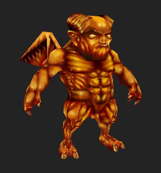
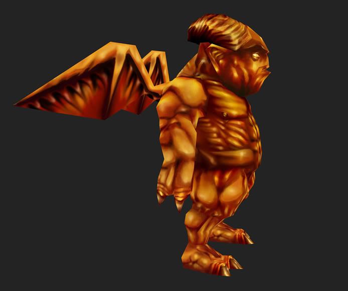
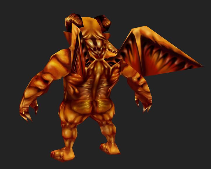
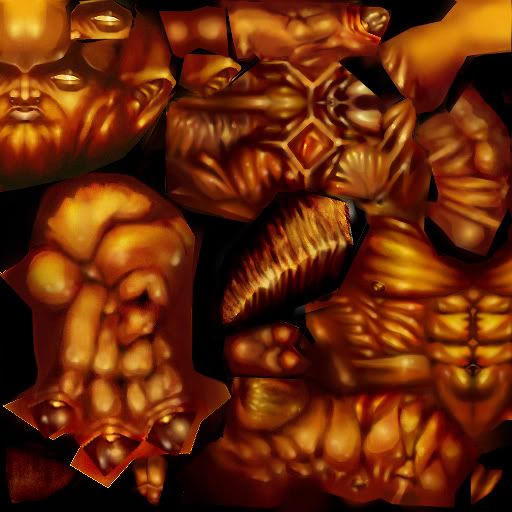
Been working on a texture for the Imp SDK. The model and unwrap were created by BoBo_the_seal.
Unfortunately I don't currently have a functional wacom tablet, so I had to paint everything with a mouse. This was still really fun though and it was great painting practice. I've been meaning to do an SDK for a while now.
Comments appreciated.


Replies
i dunno, this texture is cool n' all, but it's too orange and too noisy with the little musckles and shines and everything. but good times!
Also, currently the muscles look like they all have their own lightsource. I would try to put some directional lighting in there instead. Although it might not be quite accurate in some lighting situations, you can't really depend on engine lighting in such low spec work. Top down light works okay for most normal normal situations, and will solidify the character a lot.
Also, not all muscles need shading that goes from the darkest dark to the brightest light. Using highlight colors in the dark areas or using shadow colors in the bright areas muddles up the sense of depth.
And lastly, don't fix your seams by painting them over with solid colors! This is the lazy way of fixing seams. Having muscles terminate like that looks unnatural, and ironically draws the eye straight to the seam. Fix them either by careful painting (the oldschool way), projection painting, or you can do the following:
Select the polygons surrounding a seam. Remap them in the second channel. Use render to texture to render the first channel into the second channel. Open up this texture in photoshop; you can fix the seams here now. Then put this altered texture on the model instead, and render the second channel to the first one. Composite the resulting texture back into your original texture to fix the seams.