Unearthly Challenge | TocTocToc | Corruption from the Skies
Challenge is over! Here are our final shots:
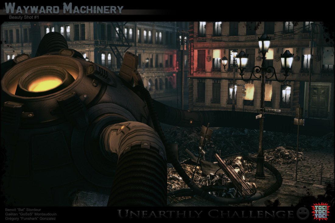
Beauty Shot #1

Beauty Shot #2
Concept Sheet
Construction Sheet
Texture Sheet
Original Post :

Hey, Team TocTocToc (yeah we voted for the stupidest team name possible), composed of Funshark, GoSsS and myself, have started working on this concept:

Vague Backstory :
Our general idea is to keep the city atmosphere and setting, but transform the machine into some kind of evil alien machinery that crashed down into the city, and that is slowly consuming it, by expanding cables and pipes and random tech-stuff all over the city.
Good luck everyone!
Beauty Shot #1

Beauty Shot #2
Concept Sheet
Construction Sheet
Texture Sheet
Original Post :

Hey, Team TocTocToc (yeah we voted for the stupidest team name possible), composed of Funshark, GoSsS and myself, have started working on this concept:

Vague Backstory :
Our general idea is to keep the city atmosphere and setting, but transform the machine into some kind of evil alien machinery that crashed down into the city, and that is slowly consuming it, by expanding cables and pipes and random tech-stuff all over the city.
Good luck everyone!
Replies
Cables, pipes and other stuff are not visible on this sketch because I created the machinery in its closed state.
I've been checking Polycount site a hundred time today to have a look at you work. Good luck to the three of you. I'm sure you'll do something great. See you soon.
keep up the good work
First prop of the scene.
I just placed it in two UT3's maps to see it in 2 different atmospheres.
I'm looking forward to go back home (to see the lamposts that are on the way home of course). Keep lam-posting man!
Messed around trying to find some machine design, we want it to be unearthly, but not fall into the clich
Here some early concepts I've done before moving to another direction.
For the main focus of the scene, we are still trying to find the right shape with the proper explanation for it.
The old style machinery that follows is great too.But wouldn't a mix with Bal's last drawing work better? That's not an easy question but I'm sure you'll find a better design by mixing both drawing.
Is that un umbrella on the last machine ? Cute
This building using a 1024x1024 diffuse, normal and spec maps.
For the moment, Bal works on the crashed vessel, Funshark ... just takes vacation (grrr
it rock's :thumbup:
A few crits:
Those columns on the bottom level are they suppose to only go halfway up the walls? The ones on all the other levels go all the way up.
The building to sidewalk transition is a bit harsh to me for some reason maybe some more grime buildup on the edge of the sidewalk?
Lastly where is this going to be in your scene? if it is one of the main buildings up close I would add some more unique detail to it. Right now it is very modular so you see a lot of repeating elements. Using items like window air conditioners, balconies with vegetation, front doors, and unique wear may help break it up.
Again I am sure you have a lot of those planned out but I thought I would suggest some in case you did not!
I just use this image as a reference and as you can see there is some columns that only go halfway up the wall. Probably 'cause of the arch.
http://flickr.com/photos/deanmelbourne/849946370/sizes/o/
Yup I'll do that because as you say, the transition between the sidewalk and the building is a little bit to harsh.
This structure will not be really close in the final image but I will add some props as you say to add more details.
But air conditioners is not possible 'cause the scene takes place in the 1900's. So probably, vegetation, front doors (as you suggested), fire stairs, blinds, rails and probably decals to add some random dirt.
One last comment looking at your ref I would extend those half columns on the bottom floor the full length of your wsll like the ref. Its a small nitpick I know
Keep rocking!
keep up the good work
Lighting is still in progress but the atmosphere is roughly the one we want.
I'll finish the second type building tomorrow and add some skyscrapers all around.
The 2 weeks extension time will give us time to do some other props (benches, trashes ...)
It's still very empty but as you can see we've only placed 2 buildings
And as you can imagine, the crashed vessel is just put in the crate but totally unfinished (Bal needs to do some more tweaks on it and begin the texture work
By the way, we have a problem with the vertex color bake into the unreal engine. As you can see on the screen under, the vertex color is very harsh between 2 different meshes.
Do you know a trick to get rid of this thing ? or an idea of where this could come from.
You probably have to do two things.
1) Regulate the range of your point lights. Actually it may be too much wide and could have a slight influence on low-vertexed ground parts that are too far appart from your light source.
2) Split more the planes wich are located close to your light source.
By the way, do you have normal map on your ground? Iff so, try to take it off and generate your vertex lighting once more. I had a strange problem with it when I tried to build a non-bsp ground once.
You spend more time in unreal3 fixing lighting bugs than making the actual lighting
Been a bit disorganised when it comes to the general composition of the scene, we're kind of improvising where to put what as we go, and changing our minds alot (probably due to being so tired of having stupidly annoying specs to follow at work, it's good to be able to do things however you want!). But I think once we've tightened up the graphics a bit (heh), it should work out ok.
Obviously the extruded cylinder bits will be attached to big evil pipes, and there will be alot more grit, and less shine.
Low poly with normal maps soon hopefully.
Can't wait to see it in Low poly.
Tomorrow we'll post an update of the scene with more stuff in it.
What are you using to generate your normal maps? I've been using Xnormal.
(Forrest Gump like voice) "I like it alot."
We will create some other props (benches, trash, Fire hydrant ...) to add some more details.
The closer building from the vessel will be destroyed.
Enjoy!:)
CONGRATS
Thanks to GoSsS and Funshark for their hard work, especially GoSsS without whom this entry would most likely have never seen completion on time!
Here's a quick shot I made showing in more detail the machine and pipes, high poly and low poly, I finished up yesterday :
Congrats to all those who finished!