The BRAWL² Tournament Challenge has been announced!
It starts May 12, and ends Oct 17. Let's see what you got!
https://polycount.com/discussion/237047/the-brawl²-tournament
It starts May 12, and ends Oct 17. Let's see what you got!
https://polycount.com/discussion/237047/the-brawl²-tournament
Vicktoria: First character in a long time
So yea the last time i modeled a character was back in the N64 days. Otherwise i have just been doing environment work since then. So i started one for a class to start to brush up on it. I wasn't going to post untill shew as a little further along but I have ran into a big problem that is most annoying.
So first the pics of what i have before we get into the issue i am having.
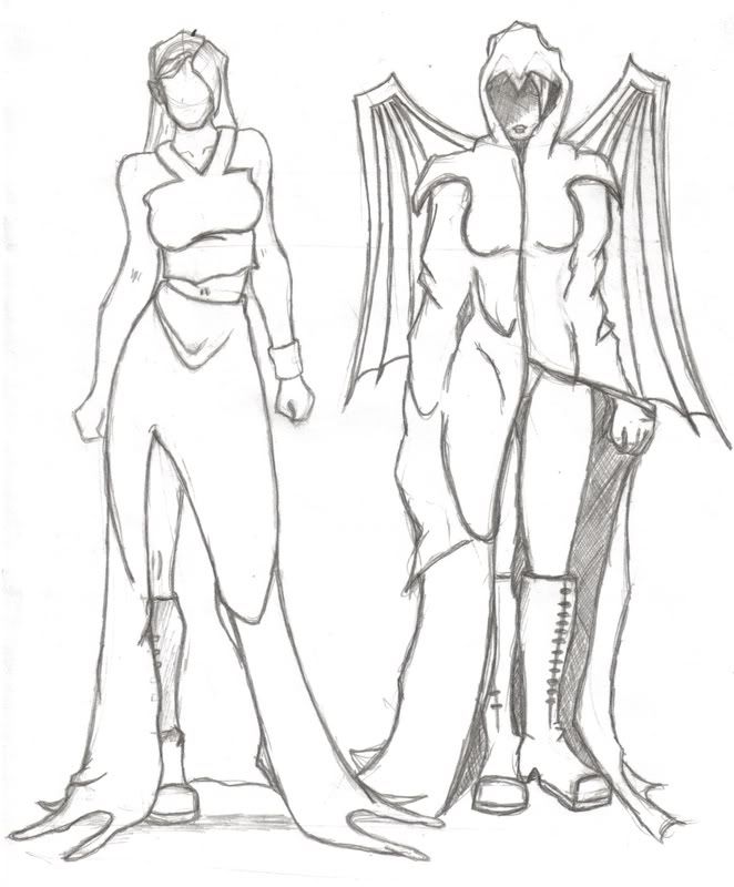
Concepts from way back in the day when i first thought of this character.

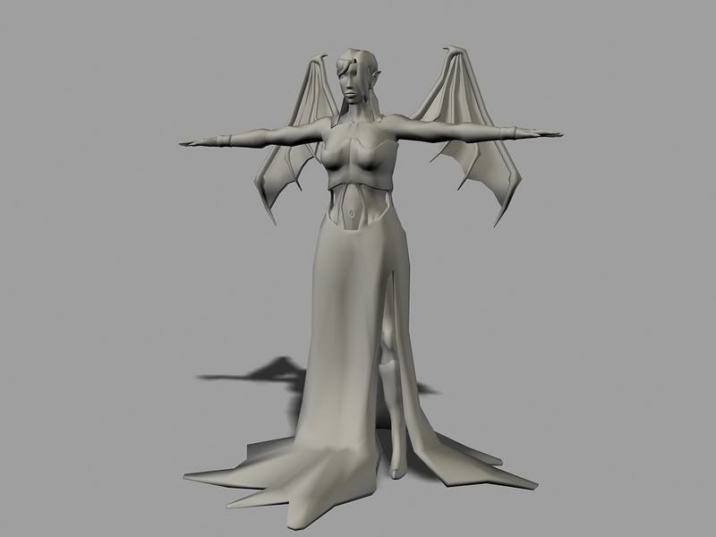
Base Mesh
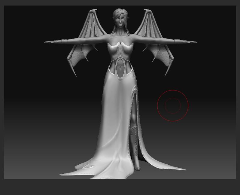
Zbrush
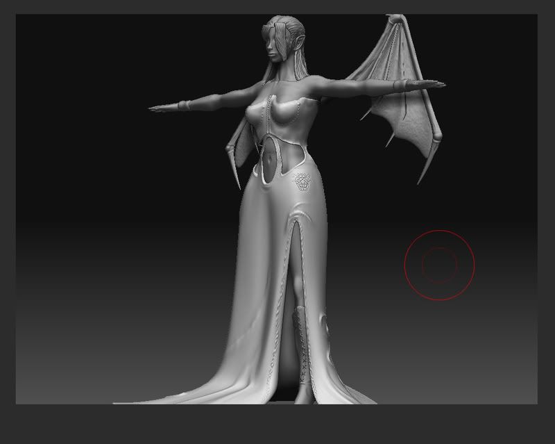
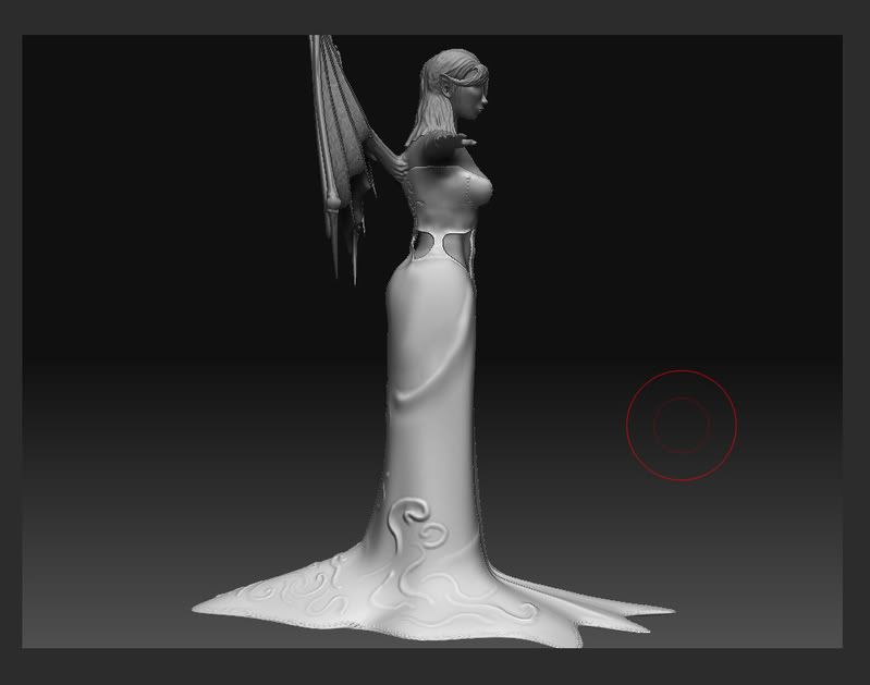
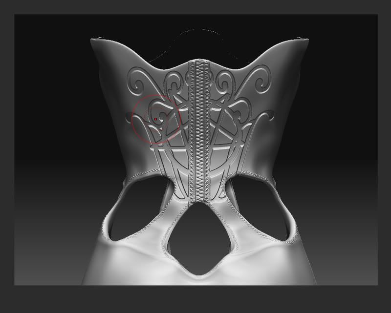
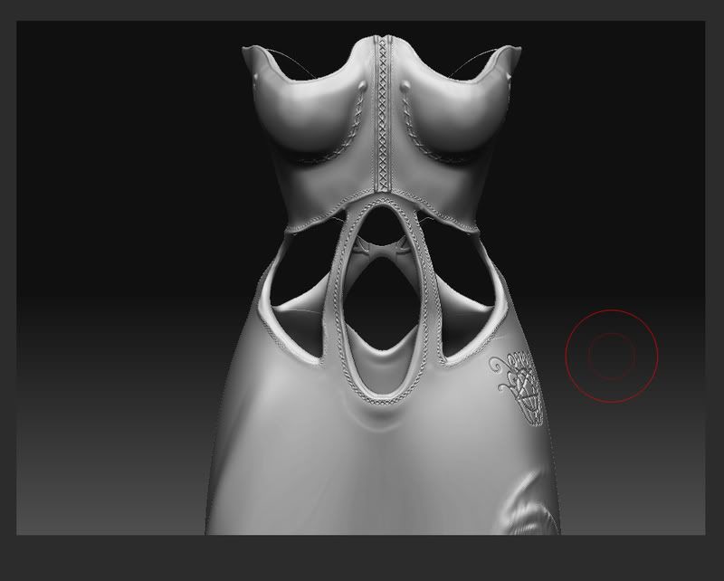

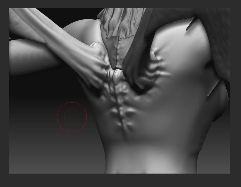
Alright so there is what i have going so far. So here goes the problem i have run into.
A few of the sub tools i ahve changed in Zbrush to the point where they need to be re UV mapped. Now i would prefer to just bake them in Max with a new low poly built for it but things like the Dress are about 4million polys and so max wont take them. So a few of the parts like the dress and the boots need to be Zmapped.
So i exported the low poly for the dress changed the UVs and then re importad it. And then came the problem.
The old base mesh with a zmap looks like
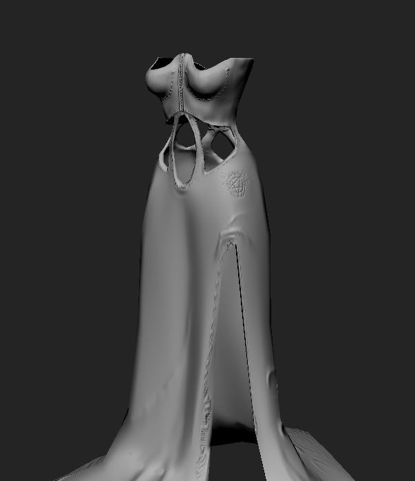
Se so it is fine.
Now with the newly UV mapped mesh it looks something like (dont mind the black i cancled the mapping early because it takes a loong time on the messed up one)
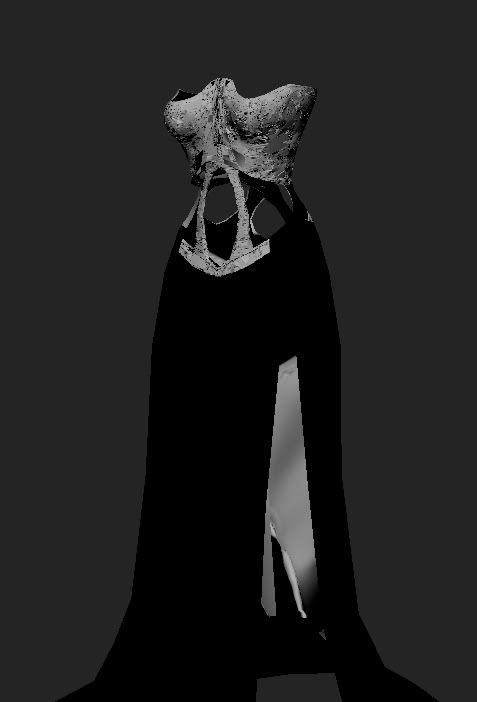
I didnt touch the modal i only changed the UVs and now it is doing this. And is really agravating. any help would be great along with C&C
So first the pics of what i have before we get into the issue i am having.
Concepts from way back in the day when i first thought of this character.


Base Mesh

Zbrush


Alright so there is what i have going so far. So here goes the problem i have run into.
A few of the sub tools i ahve changed in Zbrush to the point where they need to be re UV mapped. Now i would prefer to just bake them in Max with a new low poly built for it but things like the Dress are about 4million polys and so max wont take them. So a few of the parts like the dress and the boots need to be Zmapped.
So i exported the low poly for the dress changed the UVs and then re importad it. And then came the problem.
The old base mesh with a zmap looks like

Se so it is fine.
Now with the newly UV mapped mesh it looks something like (dont mind the black i cancled the mapping early because it takes a loong time on the messed up one)

I didnt touch the modal i only changed the UVs and now it is doing this. And is really agravating. any help would be great along with C&C
Replies
Now relooking at your normal map, you might have a lot of overlapping uvw mapping issues, you should post your unwrap.
Crits:
- Is that UV layout temp just for a test? There are half a dozen ways to lay it out in a more efficient easier to paint arrangement.
- The anatomy is pretty good, still a bit blobby but I'm sure you'll refine it. Just don't go nuts.
- Lips... where to start? Holy crap they are puffy. Its what happens when you take a basemesh that doesn't have lips and paint deform/extrude lips the surface. Which is fine... if you're working on a duck.
- The clumps of hair are kind of fugly, do you have plans to use opacity maps? They would really help those clumps look more natural.
- Careful that you don't go so micro on the detail that it reads as noise when you're nose isn't nestled in her belly button.
It looks as if the 'designer' decided to have a stencil there and then after creating it thought hey lets put 3 holes right in the middle of my design! Think about what your doing and why it's there if you just resize it to make it fit above the 3 holes it should look fine.
Also look at how some dresses are made, you could easily resize the stencil here and remove the zipper and move the zipper to the side of the dress under the arm, many women's dresses have a 5or 6 inch zipper under one arm to get it on.
As for the Lips we have been going at it this whole time. I did modal them on the base but yea they are very puffy.
-Decared. Yea not a bad idea. I'll see about moving it around.
For starters, the first thing that really bugged me is the way those side-strappy-strips-things that hang over her waist look. I'm guessing you want her to look sexy, so right now this is doing you a disservice--because they fall almost straight down the thinnest part of her waist, it removes some very important silhouette distinction for sexyness
Also, you need to put some curve into her spine. Her pelvis should be facing down and the rib cage back from the front view. In other words, make her booty and boobs stick out, as it will help add not only to her sexyness but also to soften the pose and make her look more realistic.
And finally, speaking of her booty and waist, there is something weirrrrd going on around her hips. It looks fine from the front view, but the from the profile and 3 quarter, it's looking bulky and huge. I'd compare the area to some reference of female bodies and see if that can help tighten the porportions there.
Looks like you're on the right track, just tweak some stuff and hopefully it'll turn out great!
Oh an Mezz i'll post a nude shot so the anatomy can be seen a little better.
So doing my tests this week, inverting UVs did nothing, starting with no texture on her did nothing, Expoting the projection that worked and then reimporting it made it not work.
the only good thing i have found today is if i go to the normal map tab and just hit create normal Map it works fince..but its that ugly non blue normal. none the less it is annoying and i need to get her texture done by next monday. ><