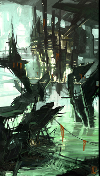
So I am thinking a small grouping of structures on some marshland. The main focus is going to be that shack in the bottom left. I plan to have some more plant life and creepy trees. It will be foggy, and probably have some rocks poking out of the water here and there. There will be a series of catwalks connecting the buildings. Maybe I'll make this be in a cove of sorts. I am most likely not keeping the waterfall, as this will be in UT3, I will just use the water there. I might remake the water textures if I have time.
I am thinking of a stylized realism sort of like Crackdown. And ideas for the scene or tips to make it more evil are welcome.
Nice start. My comments on lighting: You can have an ambient light in the scene to avoid the darkest shadows.
Modeling: Avoid perfect horizontal and vertical lines in your scenes as much as possible. Create a foreground element.
Good stuff.
Cody: Nice work so far, and I really like your paintover; it turned out sweet in my opinion.
I'd say the closer you can resemble the 2d art the better. Are you going to have a bunch of planes with opacity maps to capture all those metel bits and peices everywhere in your concept?
Thanks, Brad. I'm not sure which metal bits you are talking about, but I am going to try to make it just as interesting as my concept, yes. I am going to try to stay away from alpha planes as much as possible, however, as we have such a large amount of polys to work with.
Hey-oh! Well since the above building is in a swamp, I'm going to have cables supporting the structure sort of like a radio tower. Anyway, I'm making the hi poly for the connector that said cables will be attached to. I know it is not up to his holiness Kevin Johnstone's level, but I happy pretty happy with it .
Ok, got the low poly with normals done for the connection for the cables. the idea is that it can reel in or let out cable as the structure sways. Anyway, this render is with normals and a first draft of Diffuse and spec. I'm going to add some more variation and grime.
Here is the cable so far [no diffuse yet]
and to sgv3dmax- here is a shot showing how the cables work. for a sense of scale, that little rectangle in the right archway is the size of a human.
Okay, think I have nailed the compostition and structures now. Not liking the plants so much, I think I am just going to bunch them in select areas. [and I will make variations]
Small update of a prop i will prob use everywhere... Will have bigger updates soon, working on one of the buildings, will post when it's farther along. grill--
I'm not sure which image editing software you're in so....
in photoshop the histogram is under window>histogram, in cs3 it pops up in the right side bar.
in the gimp (2.6) the window can be pulled up from windows>dockable dialogs>histogram. The default histogram in the gimp is displaying value and you'll want to look at the channels individually so use the drop down to switch between them.
if you are in a different image editing program, just tell me and I'll track down the histogram in it.
Also check your lighting. If your lighting is too flat in your scene your normals won't pop very much. It looks like you've got only one light in scene at the moment.
Are you baking ambient occlusion for your textures? An AO map multiplied ontop of your color would also help pop the details.
@Drachis- thanks im in photoshop, ill check that out
@misterboogie- thanks man, I will try some more dramatic lighting. You are right I just have a directional light at the moment. Good call on the AO, forgot to do that. DUHR! I have a lot of time this week, so should be able to crank this baby out.
plants look sweet. sometimes what I like to do is add a slight hint of color to the specularity for plants. Like if my leaves are under a clear blue sky, I would tint their specular color towards blue - so when the leaves catch the light it feels like they fit in with the scene better.
Keep it up, plants look rad. Lights will help all your normals and everything pop. I'd like to see more color variation in the metal texture and spec in that door thing. Good luck!
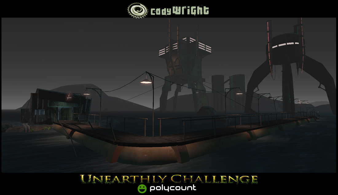
Thanks man! Here is an update...finished the big building, still have to do those tanks in the back... got my second angle, though. To Sleep! Awaaaaaaaayyyyyyy.....
The windows are too bright on the big one, and the lighting on the foreground needs a little tweak, but calling it done as soon as I do that and the water tanks or whatever they are in the background. And it took away my pretty railing shadow....got to get that back....
Done! With just under 3 and a half hours to go. Phew! That was fun. Thanks to Polycount for my ongoing inspiration, all the other entrants, and everyone who helped me out along the way. IMAGE SPAM!
Oh shit, just realized I didn't put my triangle count anywhere! CRAP! DISQUALIFIED! Haha. Anyways, it was 22,058 triangles....oh well. I fixed it here and contacted Fred, so we'll see what happens.
Shit, looks great Cody! I thought you quit on this project cause I didn't see any updates for a little while there and lost track of your entry. It turned out really good man, I especially like the high poly work you did on those metal doorways and such.
It's really nice to see your progress and how much you have been improving.
Replies
I am thinking of a stylized realism sort of like Crackdown. And ideas for the scene or tips to make it more evil are welcome.
Here is my crappy paint over.
Click for Full Res
Click For Full Res
Modeling: Avoid perfect horizontal and vertical lines in your scenes as much as possible. Create a foreground element.
Good stuff.
Click For Full Res
Click For Full Res
I'd say the closer you can resemble the 2d art the better. Are you going to have a bunch of planes with opacity maps to capture all those metel bits and peices everywhere in your concept?
Here is the cable so far [no diffuse yet]
and to sgv3dmax- here is a shot showing how the cables work. for a sense of scale, that little rectangle in the right archway is the size of a human.
mexico is nice as is the warm clear water.
eh...
i need to make parts of this stand out more. ideas? crits?
Just start adding shapes, boxes, cubes, pipes, bolts, etc..
It will start to come together.
Keep churning!
If those are fine, then try adding more more lights near the walkway to help exhibit 'em.
I guess i'll try more lights first.
in photoshop the histogram is under window>histogram, in cs3 it pops up in the right side bar.
in the gimp (2.6) the window can be pulled up from windows>dockable dialogs>histogram. The default histogram in the gimp is displaying value and you'll want to look at the channels individually so use the drop down to switch between them.
if you are in a different image editing program, just tell me and I'll track down the histogram in it.
Also check your lighting. If your lighting is too flat in your scene your normals won't pop very much. It looks like you've got only one light in scene at the moment.
Are you baking ambient occlusion for your textures? An AO map multiplied ontop of your color would also help pop the details.
Go!Go!Go!
@misterboogie- thanks man, I will try some more dramatic lighting. You are right I just have a directional light at the moment. Good call on the AO, forgot to do that. DUHR! I have a lot of time this week, so should be able to crank this baby out.
that cloth is a place holder btw
Quicken the pace for the final stretch.
Good luck!
*edit* updated again with slight lighting changes and a hella sweet power line [wow, I'm tired. haha]
angle 2
and of course, my thumbnail,
It's really nice to see your progress and how much you have been improving.