The BRAWL² Tournament Challenge has been announced!
It starts May 12, and ends Sept 12. Let's see what you got!
https://polycount.com/discussion/237047/the-brawl²-tournament
It starts May 12, and ends Sept 12. Let's see what you got!
https://polycount.com/discussion/237047/the-brawl²-tournament
Proxzee's "Blizzard or Bust" HQ
Hello! I've begun my blizzard project!
I'm designing a character class called a Beastmaster. The name will probably change, but the Beastmaster goes around and captures mythical beasts.
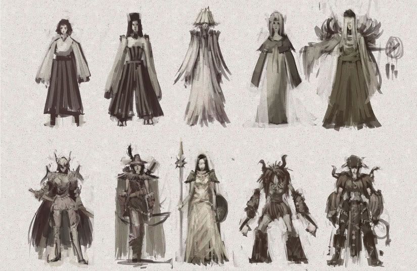
Female Beastmaster thumbnails:

Plan:
Make both male and female versions.
I take 3 of these designs and do a refined monochrome for both m and f versions
I model said character
I take the female version, and make an illustration where she is taming a mythical tengu.
I model the environmental assets and create a little diorama inspired by the illustration.
I'm designing a character class called a Beastmaster. The name will probably change, but the Beastmaster goes around and captures mythical beasts.
Female Beastmaster thumbnails:

Plan:
Make both male and female versions.
I take 3 of these designs and do a refined monochrome for both m and f versions
I model said character
I take the female version, and make an illustration where she is taming a mythical tengu.
I model the environmental assets and create a little diorama inspired by the illustration.
Replies
I like the top right, and the two on the bottom right. They have the best silhouettes and are most dynamic and interesting IMO. the bottom two are very outdoor-like and Grizzly Adams, I like them a lot. also on the top right the wing/shoulder pads look cool.
this project needs 25% more breasts
I also like the bottom two. I think ill go with the winged one, and the two beastie ones.
that made my day
on topic: yes I'd vote for the two bottom right. although the right one looks better but it's hard to tell from the sketches which will turn out better.
the other ones seem to be too elegant or overdone. (IE look like a hunter class, or warrior, ect)
So yea my vote is last 2 as well.
My vote goes for #9 also.
I really like the middle-top-row-lampshade-head thumb, but it doesn't really convey "beastmaster". I am gonna go with the consensus here and pick the bottom right two jungly ones.
DON'T FIZZLE ON US, YA HEAR!?
Here's the direction I'm going with one of the thumbnails:
I think I overdid it on the hangy stuff, and I want to change that.
Do you guys like the fuzzy chest with midrif? Or should I put a tunic leather wrap thing on? Kinda debating that.
I kinda like the hanging stuff. Maybe take away the 2 really big ones and put them on the neckalace. Or use them for like claws on her bracers to mix up that 2 bone patteren you have going.
i liked the thumbnail much better. it had better proportions, a more feral pose, and the silhouette was much more interesting and easily recognizable. the revision has turned into a furry hump that will be lost at a distance.
also, i thought the thumb had two big angular hooks for weapons, and i thought that was badass.
as for the manga stuff, i was being influenced by princess mononoke. The way I drew the eyes is what is causing it. I'll put some more structure into the face, since I think she is looking a bit too cutesy.
But yes what your thumb had that has been lost is that nice feral pose. In the thumb she looked kinda crazy like she was hungering to kill something.
Also in the thumb to me it feels like leather garb on the torso and i think that would help keep her less "poofy" looking. But to me it would make since to keep the fur on the wrists and legs for warmth again just like Indians do.
One last thing is that if you are going for a Blizzard feel you need to start thinking of the shoulders. the thing that blizzard is known for is over exaggerated shoulder armor. So maybe cutting back on the fur hat to bring Fur onto the shoulders or something like that.
and now i will go off a bit here. (yes the following picture is me, i used to be a fancy dancer, and yes it was all hand crafted by me as well).
Now this is more of a modern Indian reguelia. but it was still mimicking some of the other things they wore as a norm it was just made more flashy for the style of dance. . the small shields on the arm, the angora on the ankles, ect. So hopefully this shot might help you get some ideas.
i have others if you want more refrance but again not sure if its gunna help you in the direction you want.
Here's a new direction I am going in but maybe I will change to something is a bit more solid what do you guys think:
Love the model sheet.
i messed up the silhouette on the legs. she looks goofy and evil in this one. Im gonna go with cloth leggings, instead the fuzzy stuff i think.
yeah, cloth leggings might be the way to go.
I am very interested in this project.
If you are out running across the many plains these fantastic worlds have to offer, you dont want tons of stuff hanging all over your extremities, catching on rocks and giving some group of mobs something to grab on to. no. But you do need lots of gear.
Gear should appear on the back / shoulders. You need to set up camp for days at a time. Since you are charming and killing so many beasts, so. many. beasts..... You need more than just weapons. You cant let all those skins and meats go to waste? You build your camp and collect them all. You need to process and smoke meats in order to preserve them. Then at the end transfer this stuff to a near crossroads for sale. So Skinning gear and habitat forming tools are essential. But not immediately necessary.. they can be held deep in middle of upper back. Then weapons and charming gear close to hand or in hand. Pelvis, Shins and forarms should be armored and tightly binded hands and feet. This will give you defence against close contact mis-charms and the like.....
I really liked the femur armor you had going below. I would be happy to wear this.... You seem to have moved backward since then. The armor you have now is for those cheesy "showman" Beastmasters. They set up camp, in town! of all places, doing sily dances and the like. no no no. nevermind them. Showoffs. They spend their time charming woman, of all beasts... not the wild mob.
ill be watching your progress HA-ga-gaaah!
crits please! FONT IS TEMPORARY!
Also beginning to model.
uploaded to my website.
Like anything complex, just break it up into smaller jobs, in the case shapes.
I'm not at all keen on the model. Look nothing like your drawings. If your going for stylistic create a model sheet and follow it.
eg. of a great stylised character sheet: http://www.comicraft.com/print/dangergirl_sketch/spread2_lg.jpg
Also i modeled it in the T because that's how i was taught to prepare models for bones and skinning.
Really like your concept stuff (especially your early thumbs) and glad to see you're taking it into 3d too (low poly?). No crits atm, keep on working it :P
o**** watch the geo on the front of your hip, the geometry there is gonna caus u some pain if you have to animate it!!!!
-woog
Also, don't just select an area and fill it, you should expand the selection by about 2 pixels to allow for bleed (that will fix the white areas in the texture)
Man I'm pretty slow at this, but I'll get faster with practice! Appreciate everyone's input.
critiques!
also how fast does one do a model like this professionally? what is expected?
1-3 days. some people work very fast and can knock this shit out and still make it look awesome under a day's work. i think that comes with time, having a good workflow. i'm slower, and have been known to take experimentive approaches that can sometimes help or hinder my progress. i would probably take about 3 days currently.
day 1 - model
day 2 - unwrap
day 3 - texture / import
i wish u luck on ur conquest! i'll definately be watching ur progress and when i have more time, hopefully help u out more. keep up the good work.
A model like this shouldn't take more than three hours to unwrap. Thanks to max's "relax" tool and other unwrapping programs, uv unwrapping characters has become a lot easier than it used to be. It just comes down to practice, really; once you've unwrapped enough arms and bodies, you dont really have to think about it, unless the character has a particularly unique piece of geometry. I'd revise the list like this:
day 1 - model
day 2 - unwrap / texture
day 3 - texture / import
Really been enjoying watching this progress, keep on rockin it