Unearthly Challange | kat | (concept 41)
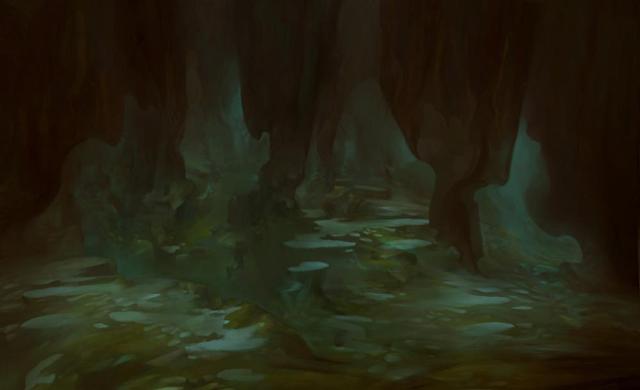
Highres concept No.41 - "Thee Al To Sore Smerte"
http://www.gameartisans.org/contests/events/4/concepts/images/concept_41.html

Still formulating ideas and stories but wanted to choose and post.
[updated info - 27th Oct 08]
TOOLS
Blender 3D - all 3D asset modelling
Corel Photopaint - textures (diffuse, specular)
CrazyBump - textures (normal maps, specular)
Quake 4 Radiant - level design compositor, compiler
Quake 4 - in game dynamic renderer
[updated info - 08th Nov 08]
ASSETS
Mesh - Final triangle count - 26402 (all models, no quads)
Textures - 8 sets of 1024x1024, diffuse, normal, specular. 6 x 256x256 env map.
SFX - fire and crystal motes from Quake 4 game content (that's allowed?)
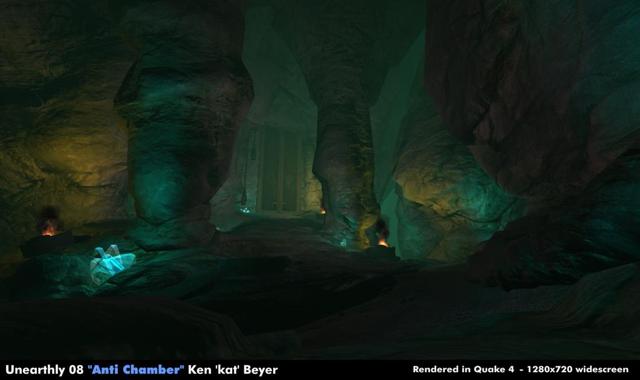
Beauty 1

http://www.gameartisans.org/contests/events/4/concepts/images/concept_41.html

Still formulating ideas and stories but wanted to choose and post.
[updated info - 27th Oct 08]
TOOLS
Blender 3D - all 3D asset modelling
Corel Photopaint - textures (diffuse, specular)
CrazyBump - textures (normal maps, specular)
Quake 4 Radiant - level design compositor, compiler
Quake 4 - in game dynamic renderer
[updated info - 08th Nov 08]
ASSETS
Mesh - Final triangle count - 26402 (all models, no quads)
Textures - 8 sets of 1024x1024, diffuse, normal, specular. 6 x 256x256 env map.
SFX - fire and crystal motes from Quake 4 game content (that's allowed?)
Beauty 1


Replies
Looking forward to see what you can do with it.
Nice to see you in, kat, looking forward to see the progress!
I know most peeps will use UE3 so I might try this on the idtech4 for rendering out and see what happens.
larger version
Yeah I'm doing all my stuff in ETQW's EditWorld, so basically id Tech 4 with some stuff added on.
I might do my final renders in Max though, depends what I need for the look.
larger
larger
Larger
Further down the layout process, each area is pulled up from the base by extruding, including the pillar blocks, I find doing separate objects more tricky and time consuming than it's initially worth.
Larger
Worked up more of the main shape.
larger
Further on and the mesh is broken into sections using material assignments to make it easier to manage whilst working on some of the awkward shapes that occur... thank goodness for Blenders layers ;o)
larger
Using Blenders under-rated UVW unwrap tools - laying out (testing placement of) seams to unwrap a mesh section; being able to 'split' a mesh into sections like this makes managing the overall UVW map so much more efficient and easier to do.
larger
Modelled up most of the initial work I needed to do to get a clear idea of shapes and forms. There's obviously more work to be done but I often find it easier to work up a section of something rather than block out as that can be overwhelming and frustrating at times, especially when the shapes in meshes get in the way of being able to see what you're doing.
larger
Created 16x 1024x1024 sheets to 'hard-wire' the texture limit, will need to decide on how to do the texturing next, probably 2D and crazybump rather than sculpted normal maps.
Larger image - trying to leave the whole 'floor' area on one texture gives poor quality results, so the mesh is broken down into sections, each getting it's own 1024 sheet
larger image - got most of the cave itself built so now I can 'study' how the man-made stuff will fit in so it look like it's meant to be there. Using about 3500 faces (c.5000 tris) so far and 13x 1024 (as reasoned above).
More UVW mapping fun, this time gridding to make sure texture res is approx over entire mesh. Texture scaling done via materials in Quake 4. Vertex painting shown for texture blending, also done via material files
Selection of textures. Normals and diffuse also with the height templates used to generate normals. Not just putting photos through CB as that's bad.
In editor shots next
Really nice organic rock "plinths" you have there, very natural!
I think even megatexture would haev a hard time with this mesh! heh
URL="https://www.katsbits.com/misc/unearthly_challenge_08/unearthly_phase12a.jpg"]larger[/URL Model sections shown below with editor images "rock" and "ground". Broken into 3 sections; two 'ground' sections and one big 'wall' section. Smoothing has held up surprisingly well as I've had problems in the past with it when breaking meshes into sections, which has to be done normally for vis/overdraw reasons. UVWmaps islands work similar to UE3 in that they don't automatically cause vertex splits (which despite having worked with idtech for years, I always thought was the case - learnt something new in this project).
URL="https://www.katsbits.com/misc/unearthly_challenge_08/unearthly_phase12b.jpg"]larger[/URL r_showvertexcolor 0/1 showing the vertex painting that creates the texture blending on the mesh.
URL="https://www.katsbits.com/misc/unearthly_challenge_08/unearthly_phase12c.jpg"]larger[/URL Render preview, texture blend in real time. Initial light setup. Not happy with crystal pillars (as objects) so changing those and the lighting as a result. bleh.
I think some more moody lighting (more saturated brooding colours like the concept) would really help, and if you can do it, stick a global ambient fog in there with a green colour so that you get the nice atmospheric perspective that the concept has.
Agreed, I will be doing that re the lighting, just need to get some 'stuff' in place to do what I have in mind which should create some nice 'hot spots' and pools of light (contrast and brightness as well). There is an ambient fog in the level but it's pretty thin at the moment whilst I get every thing in place, so what's there just basically sets a baseline of sorts, I don't want to go any darker than that - which as you know is all too easy to do in this engine. The crystals aren't set up properly yet, no glow material and what have you, just in case anyone was wondering looking at the render preview.
Thanks for the comments btw
I was going for an 'eerie', 'ethereal' look for this rather than overtly evil, it's certainly not somewhere you'd want to be hanging around for too long. I had visions of 'fire sprites' emerging from the two cauldrons in the scene (approx where the pools of yellow light are) to attack the player as the enter/pass through the area. They would be killed by extinguishing the flames (which would restart after a time as they're "ye olde majic eva'lasting ouchie makers").
There's more I could probably do to this but I wanted to keep things uncluttered as well as making sure to get the level built within the original submission date; anything done now would be an addition to the scene rather than a missing/unfinished part of it. Left the player start point in view as a point of reference.
Editor Render URL="https://www.katsbits.com/misc/unearthly_challenge_08/unearthly_phase13a.jpg"]larger[/URL
Light Count (shadow volumes/surface lighting) URL="https://www.katsbits.com/misc/unearthly_challenge_08/unearthly_phase13b.jpg"]larger[/URL
Tris (all polys in scene) URL="https://www.katsbits.com/misc/unearthly_challenge_08/unearthly_phase13c.jpg"]larger[/URL
I'll post a proper in game render soon as well as some lighting breakdowns.
Possible alternative shot URL="https://www.katsbits.com/misc/unearthly_challenge_08/unearthly_final1a.jpg"]larger[/URL
Another possible alternative shot URL="https://www.katsbits.com/misc/unearthly_challenge_08/unearthly_final1b.jpg"]larger[/URL
Final shot will be something like this. URL="https://www.katsbits.com/misc/unearthly_challenge_08/unearthly_final1c.jpg"]larger[/URL
Most of the main textures are 1024x1024 tiling textures. Although Quake 4 can take 2048x2048 it was felt that tiling was sufficiant to reduce pixelation and keep texture density up. Eight [8] full custom textures sets of diffuse + normal + specular maps plus one 256x256 env map set (6 x 256x256).
Two in game particles emitters were used - fire and crystal 'motes' - as shipped with Quake 4.
All the normal maps used were created from 2D using CrazyBump
Assets shown over in game Quake 4 render with "showtris" active outlining total of 24631 triangles (dynamtic light volumes and other 'real time' data push that up to 150k in game when viewing the entire level)
Beauty 1
Beauty 2
PS: your blog is also a decent read! thanks for that too, i enjoyed the Conan interview!
The Conan interview took ages to set up, mainly due to the developer being a bit 'slow' on feedback rather than the chap I chatted with.