Suzie Mcfannigan - Jet Bike!
Oh dear. This is my first post for Polycount...
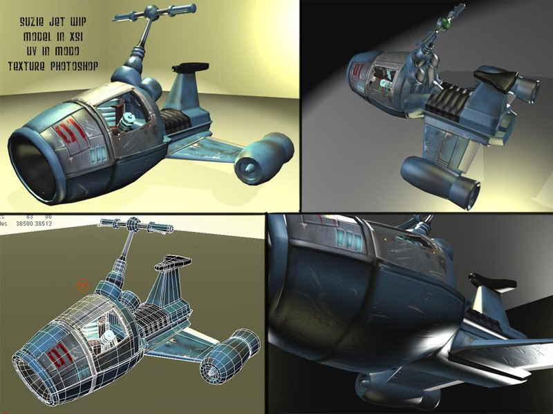
Anyhow I'm working on some assets for a piece/short. This is the first step: A jet bike:

The mesh (hull) is about 9000 triangles at the moment. Going to crank it up ERM DOWN *edit*. there are currently 3 maps of 1024... though I think I'm going to up the resolution considering it may be used in close up shots. Anyhoo just making a pimping post? i'm not a pimp though so it's more like a hi! I model.
What is a good polycount for a vehicle? for the low poly i'm dropping the innards... it's going to have two different uses...
C&C great appreciated!
EDIT:
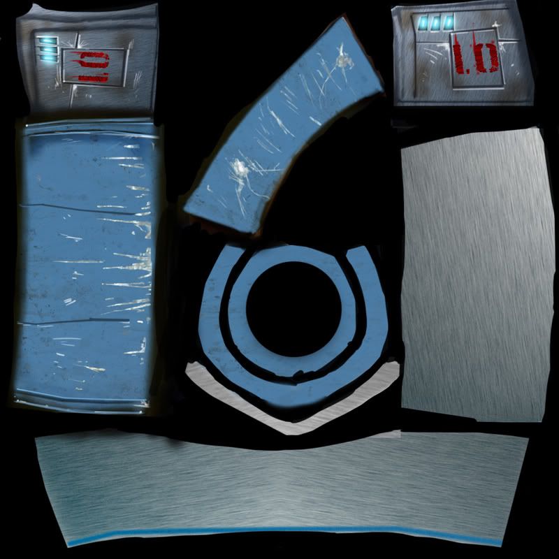
Texture map for front hull... not my best. metal sheet from somewhere found on my 'puter... forgot the source! but it was a free texture site... can't remember ;_; blue metal was actually found, but i ended up just repainted it 90% over anyways. Added map because my buddy bet me 10 dollars...

Anyhow I'm working on some assets for a piece/short. This is the first step: A jet bike:

The mesh (hull) is about 9000 triangles at the moment. Going to crank it up ERM DOWN *edit*. there are currently 3 maps of 1024... though I think I'm going to up the resolution considering it may be used in close up shots. Anyhoo just making a pimping post? i'm not a pimp though
What is a good polycount for a vehicle? for the low poly i'm dropping the innards... it's going to have two different uses...
C&C great appreciated!
EDIT:
Texture map for front hull... not my best. metal sheet from somewhere found on my 'puter... forgot the source! but it was a free texture site... can't remember ;_; blue metal was actually found, but i ended up just repainted it 90% over anyways. Added map because my buddy bet me 10 dollars...

Replies
on the modeling, if youre going for a high poly, you might want to keep going. but for low poly, you want to capture the silhouette of the vehicle while keeping the poly count low.
From what I can see, you can easily collapse together a bunch of the edges on the seat cushion and not lose any detail. Just have the rippling done all with normal mapping.
So I think I'm going to go with a lower poly count. What count do you think I should aim for?
On the normal mapping, I'll have to figure that out! Haven't really normal mapped that much ^_^;; been out of the loop for a while and this my first serious attempt after several months. Usually just on the concept side.
Thanks for the C&C! I'll post an update in a few days! Thanks!
Sandbot
but man, after seeing your uv sheet you can MOST DEFINITELY put this whole thing in perhaps 2 sheets. your 3rd uv layout isnt too efficient, a lot of places can be stretched out and aligned evenly to help preserve some uv spaces, sure you might get some distortion, but i think you can compensate it with painting. the style looks pretty unique, but i think i'd be super cool if you can grab more metallic texture samples.
To be honest I'll have to echo what's already been said...
Although, as you said, it's for a short so there are less restrictions, but with the emphisis being on game art on this forum, it's going to be you'll probably find that work like this will be judged as though it's about to be used as a game asset, thus criticized as so.
Unless the geometry is pushing the silhouette of the model or creating interesting detail, get rid
Something you could do in order to chop down the amount of textures you're using is to re-uv map the vehicle on another channel (you can do this in max, not sure what happens in Maya) and project the current detail on to the revised uvs and work in to them some more. At the moment you're wasting space left right and centre and giving yourself more work to do to get the detail.
Overall it looks nice, makes me think of the futurist 1960s sci fi jet bikes- can imagine Buck Rogers or Flash Gordon turning up on one of those
seeing your unwrap now(and theres a fourth one?!), you definitely can fit all of that in one map. your texture detail also looks just a bit random. like splotches and scratches everywhere.
are you making a high poly ver. to bake into a low poly? if you are not too familiar with such a popular technique, you should check out some more forums on normal baking, or you can go to Ben Mathis' site www.poopinmymouth.com and go to his tutorial page. no kidding, thats the name of the page.
keep going and good luck
That's something I've always wondered, when is too many samples too much? Do texture artists make everything up? or is a lot of it re-purposed samples of the texture (repaints on say a metal texture).
Again thank you all for the critiques and I think I'm going to go with a lower poly model and see where that goes. Be back this weekend! Thanks!
I really like it. You do hit that 70's futuristic thing pretty well. I'd call it more of a scoother than 'bike'
I think the details are great, love the visible engine. I think the textures also look pretty good. As stated before maybe the paint could use a little more wear on the corners, but pretty cool as is.
I'll sample from photographs as much as needed. If I can paint a texture more quickly than I could find a good photo source to work with, then I'll paint it. The more you paint the better you'll get at it, but using photos is certainly faster.
i guess it has to do with what style are you working with. i know that blizzard never uses any photosources for World of Warcraft (so is diablo 3, it appears), everything's done in photoshop and painter. so in that aspect i guess texture artists need to paint everything.
other companies like valve and infinityward use photo references, so is ubisoft, assassin's creed used photos from cgtextures.com, i read. if someone's to tell me do a realistic texture for a wall, i wouldnt torture myself and try to paint it photoreal, there's not really anything to prove but the fact that you can get it done alot faster with clone stamp and a photograph:)