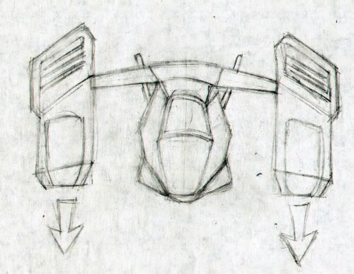
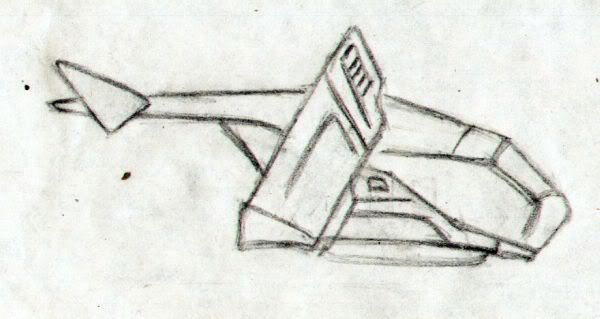
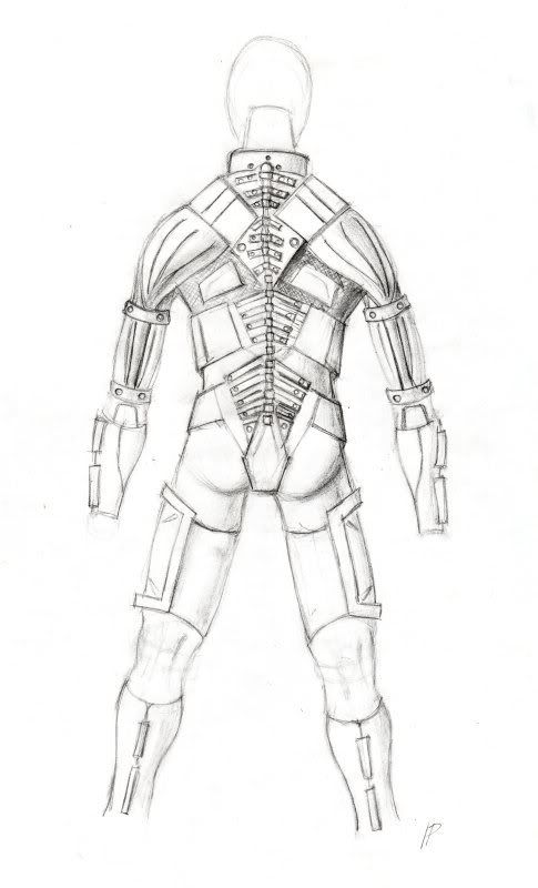
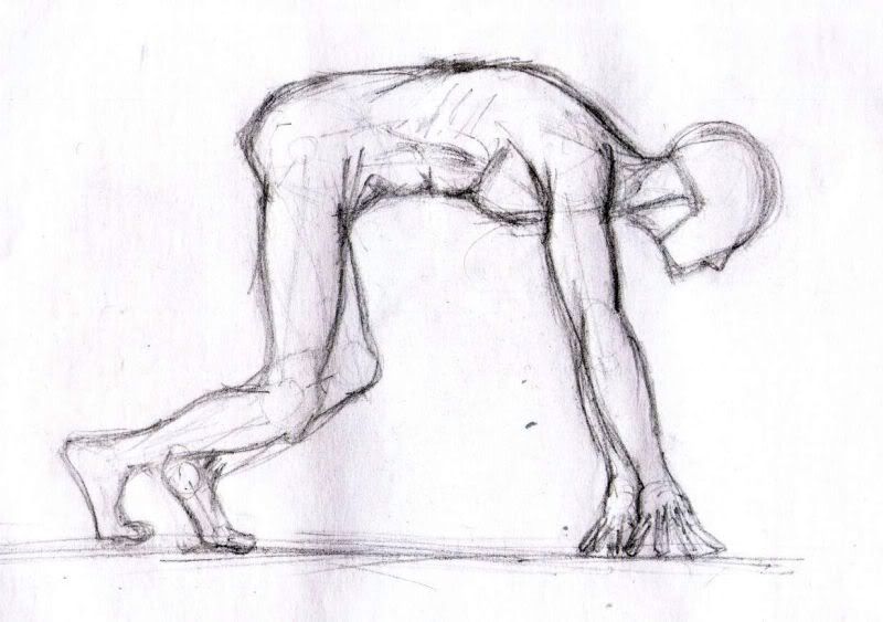
Hello all. I've been recently starting to draw some concept, and learning how to draw correctly. Anatomy isn't my strongest point, but I'm learning with Rens' help (thanks man). These are my earliest, from around 1-2 months ago.
Comments and critics are always welcome.
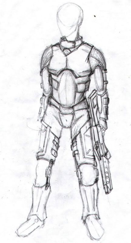
P.S: Sorry if the images are too big. I'll scale them or use another image host if you like.
the first image is a little weird. the lower half of the body looks like he's leaning against a wall with his back but the upper part makes it look like he's standing straight. in the last image.... I'm not sure if it is the pose but his torso seems really small.. could be that he's bent.. hmm.. cause if you compare with the arm length the person seems more like a monkey. good job though image sizes are fine.
And with this, I henceforth resurrect ye from the dead!
Hi,
In the short time between the Dom War pre-event and the main, I want to boost up my 2D skills as much as I can. I've seen that I suck massively at doing anything texture related, so I'm trying to get better at it.
I started off with a bit of anatomy practice, and an atempt at painting shadows and such. The outline was done on pen and paper, without any refs. I posted it in the WAYWO thread as well.
Kicking back this thread into action after 2 years of inactivity. Recently, I started making quick projects to learn texturing. Each project took 1-2 days to make. They aren't very good, but it's all about learning. You might have seen these on Google+, but I don't want to turn that into my blog.
The postbox took 2 days and a bit to complete, since I received feedback that the asphalt wasn't reading well. This is the final version.
Wooden barrel - I like how the metal came out in this one, but the wood doesn't really look worn out in the middle.
Concrete barrier - First time using a non-standard texture size and ended up making the texture slightly smaller than I wanted. Because I changed the UVs during texturing and scaled the detail when it was almost done. The sharpen tool did nothing! Might redo it later on.
Sorry for the double posting. I started a week long project based on Penguin Express. It's been done before on Polycount, but I've always wanted to do this scene, but always postponed it for when I got better. Now, I'm using it as a learning piece.
I started yesterday. Since then, I've done a scene blockout in Maya, finished modeling and baking a couple of assets, and set up the scene in UDK. Some pieces will probably get changed. Let me know what you think.
For the past couple of days, I've tried getting some proper lighting results with modular pieces in UDK. This is my first time putting together modular pieces in an engine, so I was bound to fuck it up at one point. Right now, I have 2 issues: the texture looks stretched on its thickness. I'm trying to use a tileable texture, so I can learn the ways to deal with them. I uploaded the texture I'm using, just to see if it's not actually the texture's fault.
My second problem is that I'm getting a seam because of the lightmaps at corner where it goes inward. My questions are: How could I get rid of it? If not, should I care when this type of seam appears?
Slow update for this scene because I was doing a lot of trial and error to get a better understanding of lightmaps, modular pieces, and everything relating to UDK. I had to redo almost all of the pieces because I didn't keep the grid in mind. I've also been experimenting with the material editor. The decal is based on the alpha channel of the tileable concrete texture.
A close-up of the phone, with a weird lightmap issue going on.
I did not drop this project yet. Here's an update. A lot of things are still placeholder, even in the thatching texture. Just trying different things to get an understanding of UDK by just dicking around.
Replies
Hi,
In the short time between the Dom War pre-event and the main, I want to boost up my 2D skills as much as I can. I've seen that I suck massively at doing anything texture related, so I'm trying to get better at it.
I started off with a bit of anatomy practice, and an atempt at painting shadows and such. The outline was done on pen and paper, without any refs. I posted it in the WAYWO thread as well.
Any critiques are welcome.
The postbox took 2 days and a bit to complete, since I received feedback that the asphalt wasn't reading well. This is the final version.
Wooden barrel - I like how the metal came out in this one, but the wood doesn't really look worn out in the middle.
Concrete barrier - First time using a non-standard texture size and ended up making the texture slightly smaller than I wanted. Because I changed the UVs during texturing and scaled the detail when it was almost done. The sharpen tool did nothing! Might redo it later on.
I started yesterday. Since then, I've done a scene blockout in Maya, finished modeling and baking a couple of assets, and set up the scene in UDK. Some pieces will probably get changed. Let me know what you think.
My second problem is that I'm getting a seam because of the lightmaps at corner where it goes inward. My questions are: How could I get rid of it? If not, should I care when this type of seam appears?
A close-up of the phone, with a weird lightmap issue going on.