[Graphic Novella] Wifebeater comic - critique please!
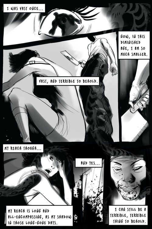
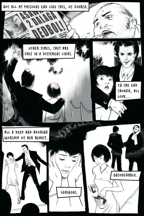
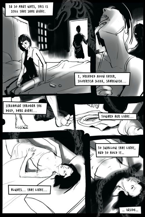
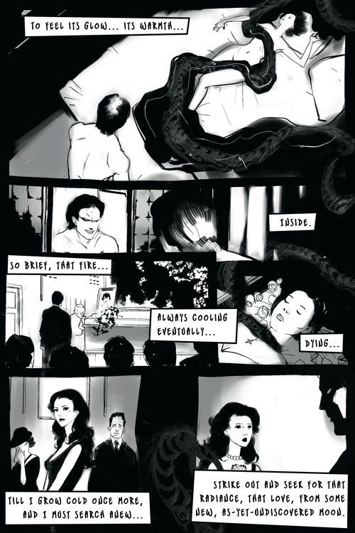
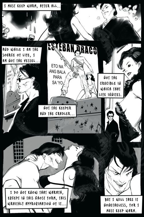
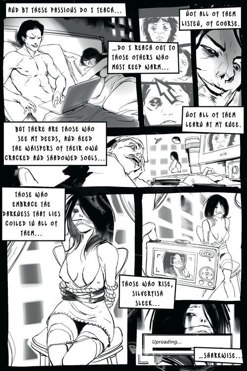
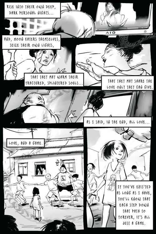
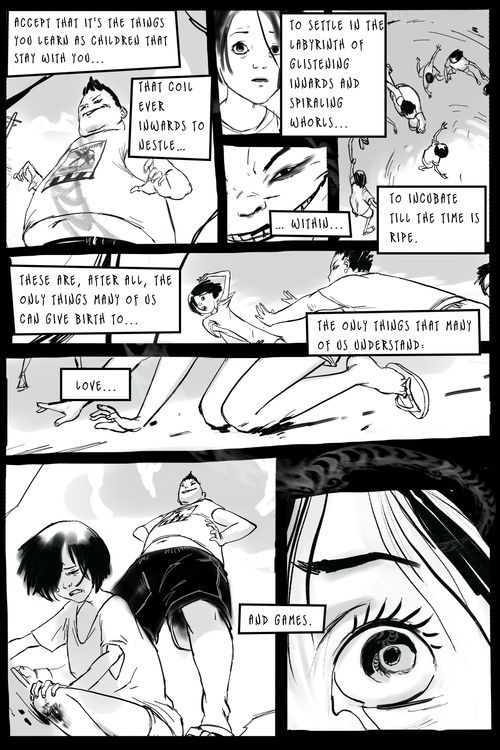
Haven't done one of these in a while...I threw this together over the weekend. Paint Tool SAI for pretty much everything.
The script's from a friend of friend...a bit lit major for my taste, but it seemed like an interesting non-videogamey story to draw. Getting the storytelling to come across was definitely a challenge. I think I failed big time.
For the rendering, Page 1 pretty much is the look I want to go for for the whole thing. Just the right balance of darks, mids, and clean vs. dirty areas. I got some good feedback last time I posted a comic here (ages ago), so once again, I'm putting up non-3D stuff for the black and green to tear apart.


Replies
However I agree about the font being painful to read. I would suggest switching to something more 'mechanical' like a Courier typewriter font. It would increase the contrast between text and pictures (as opposed to what you get from the current handdrawn fontface).
http://www.identifont.com/samples/microsoft/CourierNew.gif
I must say I'm not a great fan of the writing style either. It's a bit convoluted and trying to impress, with big words. However I like what you made of it!
Ever thought about trying the 'digital graphic novel' approach? Putting all this in video form with parallax backgrounds and such. I'm investigating that kind of things these days, it's quite fascinating.
On the art side, I love your shadow handling. Especially the girl shot in the first panel
Congrats, can't wait to see more!
Agreed. Font is difficult to read.
check out: http://www.blambot.com/fonts.shtml
there are some good (and free) comic dialogue fonts. bottlerocket seems similar to yours and a little easier to read too.