Work update!
I'm still here i swear! Just started school again so i've been working hard on all that stuff.
So AI-OC is working on a level as a large group project. I am one of the environment artists. For the most part speed has been key here, and I have been finishing a building per week.
For the most Part my art lead (Paul..a poster here..somewhere) gives me the concepts and I get it done. Most of the time the building doesn't end up in the game the same way that I constructed it. Using the modular pieces he mix and matches and makes a lot of buildings. My renders are from Max, i'll get Unreal screen grabs when the level is done.
Oh and one last thing, For the most part i am just doing the building, no props. So some seem a little naked.
So here is an update of work.
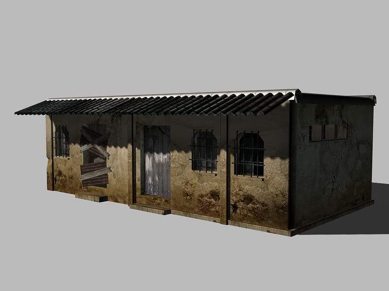
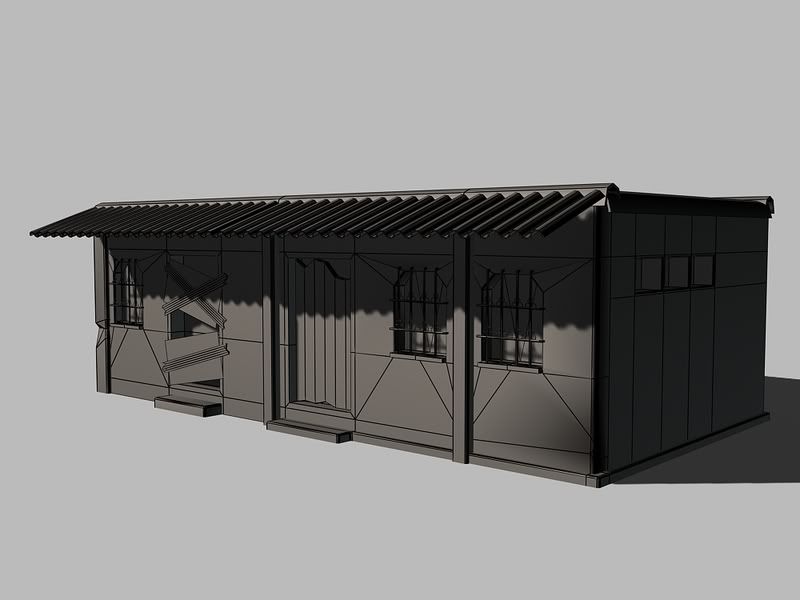
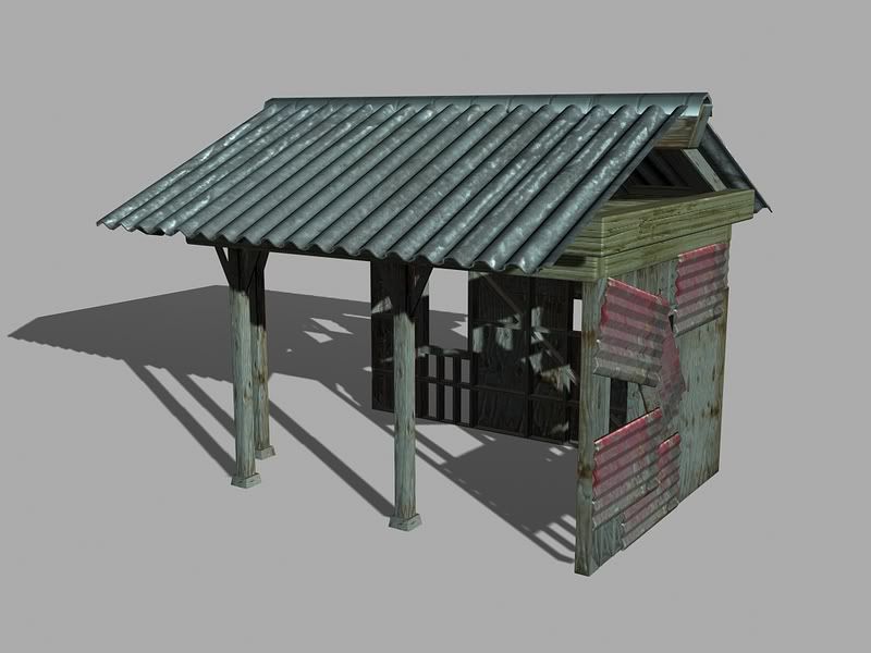
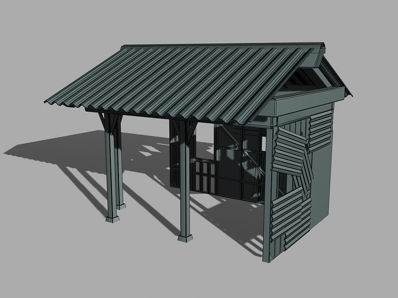
Shack
-2 hours from start to finish
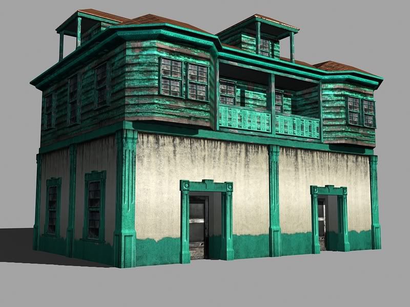
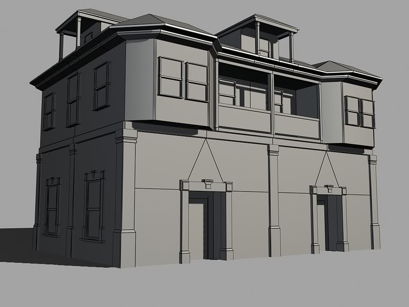
Fish Market
-8 hours time
Dock Side Store
-3 hour time
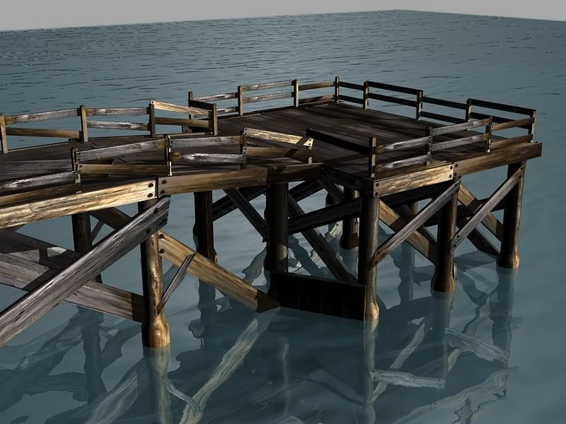
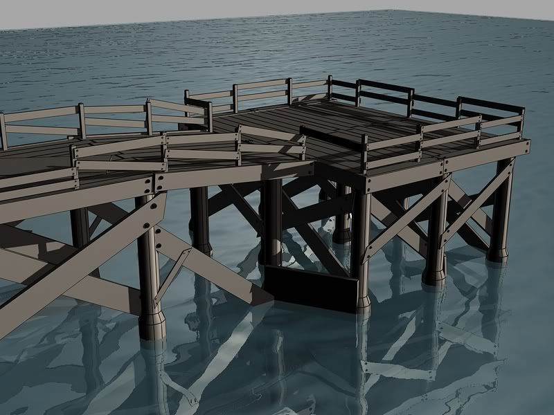
Dock
-2 hour
(this is really just a bunch of boards i made for him and board sets so he can put it together however he wants.)
Window AC unit (random prop from another class that we did for this one.)
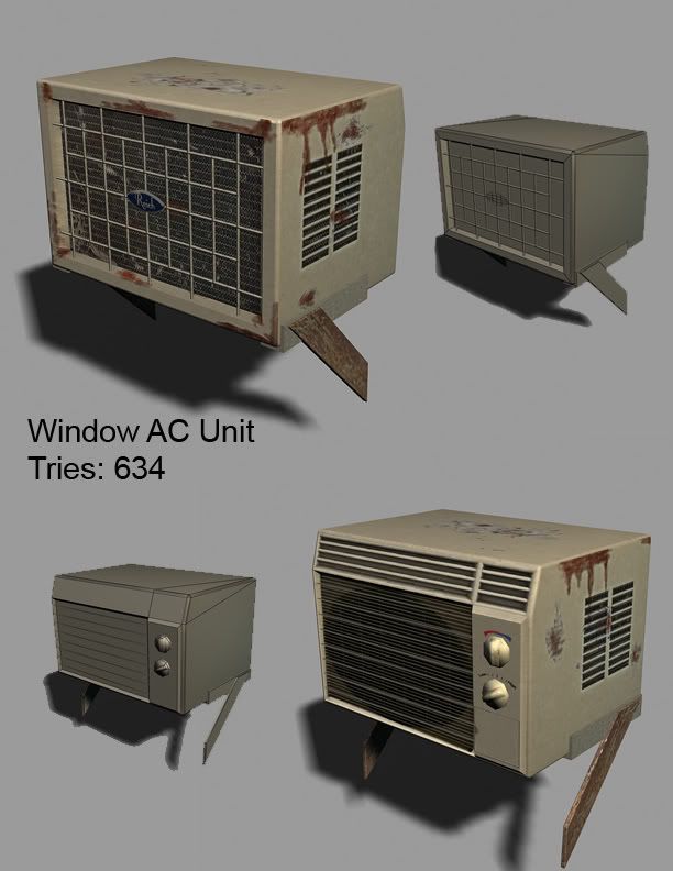
-Enjoy
So AI-OC is working on a level as a large group project. I am one of the environment artists. For the most part speed has been key here, and I have been finishing a building per week.
For the most Part my art lead (Paul..a poster here..somewhere) gives me the concepts and I get it done. Most of the time the building doesn't end up in the game the same way that I constructed it. Using the modular pieces he mix and matches and makes a lot of buildings. My renders are from Max, i'll get Unreal screen grabs when the level is done.
Oh and one last thing, For the most part i am just doing the building, no props. So some seem a little naked.
So here is an update of work.
Shack
-2 hours from start to finish


Fish Market
-8 hours time


Dock Side Store
-3 hour time


Dock
-2 hour
(this is really just a bunch of boards i made for him and board sets so he can put it together however he wants.)


Window AC unit (random prop from another class that we did for this one.)

-Enjoy
Replies
Shack mesh, minus that ding in the left side, is too perfect. If it's that old and rundown based on the materials, I little shake-up of the rest of the mesh is in order. Background color is too bright for this building.
Fish market colors kill me. Neon aqua needs to be bumped back a bit unless everything else around it is also that obnoxious.
Dock Side Store mesh is similar to Shack mesh in that it's in complete ramshackles but still has perfect horizontal and vertical edges.
Dock's wood slats seem to big and thick. This breaks the sense of scale, makes everything look tiny. Again, in ramshackles, but walk-on wood is perfect.
AC unit looks believable.
Everything looks good though, just being nit-picky. Keep us updated on your progress!
As for the Dock Store i just updated it yesterday afternoon and made the wall frames Ect falling over and what not so it's not as perfectly made in a 3rd world country.
As for the Dock, yes the main part you walk on is a bored set so make it easier to assemble. the size and what not can all be adjusted by the level designer thats just how i threw it together really fast.
As for the shack i never really thought about really messing up the mesh. i might look into that but we are getting down to the wire so i am not sure if i will have time to go back and tweak a lot of things. Only have about 3 more weeks before Hurley wants it done (yes we are being sponsored by hurley).
Thanks for the feed back so far though ^^, ill load up my textures in a sec as well.
all are 1024/1024 Textures for the game. Worked on at 300dpi 4096/4096 when created.
Shack
fish Market (roof is on a 256/256 texture, never gunna be able to see that nigh so thats why it's so small)
Dock Shop
Dock
Each bored had unique UV space only because I backed a normal and a light map so i could make each bored just a box and let the normal fake the chamfers ect.
Window AC
And yes that my gamer tag on the Logo, Come to find out no one had done any ACs so they are ALL over the level..so that means my name is all over the place...muahahaha.
I accepted all of your work, which is well done and game acceptable, so this is me just really nitpicking on certain things.
On a whole, it seems like all of your textures were taken straight from an image, slapped on the PSD and shipped to the targa. Their is hardly any manipulation going on with them, and the contrast between all of your individual texture (wood, metals, stucko) are too light and peachy. Having darker darks and lighter lights brings out the form of the object a little bit more so that they pop. Right now, things seem to light without any tremendous attention to darks and lights.
I think your Shack is an excellent example of what you are able to do, to bring out those colors and to bring out those darks. If you apply that same mentality to the rest of your work, your stuff will look awesome.
Anywho, again, this is me just nit picking. We'll have time at the end of the Quarter to revamp some of these, so you will be able to go back over them and apply these critiques to them.
@cholden
The Fishmarket reference.
Butt hey all were manipulated inless it was like the gravel on the roof that your never see or something. But yea they all do look genaro.
As for the contrast thing from what i have understood and read its best to keep contrast and lighting information as low as possible and let the spec and normal handle that. Otherwise you will loose your normal, or it will look really noisy.
As for "i accepted all your work" Please be sure to smack me as much as you can..although you always have something for me to tweak each week. But yea i'f something is lame you better let me know!