Environment WIP: School House [Image Heavy]
polycounter lvl 18
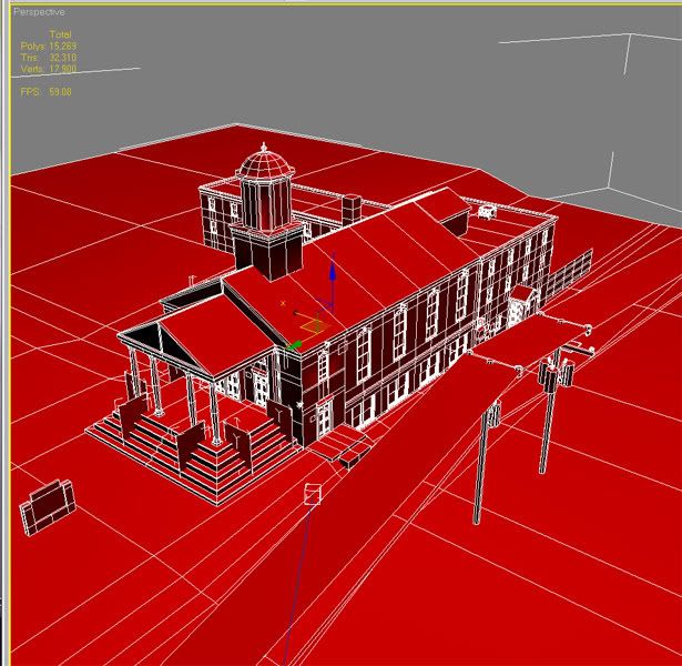
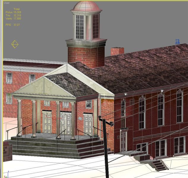
Working on this school that's located about a block from my apartment. Trying to elevate this piece to portfolio quality so any and all critiques are greatly appreciated. Also using this model to work on sharpening my modular modeling and textural skills. Note: poly count in screens includes objects that haven't yet been reduced to lowpoly, School object itself is about 12,000 polys
Couple questions that I need to ask in addition to crits:
1) Is there a way to disable shadows from alpha planes alone w/o using raytraced shadows? Currently I've been working around this problem by detaching faces with alpha textures and excluding shadow casting from the lights.
2) Some of my faces though unwrapped and textured (See the bottom levels of the columns at the front of the school) remain plain and untextured though the faces around them function normally. I can fix this by deleting the faces and remaking/unwrapping them but I'm looking for a faster way to fix the issue.
Thanks!
Renders:
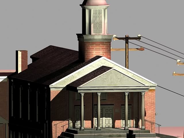
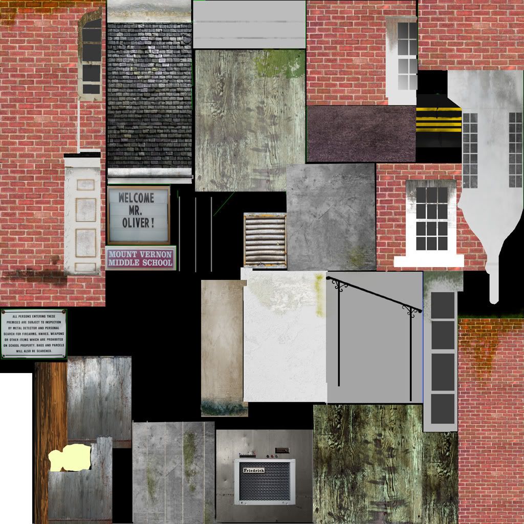
Texture sizes 2048x2048
Couple questions that I need to ask in addition to crits:
1) Is there a way to disable shadows from alpha planes alone w/o using raytraced shadows? Currently I've been working around this problem by detaching faces with alpha textures and excluding shadow casting from the lights.
2) Some of my faces though unwrapped and textured (See the bottom levels of the columns at the front of the school) remain plain and untextured though the faces around them function normally. I can fix this by deleting the faces and remaking/unwrapping them but I'm looking for a faster way to fix the issue.
Thanks!
Renders:
Texture sizes 2048x2048
Replies
Bake out an ambient occlusion map to help make this look a bit more realistic. Keep working on this.
Bricks have noticeable scale differences from face to face, and as GOBEE said, those stairs and handrails look wrong.
Thoughts?
Also, if you post a user viewport grab again, I will fly back to Richmond just to stab you in the neck. It makes it really hard to judge the scale of things, so never use the user view. Perspective only fool!
And take a look at your bricks, man. They are way too big. The ones on that steeple are like 5 feet wide. Another thing...model those handrails. They are right there where the player would see them, so they are worth the polys imo. Speaking of polys, you could save some on the sign, triangle part of the roof, and the stairs on the side. I'll do a paintover for you later. Keep going man, it's looking good. Give some more love to the textures. And try looking at them with no lights to get a better idea. Last thing. Be sure to count the polys by triangles, not polygons. Peace!
Oh, I think what's most off about your handrails going up the stairs is the angle they are currently at. The handrails should be going up the same angle as the stairs.
Some of the scale seems exagerated like the telegraph pole, it shouldn't that big. Generally with textures a bit of noise/dirt would look better, especially at the base of building.
Working on a lot of the suggestions you threw at me, got the stairs a bit smaller, running my AO and I guess I'll build those handrails up a bit to make them more solid, I'll post some updates soon as some of these are done. Meanwhile heres a couple of my reference pics, though I'm obviously trying to age the building a bit more, or at least a bit grungier. It builds character, no? Oh and I decided Brick stairs are a pain in the ass.
And cody... I might just post another user screen grab if that means when you come up here to stab me you bring my 13th Floor DVD back while yer at it... zing. Thanks all!
The powerlines clutter the scene a bit. I'd remove them unless planning to build more of the scene around this area.
If you look at the ref you can see they used some ordering principles when making this building, including axises and grids. It immediately strikes me that you just winged all the placements and proportions. The portico is the most obvious, why did you make distance between the middle two columns bigger?
This also makes it functionally quite strange, if you follow the handrail you are almost bumping into a column, because now they are much closer to the rail.
I'd appreciate any further Crits as I continue to work on this project.
2048x2048 diffuse:
Secondly, you have some smoothing errors on the base of the bell tower, and the window above the side door. That is easily fixed.
Texture wise, you rarely want to use that pure a white in the diffuse, because it can easily be over exposed by lighting. This can be remedied by the specular, however, which you should start working on. Some of your tiling parts could use some work as well. Use the offset filter in photoshop to help fix that. crop the individual texture that you are tiling and play with offset [filters-other-offset] you will see what i mean.
Your texture layout in general is kinda all over the place. Look in the mod-facade threads for some examples of some better layouts. Also having the same wood texture with some photoshop adjustments doesn't look very good. those are for the fence, I assume?
On the model itself, looking a lot better. I see you modeled the handrails, and fixed the stairs, but on the side stairs, there is that huge ledge that is stairs in the concepts. Also, I see some geometry that has some unnecessary lines about. Instead of circling all the exact examples, I will say this...not everything needs to be attached. Different parts can be floating geometry. Trim on a wall can be separate, as can steps. No need to waste triangles trying to attach them.
All these are my opinion, and not necessarily true, or correct. It's just what I see. Sorry if this sounded too harsh, just honestly trying to help a brother out. Wow, this was a long reply.
All in all it is looking a lot better, and I hope you take it farther and make it as good as it can be. Ki for life!
The hand rails look A LOT better. But unfortunately still look off due to the size of the columns. Compare your screenshots with the actual photo reference. Look at screenshot, look at reference.. back and forth, back and forth. You should be able to tell that the hand rails in your scene are almost as long/tall as your columns. Kinda measure the hand rails in your photo ref by eye, and it looks like the columns should be about 2 1/2 times as long/tall as your hand rails. Also what is throwing it off is the exact amount of stairs you have leading up to the front entrance. Now, I don't know if you're modelling this to be exactly the same but if you are, there should only be 7 steps leading up to the front door. You have modelled 9 steps. Delete the bottom 2, and try moving the other steps you have modelled down, and then try scaling the columns up more. The columns need more thickness to them.
Keep it up man! It's definitely getting better!