The BRAWL² Tournament Challenge has been announced!
It starts May 12, and ends Oct 17. Let's see what you got!
https://polycount.com/discussion/237047/the-brawl²-tournament
It starts May 12, and ends Oct 17. Let's see what you got!
https://polycount.com/discussion/237047/the-brawl²-tournament
Arabian Pottery Shop - DS Specs
I'm calling this piece done but would appreciate some input on it. It's an Arabian Pottery Shop that's 902 Tris. After reading some spec sheets they all agreed a game at 30fps could hand 2048 tris onscreen at once so I wanted to keep it under 1000 tris since the characters onscreen would take up the remainder of tris. I figured the player could rotate the screen 45 degrees to the left or to the right so planes weren't an option for the pots. The majority of my textures are 16x16 with the highest single map being 64x64 on an object and 128x128 for the shadow map. I don't know if the DS can handle maps that size though, couldn't find anything on that. If anyone has official specs on the DS please share.
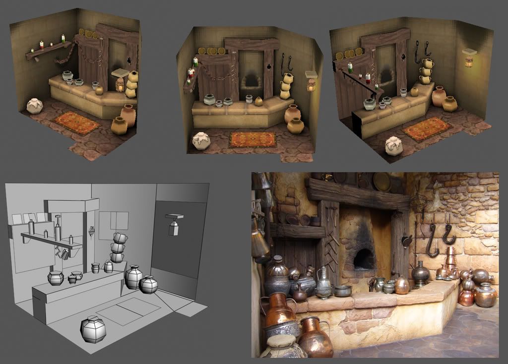
Up-Close Renders (I know you'll never see this on the tiny DS screen but I figured I'd show the little details for people to scrutinize:poly124:.)
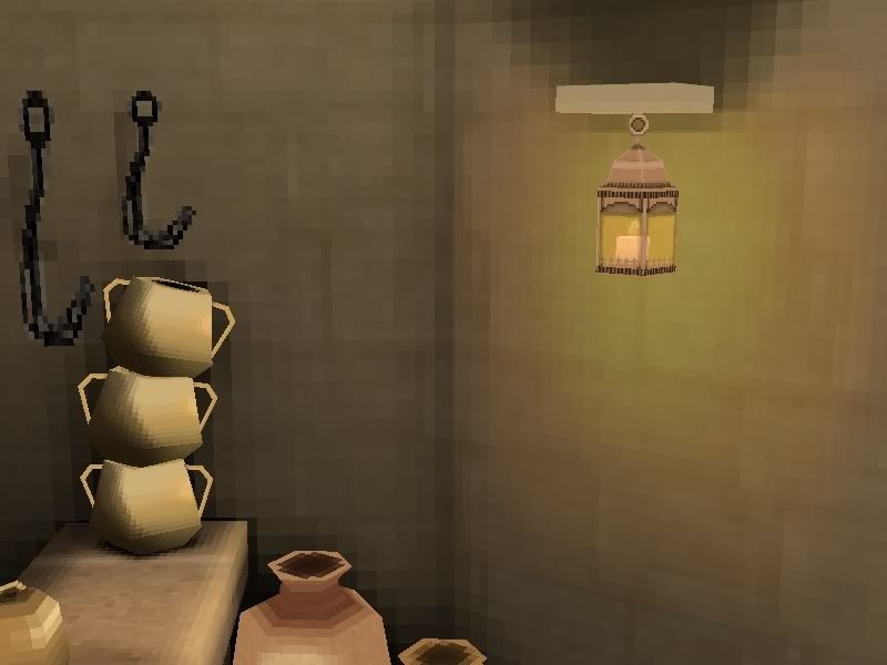
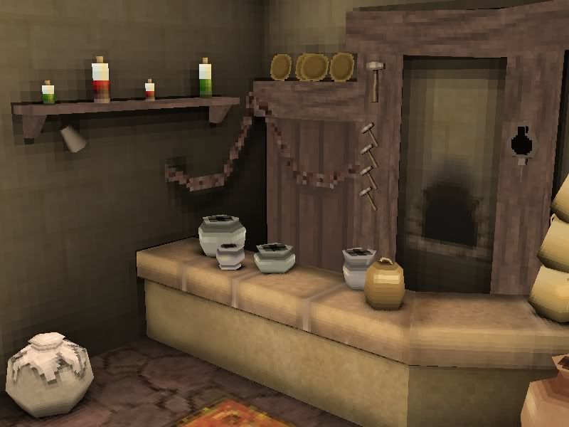
Lemme know what you think:)

Up-Close Renders (I know you'll never see this on the tiny DS screen but I figured I'd show the little details for people to scrutinize:poly124:.)


Lemme know what you think:)
Replies
From what I know the DS can handle 512x512 textures but most of the time you won't need more then 256x256 (and this just for backgrounds and maybe characters) because the screen resolution is smaller then 512
DS also has less colors then Windows does. I like to index my textures to 256 colors... gives a better idea of how it will look on the console. This might mean that you won't get that nice gradient in the light color.
"After reading some spec sheets they all agreed a game at 30fps could hand 2048 tris onscreen at once so I wanted to keep it under 1000 tris since the characters onscreen would take up the remainder of tris"
it's not 2048 tris in total for your scene and characters - it's 2048 RENDERED tris. Everything is backface culled, you're never rendering anything you can't see. If you select all your polys from a camera pos with "ignore backface" switched on, you'll probably be surprised at just how few triangles you're rendering. Probably less than half of your total.
texture wise, i also think you're underestimating what you can get in. You've effectively got about 512k of vram - it's all split up into chunks, not all of it is usable for everything, but it's good as a sort of ballpark figure. Uncompressed, a 64x64 texture at 256 colours would be 4k. Compressed, this would be 1k for the texture and then whatever you need for the palette (compressed textures can use hundreds of colours). Dunno if the ninty compression photoshop plugin is available to the homebrew crowd though
Not entirely sure of the actual maximum texture size as defined by hardware... PSP is 1024x1024, i seem to remember DS might be bigger than that. It all depends on what you can squeeze into VRAM at any given time really. Difficult to second guess without an engine in front of you, but 64x64 is a good ballpark for a working maximum for environment textures. Optimise down from this in halves rather than quarters since you can have rectangular textures, as long as they remain power of 2. So 64x32 is half of a 64x64 and depending on how you map and render it, it can be just as high quality onscreen. It's a useful technique and allows you to be as wacky as you like while getting the absolute most from your textures ... 128x8 is a favourite for trim with a really nice non-repeating pattern on it
set yourself up renders at 256x192 with anti-aliasing and filtering switched off to try and judge what you can pick out onscreen from your cameras. If it's a fixed camera distance, you need to try and get rid of stuff that just flickers and turns into glitchy noise, it can be really grim
especially more contrast and edge highlights on the wood bits, it all sort of blends together.
The soot marks on the stove kind of blur the shape of the opening
Still, this is very sexy and I like it alot