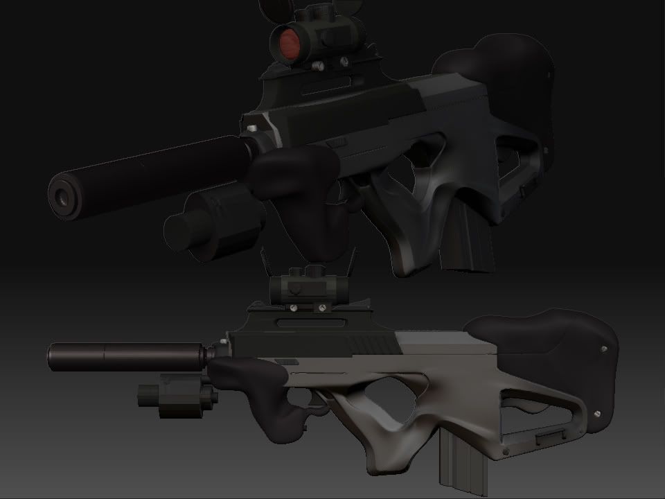
Seburo MN23
I just wanted to work a bit on my Subdiv modelling skills(which i lack totally), so i thought modeling this Seburo from Ghost in the shell might get me working.
It's so easy to dwell in the forest of Zbrush/Sculpting and forget the modeling basics and so on..
I don't know it's going pretty slow, still trying to feel the freedom of the last days before school starts again
Don't mind the strange looking materials for some of the parts, i just tried out some stuff in Zbrush.
Althought the whole model is just Maya right now.
Ey! And also, the antialiasing is making some lines appear more strange then they actually are..
It's intended to be a game model, so this is just the highpoly so far. Some more tweaking to do on it.
Will update soon!


Replies
http://johnyontehspot.com/folio/images/mn23render01.jpg
[edit] found the file, and i dont care if you want it or not! HA
MN23 cage
Oh mega cool! EarthQuake
I've been lookin' a lot at your thread here:
http://boards.polycount.net/showthread.php?t=53731&page=4
U got some really good pipeline goin' on there, helped me a lot!
Kinda inspired me to make a weapon for sub-d training too!
But dang, where did u find such nice reference pics?
I only got some very blurry ones, so i've been makin' up stuff as i go..
A lot of stuff makes perfect sense now!
Thanks for both image and file!
However, Now i know i got a lot of stuff to change!
And that both kinda sucks and feel alright at the same time, tingly feeling.
Because of lack of good references i was never really going for the authentic Seburo look, soo.. We'll see what i do now ;D Im torn
The design is by shirow, so just google image search things like seburo, mn 23, shirow, etc.
yeah i don't know, since i didn't see so good how it was shaped before, i just took myself some liberties in the shapes, like around the handle and where the clip goes in, instead of having it totally blank there i put some lines from the handle to make it more streamlined.
So now i don't know in which direction i wanna go,, do something own about it or try and replicate the orgininal better.
Actually, At first i wanted to do a Famas/Seburo clash thingy, but i think i got more excited about the details i could see on the Seburo.
I will definately come back with a better render + now i've had some work done,
but im totally exhausted now and will just coma-myself into bed
thanks for all the nice courageing words!
Yeah im a sucker for their materials to, plus it's so much faster and easier(at least for me) to see how the end result will be, since im not very good at rendering..
Well, hm i have perspective view on and not orthographic, or maybe u want me to crank up the focal lenght? i don't get it
I only know of 'perspective' under the deformation tab....but that only skews the crap outta your model. Not a handy tool
haha how did u even find that one?
i really had to look for it..
Here u go mate;
Now i really have to sleep...
Saidin: Thanks
alright then Id say for your next zbrush render up the perspective a lil more.
Also I will say I am not a big fan of AO renders...I remember back in my first year of 3d animation everyone was like 'OMG Ambient Occlusion BONER!!!1' and I thought it was sick too, but its really not the best way of showing off your modeling skillz, since it really flattens your model. AO's really good for baking down into your diffuse I find, unless of course I just dont know how to render AO for crap =$
i'll get to that too now since im awake now.
Although maybe not so much improv might be seen, i've been strugglin' movin' vertices and shit to make it look more like the original(thanks EarthQuake), Although some design aspects i might keep from my original idea..
What i have left to really fix is the front handle (black part), tweak the main handle, and also work on the shapes of the flashlight/lasersight.
Then after that i think i might head on to the lowpoly..
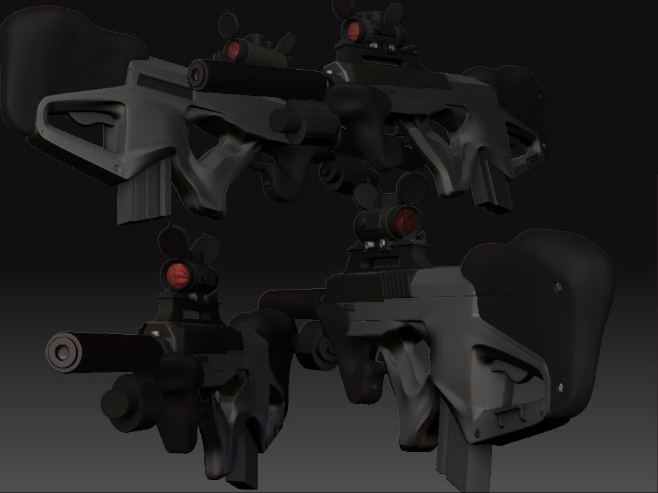
Crappy screengrabs!
Its lookin good so far and you've got the best reference of all to help!
I find a lot of times when i struggle changing complicated shapes, its because i added detail too early. You know cut in extra edge loops to retain hard edges before i had the form really set. I tend to just remove all those edges in that case, go back and tweak the initial form and then add the loops back in when i'm happy with it.
Also, dont be afraid to entirely scrap areas as well. I find a lot of times i'll make mistakes like not have enough geometry in my cage mesh, and you can sit and tweak it forever, but if you really dont have the support there its going to be tough to get results. So sometimes its best to just remodel a peice, you generally will remake it a lot faster and with a better appreciateion for how the flow/form should work out.
I've been scraping a lot of shit actually lately.. I have learned some really true lessons on this project. And i feel like i would start in the right end the next time i do something similar, however this time my pride stood in the way a lot of the time, about starting from scratch instead of rebuilding
Thanks for so much inspiration, kind words and help so far! Don't stop!
Sorry EarthQuake my weapon master gunsmith, no cagemesh wire image today. Will do soon!
BUT..
Here's an update with a little less flat AO render!
Will tweak some more with the shapes and get some jagged edges fixed and stuff,