Hammer and Shield of Sigmar
My cheesy Warhammer model.
This was an assignment for a modeling and texturing class. We were taught ZBrush and told to do the normals in it. Learned a lot on how to do ZBrush modeling. Learn what not to do in Zbrush modeling hehe. Secondary focus of this class was texture work.
Gold sucks :[
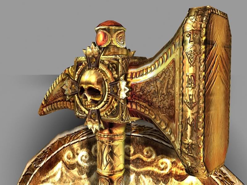
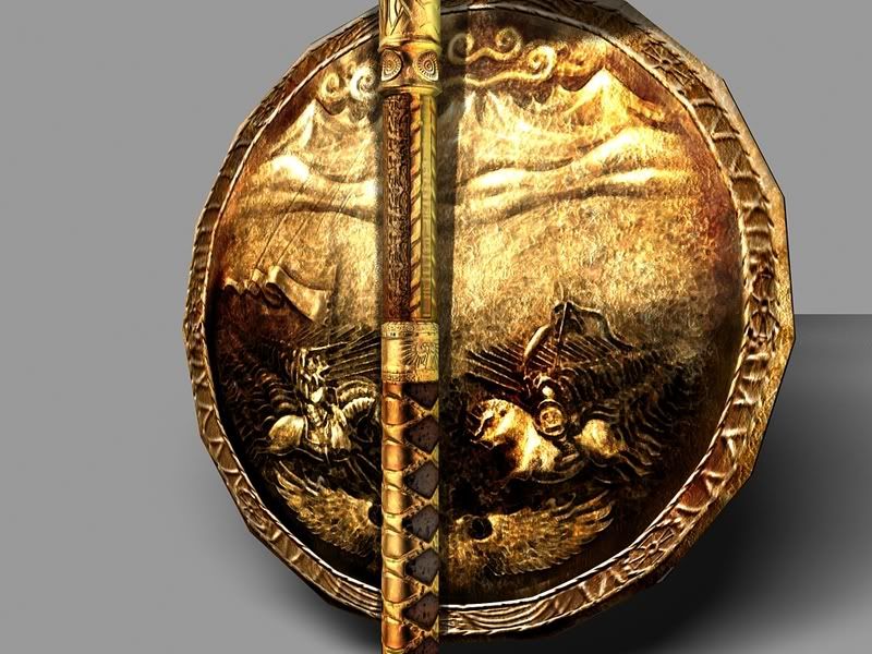
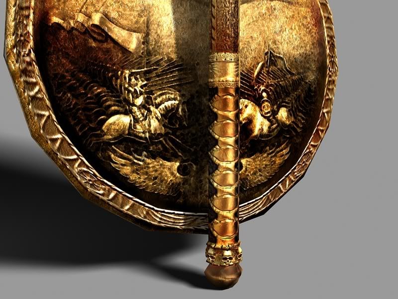
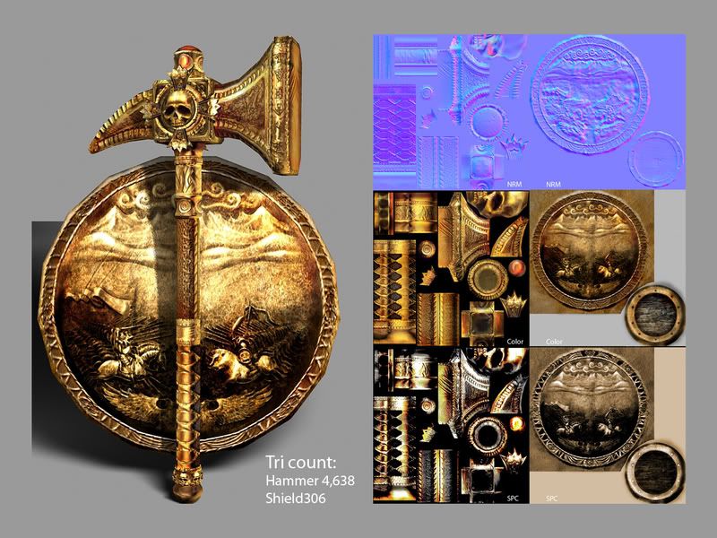
Teacher wasn't counting tri's, but I tried to stay conservative. Was given a note that the shield could be more rounder. I tried two techniques for Zbrush. One, modeling off of the texture (shield) and modeling just free handed (hammer). I defiantly like the latter much better.
On a side note, I know about that line in the middle of the skull. It's driving me crazy and I don't know how to get rid of it. It is mirrored, so I'm figuring that has something to do with it. No, it's not the UV's. I certainly checked.
Anywho, any tips on making this better or general observation is welcomed.
Cherrio
This was an assignment for a modeling and texturing class. We were taught ZBrush and told to do the normals in it. Learned a lot on how to do ZBrush modeling. Learn what not to do in Zbrush modeling hehe. Secondary focus of this class was texture work.
Gold sucks :[


Teacher wasn't counting tri's, but I tried to stay conservative. Was given a note that the shield could be more rounder. I tried two techniques for Zbrush. One, modeling off of the texture (shield) and modeling just free handed (hammer). I defiantly like the latter much better.
On a side note, I know about that line in the middle of the skull. It's driving me crazy and I don't know how to get rid of it. It is mirrored, so I'm figuring that has something to do with it. No, it's not the UV's. I certainly checked.
Anywho, any tips on making this better or general observation is welcomed.
Cherrio
Replies
The runes on the hammer spell out the name of it, 'Ghal Maraz'. It's written on both sides in the Dwarf rune language.
A fried told me about expanding the normals. I'll try this tomorrow. Thanks man.
and "Ghal Maraz"? I need to catch up on my Dwarfin
@EricV
I was surprised that it was high to (I only realized it when I was finished with everything~~). The majority of the tri's are going towards the skulls. I just copied the first one and used it for the bottom ones. Not very bright~~ I was in a crunch at the time and was to tempted to use the easy copy-paste tool. Have to keep that in mind next time I use it. Luckily, it's not a hard thing to fix.
@Justin_Meisse
Yeah, your right. If I were to move a light around it, nothing would change, just the shadows hehe. Less "bling" on the baking, or at least tone it down some. Might give that a shot latter on this week.
Thanks for the help gents.
...you can probably cut some polys here or there though.