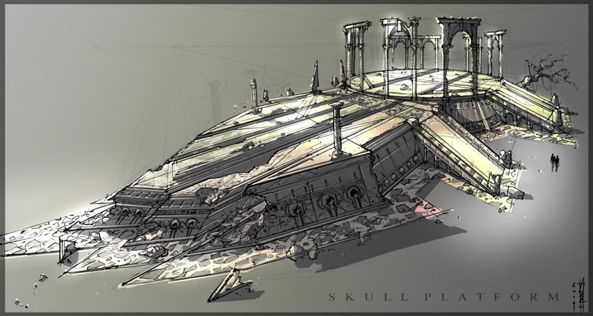
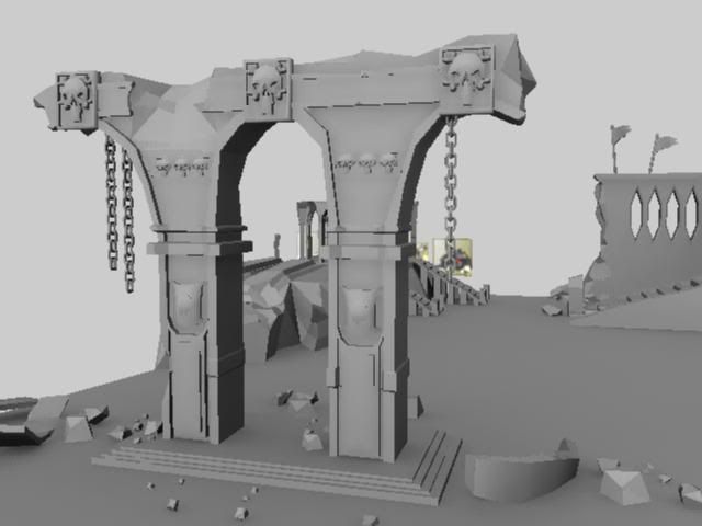
Home 3D Art Showcase & Critiques

Skull platform

This is my second new environment I have been working for about 4 days.

Its a SKULL PLATFORM/RUins/wall

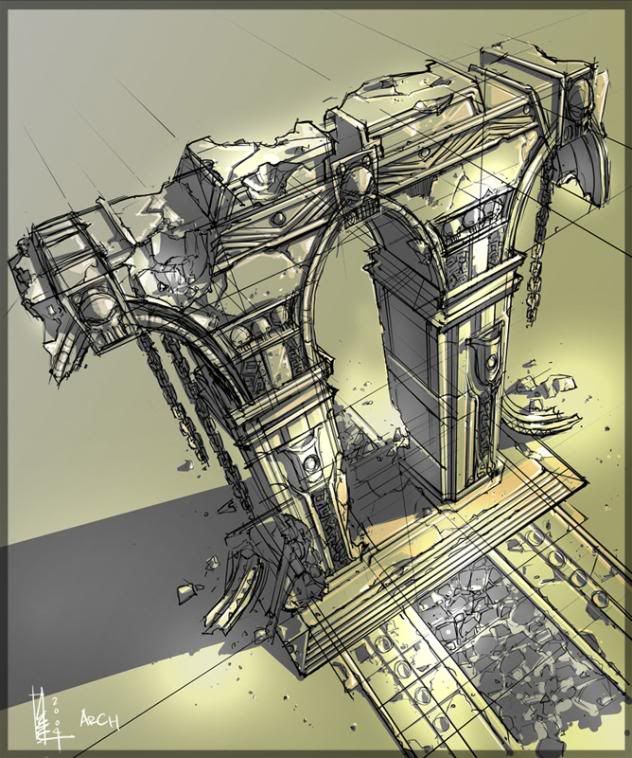
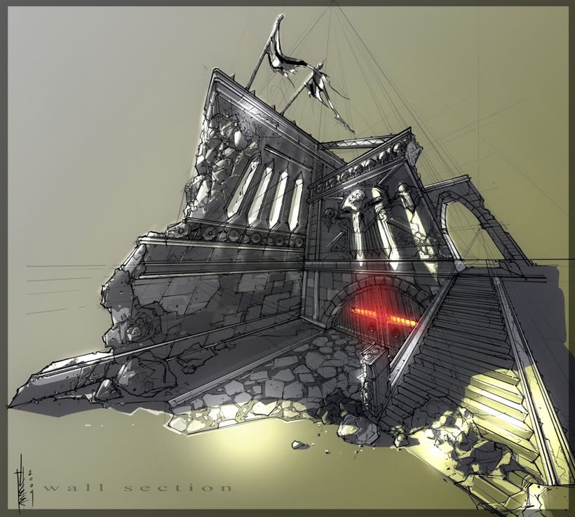
here are the concepts Im working off of.

arches.jpg

wall.jpg

skull_platform.jpg

skull_platformwire.jpg

Example2.jpg

Example1.jpg

Crits and comments are welcome.. thx in adv.

Replies

  • AsylumSeaker
    Options
    Offline / Send Message
    Looks pretty cool so far.
    The perspective on those concepts is great.
  • ghib
    Options
    Offline / Send Message
    I dunno, the perspective on the 2nd one is messing with my head and those perspective lines you left in are a bit distracting. Rest of it looks great tho.
  • Toast
    Options
    Offline / Send Message
    Toast polycounter lvl 11
    The perspective does look good, it'd be nice to see it translated into the renders! Good work, looks like a solid model.
  • Michael Knubben
    Options
    Offline / Send Message
    Since the concepts say '2004', I'm willing to bet these aren't made by the original poster. He failed to mention it, but I guess he only made the model, and is therefor looking for crits on that.

    I'd like to see the perspective of the concepts in the scene some more. It all looks a lot more tame without it, and I don't think we're getting a good sense for how well you re-created the concepts unless you show it to us with some more extreme camera angles.
  • ynotul
    Options
    Offline / Send Message
    Sry to mention, These are not my concepts.

    thx for comments.
  • JohnnySix
    Options
    Offline / Send Message
    JohnnySix polycounter lvl 16
    ynotul wrote: »
    Sry to mention, These are not my concepts.

    thx for comments.

    The platform/archi is great, the only minor crit I have is that the skull itself seems really cartoony looking, when compared to the concepts - need something more evil and badass!
  • ynotul
    Options
    Offline / Send Message
    JohnnySix wrote: »
    The platform/archi is great, the only minor crit I have is that the skull itself seems really cartoony looking, when compared to the concepts - need something more evil and badass!

    lol ..yeah i see what you mean.. hopefully the texture will bring out the evilness i'm hoping for.
  • rooster
    Options
    Offline / Send Message
    rooster mod
    reminds me of q3a
  • ChrisG
    Options
    Offline / Send Message
    ChrisG polycounter lvl 14
    ynotul wrote: »
    lol ..yeah i see what you mean.. hopefully the texture will bring out the evilness i'm hoping for.
    All you really need to do is angle the eyes down slighty, imagine your angry your eyebrows point down. Atm the eyes on yours are very much striaght.

    hope that helps
  • imb3nt
    Options
    Offline / Send Message
    imb3nt polycounter lvl 14
    really cool. can't wait to see more progress.:thumbup:
  • ynotul
    Options
    Offline / Send Message
    I was planning to put this scene with a cliff in the background surrounding it.

    Was wondering on how you guys would do that type of stuff?

    I was thinking about vertex painting..at first glance.
  • ynotul
    Options
    Offline / Send Message
    Hey guys/gals.

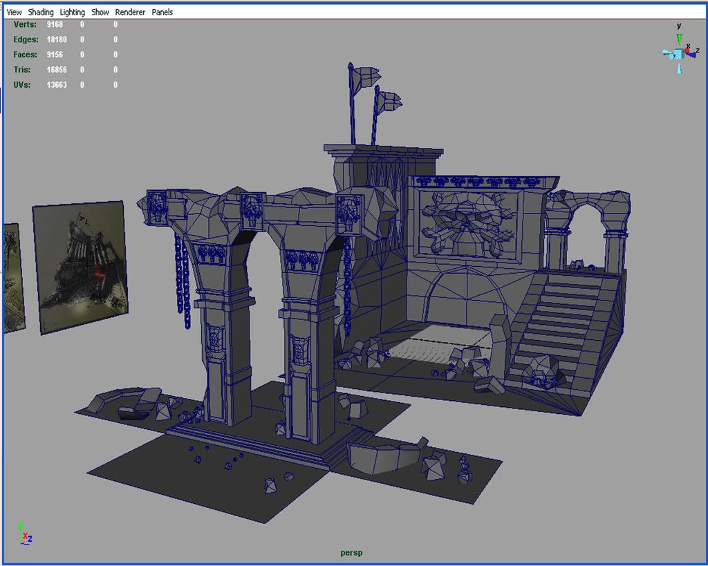
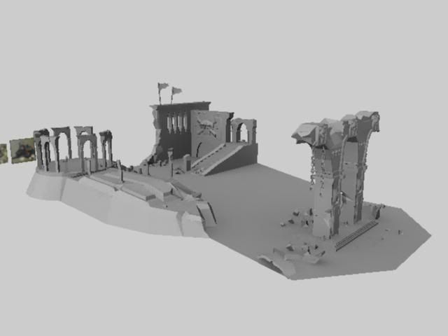
    Just wanted to update what I did...

    PS: my lightning sucks atm...currently still playing around with it.

    4.jpg

    3.jpg

    2.jpg

    1.jpg

    comments and crits are welcome..ideas how to make it better..FOR SURE. thx guys.
  • Kawe
    Options
    Offline / Send Message
    Kawe polycounter lvl 8
    post the textures :)

    things look stretched as well as low res... and weird scale.
  • rooster
    Options
    Offline / Send Message
    rooster mod
    hmm texturing so far looks like you're making something different to the concept
    as kawe mentions too the scale looks completely different too. I would take another look at what you've changed from the concept and why you've changed it

    edit: for example, some of your skulls look kind of cute, and you changed the stone block wall for a sort of miscelaneous dirt texture. remember not to checklist that you've got the bits from the concept, but also that they *feel and look the same
  • Indecom
    Options
    Offline / Send Message
    Indecom polycounter lvl 16
    okay, so this is like disgusting, those architectural drawings you made almost made me throw up due to the sheer amount of talent and patience you spewed into them, disgutingly, inhumanly awesome.

    Liking the model progress, but its looking a little flat texture wise, i'd maybe lower the contrast on the textures and add some normal mapping or bump mapping maybe. havent read through the whole post so i dont know if you said you were gonna or werent, but it would help a lot.
  • RobStites
    Options
    Offline / Send Message
    RobStites polycounter lvl 8
    ynotul wrote: »
    Sry to mention, These are not my concepts.
    Indecom wrote: »
    okay, so this is like disgusting, those architectural drawings you made almost made me throw up due to the sheer amount of talent and patience you spewed into them, disgutingly, inhumanly awesome.

    Looks like low res stone texture tiled over the whole thing. If you're going to go low spec you need to work much more implied shape into the texturing, right now everything is very flat. Also, the detail that is in the texture seems misplaced and noisy, I think it's hurting more than helping.
  • ynotul
    Options
    Offline / Send Message
    yeah..low res..that might be the problem..and i did throw some bump mapping into it.

    Guess I better get some better textures.

    Ill update soon guys.

    thx for the posts.!
  • Indecom
    Options
    Offline / Send Message
    Indecom polycounter lvl 16
    ah, i see why they were so good then. Like i said, i skimmed over the post, lol.

    Good model progress. Perhaps using normal maps instead of bumpmaps would add to the overall effect and feel of the images, and decreasing the size of the textures, or layering more textures over top to add detail and reduce repeating.
Sign In or Register to comment.