The BRAWL² Tournament Challenge has been announced!
It starts May 12, and ends Oct 17. Let's see what you got!
https://polycount.com/discussion/237047/the-brawl²-tournament
It starts May 12, and ends Oct 17. Let's see what you got!
https://polycount.com/discussion/237047/the-brawl²-tournament
model(s) to crit!
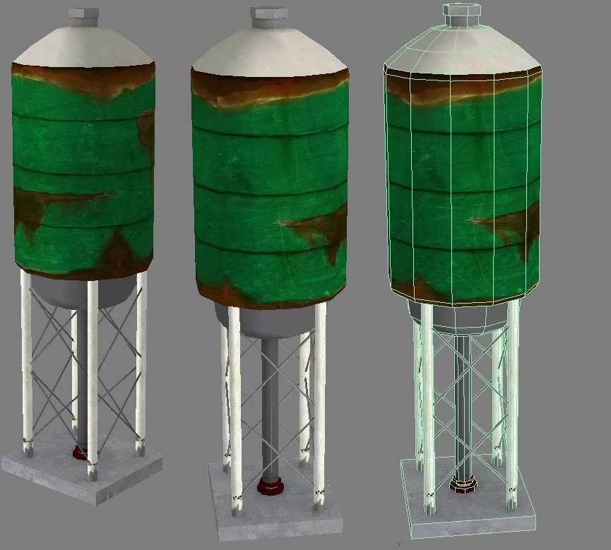
Im making a old container (maybe make it into a scene) would like some crits where people see fit


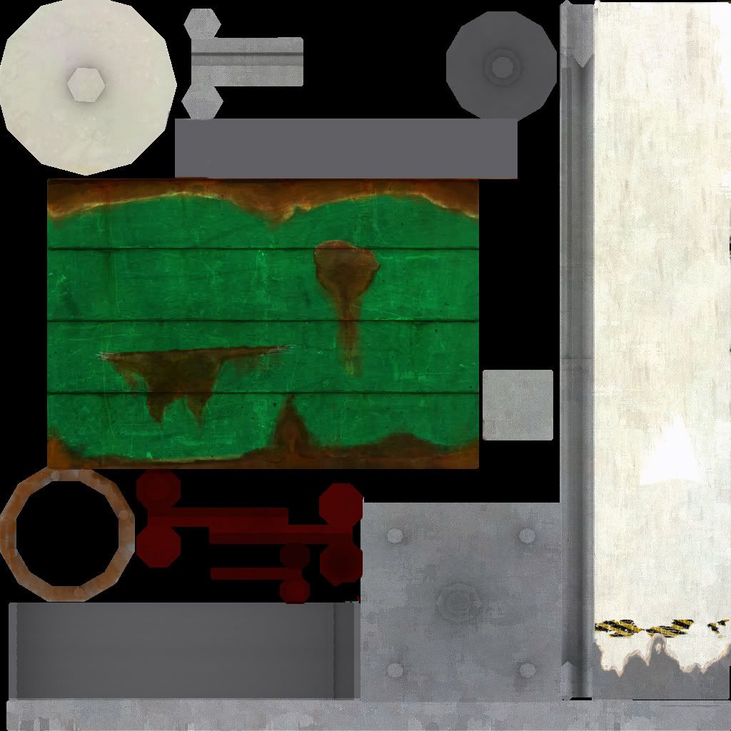
I have only really textured the main body, everything else is just block colour over the base (apart from the legs which I have kinda started)
I see the seem in the top picture and have blended in the rust (I hope people can see it as rust!), I still am going to add wear and tear along the lines in the metal
thnaks
chris
Replies
- you have some texture seams, have a look here for a possible way to get rid of them:
http://www.gamasutra.com/features/20061019/kojesta_01.shtml
alternativly you could use tools such as polyboost, bodyPaint, enzo3d,.. to clone stamp parts over it
- depending on your final lighting either engine or rendeirng I´d go for more color variation,- the example I painted over has a light sun touch
- if you have not yet reached the poly limit for the prop,- try for more details (same goes for the texture)- You could add e.g: bolts, signes, wires/ropes, signs, ... and lots of other stuff. In most cases it would add a whole lot more to the game/ or movie.
- have you tried rendering a ambient occlusion or some other alike dirt map ? ,- it might create soft shadows for you to add to your texture so that it looks like dirt is still between parts soft blending in and out.
http://www.xnormal.net/2.aspx
xNormal is a free tool to do such (alternativly also possible in max but a pain to setup)- blender is also quicker with such. But I recomend xNormal,- once installed goto tools and pick simple Ambient Occlusion generation- load your mesh (e.g as obj file) and hit render.
I did render a ao but I have changed the uvmap since then so maybe a good idea to render another.
Dekard, I have based it off photos I have found from cgtextures other sites and the ones found in crysis (well the x's running down the side of it was taken from crysis)
I will carry on later but right now the sun is out and i have been inside too long!
chris
Also don't be afraid to detach end caps, on cylinders, it can create smoothing problems if you don't. It also makes for a better arrangement, harder to keep track of but you could weld it while your arranging and detach before you export.
You need to think of your object as a whole piece not just each UV island as you do the materials. You have A LOT of rust up top, and none of that has trickled down to the lily white poles or even stained the ground. Its a big reason why your pieces aren't working together.
The top is fairly under-detailed and blocky. I'm not sure what your target or current poly count is, but it won't hurt to round it out a bit more and add some detail. Think about adding a ladder up the side, and cat walk around the top, (for inspectors). If you're concerned about poly counts, you can do some good things with transparency maps, just make sure they aren't grayscale as they'll start to eat up more resources then they're saving.
the reason for the lack of texture else where is because there isnt any :poly124:. well there is but only a basic colour a metal base and the ao overlay, I have only started the main body, You suggestions about stairs and things is a good idea, I feel it is alittle bare atm , updates soon!
Also I didnt mean for the model to come out at such a low poly count, 313, so Im going to probably double it to 600, smoothing it out etc.
chris
quick mock up of how it could turn out
what dose anyone reckon, ignore the textures if I went ahead with this idea I would make different textures for the other silos, maybe have one of the silos fall over.
Also I have used a single plane, which is just to show the floor, ahould I use this and an alpha or use real geometry for the final idea? Im aiming it more for this gen
crits and comments welcome or a paint over if you are feeling arty:)
chris
note*sorry about compression
I think I will lower it to a 512, but 256 is blurry even with sharpen filter