Construction Site Environment
Hey all,
This is my first time posting. A friend talked me into it, and I look forward to some input.
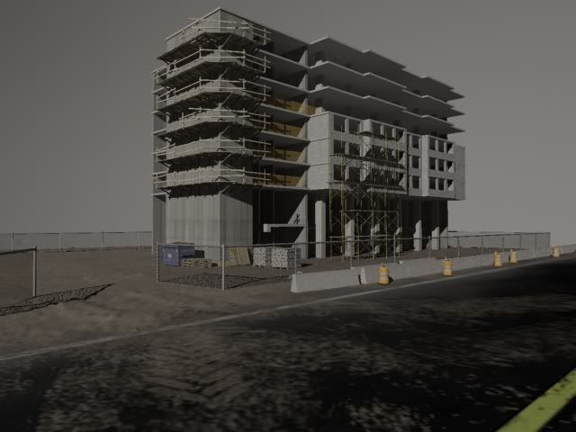
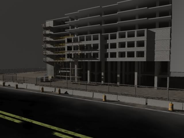
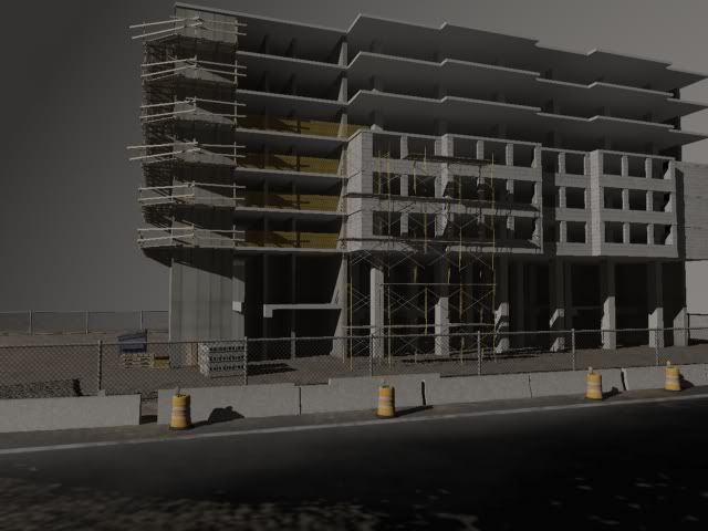
This is my first crack at an environment in 3ds Max. I am pleased with how it is coming along, but it's definitely a WIP. I would appreciate any critiques/feedback on both the project, and the nature of my posting.
Thanks in advance,
Joe.


Replies
Keep at it.
I am sure some of the more senior members can be of more help then me
Woodridge? You wouldn't happen to be a student at Westwood there? Just wondering because that's where I go.
I really like the amount of detail you have put into the geometry of the building, for there is a lot to look at.
The texture of the road and also the dirt on the road looks a bit blurry/low res. The texture of the road looks like it should be somewhat lighter too.
As far as your posting goes, perhaps some screens of the wireframes, some texture flats, and also some more up-close shots of the building, showing a closer view of the dumpster and wooden palettes and what not.
Overall it is looking pretty solid and showing potential.
Hope that helps.
The lines on the road look too big, especially the yellow lines in the middle. I like the dirt/mud that has been tracked onto the road, that is a nice touch. However, the track left by some construction vehicle seems a bit larger also. And I would also make those orange cylinder construction things, whatever they are called, bigger and a bit more vibrant orange. They seem a little pastel, and all the ones I have seen look a bit more vibrant and rich orange.
I know this a new WIP, but if you really want to beast it out, I have suggestions on what you can add. A trailer for one is something you almost always see at these sort of sites, for the management to sit in and pretend to look at the blueprints all day. Also some sort of construction equipment lying around, even if it isn't a huge crane, or bulldozer. Maybe one of those small concrete mixers, a generator, or just a toolbox or two and some power tools. Also, those tube things that they throw trash down going into that dumpster would be neat. And maybe some blue tarps and orange mesh fence that they use sometimes to protect their shit from weather and other crap would add some color and a more organic part to it.
It looks like you are doing a good job using modularity, and looks like it could come out pretty realistic. Keep crackin' at it.
Here's some ref that could help...
http://www.hermann-uwe.de/files/images/construction_site.preview.jpg
http://www.nycondoblog.com/wp-content/uploads/2007/04/brompton-construction-site.JPG
http://upload.wikimedia.org/wikipedia/commons/b/bb/Construction_Site_Seattle.jpg
http://trinhguide.com/images/construction-site.jpg
Thanks again,
Joe.
Please feel free to look at the construction site I did on my website.. take some notes on what I did right and what I did wrong. I had a tough time texturing everything and getting the proportions right. Especially the street.
There is also another student who did a contruction site at my school after I did. Go to my schools website, http://www.vanarts.com/galleries/index.php?story=../galleries/center/gad.php and under the Game Art & Design gallery look at the student reel for Lisa Fecko. Her texture work is pretty good and might also give you more ideas.
What or where is your reference? What else do you plan on adding to populate the area? There is so much you can do with what you have. You look to be on the right track so keep it up! Hope my info helps and I look forward to seeing your progress.