Home 3D Art Showcase & Critiques

My First Modular Building

polycounter lvl 9
Offline / Send Message
timwiese polycounter lvl 9
I got the idea to make one of these after looking at some of the entries into the contests and challenges section.

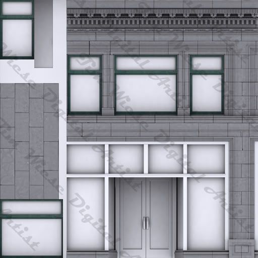
This is my first try at making something modular like this, and the texture is still very WIP. I have a high poly made of this as well, so far i have only used it for baking AO, but I will be getting the normals from it as well.

My goal for this building is to have it look relatively new and not in a bad neighborhood. so there wont be excess amounts of grime and graffiti.
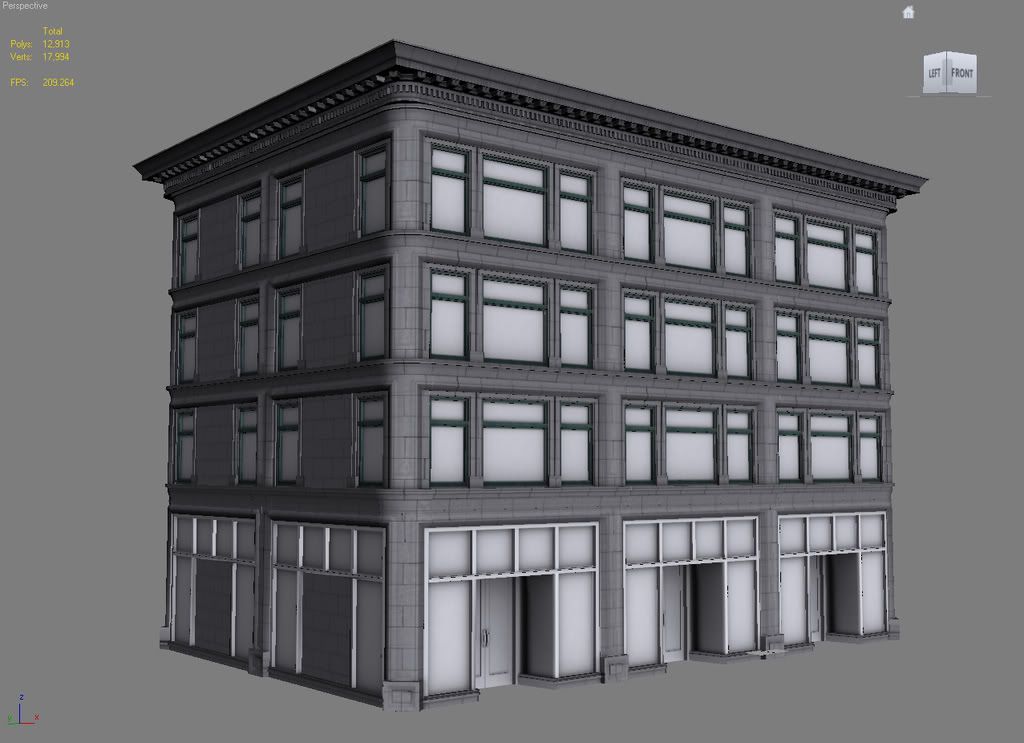
viewportgrab1-1.jpg

Texture-1.jpg

Any comments and critiques are welcome.

Replies

  • Tumerboy
    Offline / Send Message
    Tumerboy polycounter lvl 17
    looks like a good start on modeling. I question your Unwrap. While the model chunks should be modular, and tiling is important, I think you should break some things (windows/frames/etc.) out, and give them proper UV space so that you don't get crazy stretching (specifically around the doorway)
  • renderhjs
    Offline / Send Message
    renderhjs sublime tool
    you forgot the watermark in the 3d screenshot :P
    nice model, the texture still has some little space: maybe some xtra house lights or other smaler stuff?
  • timwiese
    Offline / Send Message
    timwiese polycounter lvl 9
    Update*

    Pic7-1.jpg

    I am thinking about what to do with all the dark windows.
    Those are going to be windows with no shades in them so they look strange because you can't actually see anything behind them.
    I am thinking about giving them a slight transparency and just throwing some random props I have made behind them to sort of fake an interior.

    Still need to work on a specular map as well.

    and some areas that have slight texture stretching i need to fix.

    I am also starting to think this could benefit from a bit more grime in the edges and corners, some areas are just too clean.
    you forgot the watermark in the 3d screenshot :P
    Hmm maybe I should just apply the texture to the model with the watermark in it. can never be too safe. lol
  • timwiese
    Offline / Send Message
    timwiese polycounter lvl 9
    *Update again

    Pic8-2.jpg

    Still some parts that I need to fix but I am close to calling this building done.
    I will give a nice sidewalk to sit on though before I finish this piece.
  • EggE
    Offline / Send Message
    EggE polycounter lvl 11
    i like how its looking so far, i especially like how slapped on a different texture on two of the windows to break it up a bit. the thing that doesn't look right to me is the lower left side of the image, ground floor...that has to be the thinest brick layer ever, i think replacing that with the windows is an improvement because most office buildings on the ground floor are pretty much glass.
  • timwiese
    Offline / Send Message
    timwiese polycounter lvl 9
    I changed the brick to a window, it does look much better now I think.

    Pic8-3.jpg
  • timwiese
    Offline / Send Message
    timwiese polycounter lvl 9
    I have been done with this for a while now just thought id update and post the final.

    FinalRenderWire.jpg
    Pic19.jpg
  • Ged
    Offline / Send Message
    Ged interpolator
    nice work, my only crit is that it lacks colour, almost looks like an AO only render. I mean even gray bricks arent really gray in real life, they have discolourations(very subtle but it could make a good difference)
  • carlo_c
    I agree with Ged about the colour issue, maybe some reflections off the windows could bring colour into the building if you didn't want to give the bricks anything.

    Or a lower sun would cast the building in a nice orange glow :)
  • kary
    Offline / Send Message
    kary polycounter lvl 18
    It does look nice, and the colour crits would be a main concern for me too. In the brick pattern a pair of things stuck out to me. The one edge in the middle grabs the eye, and shows off the repeat in each story. The lower one looks a little odd to have a brick pattern there, would expect something decorative or a keystone type look.

    paintoverpm4.jpg

  • timwiese
    Offline / Send Message
    timwiese polycounter lvl 9
    Pic21-1.jpg

    Changed up the mentioned areas. The updated texture itself has more color variation added to it then this render shows, I will try playing around with different sun settings to see what kind of colors I can bring out as well.
  • Wells
    Offline / Send Message
    Wells polycounter lvl 18
    flip the UVs on some of the brick walls between windows on the skinnier side. right now it's way too obviously duped

    looking good, though!
  • SHEPEIRO
    Offline / Send Message
    SHEPEIRO polycounter lvl 17
    nice, spend some time on that pavement though, bit "doughy", also add a ref map to the windows if you can.

    one little crit, is that alot of your poly detail you have could be better served by normal maps, this would help with image quality when rendered without high quality AA. particularly in you rtrims, esp the trim at the top.
    if you use normal maps baked from high poly in these areas, the sharpe edges will mip-map out at distance giving you a much less fizzy images, very good when you have alot of parallel hard-edged lines like in your trims.
    again not really an art crit but if you were to get it in-game would improve the way it rendered no-end.
  • imb3nt
    Offline / Send Message
    imb3nt polycounter lvl 14
    looks really good.
    well done. :thumbup:
  • Minos
    Offline / Send Message
    Minos polycounter lvl 16
    Looks really good. Would you mind posting an screenshot with all the different modular pieces?
  • timwiese
    Offline / Send Message
    timwiese polycounter lvl 9
    Here is a screenshot of the parts of the modular building.

    modularPeices.jpg
  • bluekangaroo
    Offline / Send Message
    bluekangaroo polycounter lvl 13
    looks pretty good. I would say you could get away with a few less sides on that corner piece
  • Talbot
    Nice job! I love the light of the later WIPs
Sign In or Register to comment.