Home 3D Art Showcase & Critiques

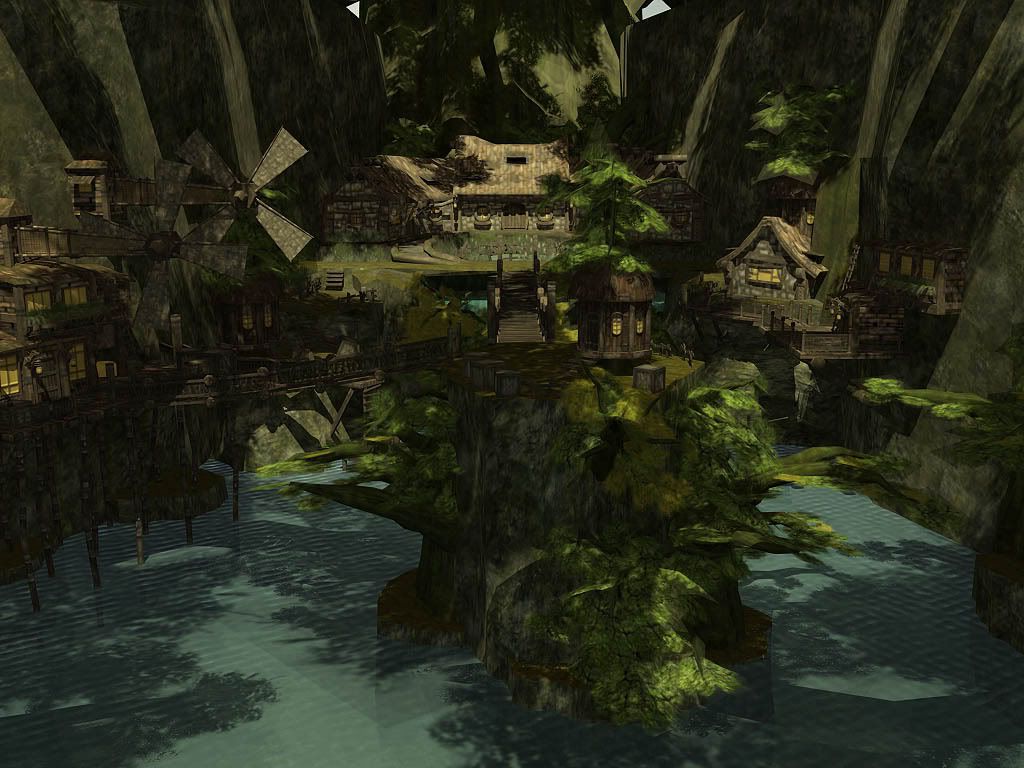
Environment: the place I want to live in the future.

CliffHouse.jpg
Still updating. All critics are welcome. Thanks.

Replies

  • Kawe
    Offline / Send Message
    Kawe polycounter lvl 8
    here's some critique:
    - I don't want to live there
    - water is repetitive
    - the middle building "pops" out but there's nothing that leads up to it. so I didn't really notice it until I started looking manually for something to rest my eyes on.. should happen automatically. I assume that the main building is supposed to be the focal point... maybe it isn't.
    - the bridge sections seem a little too dark I think. lighten them up and I think you'll have something that points to the main building better. just a suggestion. not entirely sure about it.
    - need more separation between objects. look at the windmill thing on the left side and
    then on the rocks down below.. they almost look the same!
    - overall the lighting is boring. I assume it is supposed to look like a jungle so there's not much light coming through. but I don't know.. it looks too dark.

    check these out (googled):
    surrounding-jungle_1_800x600.jpg
    jungle_hut.jpg

    oh.. and don't get me wrong. it looks good :)
  • odium
    Offline / Send Message
    odium polycounter lvl 18
    Way to much noise, nothing stands out as a focal point, no atmospheric effects like a slight haze/fog and the water is painful to look at, it shadows oddly and doesn't reflect...?
  • Jeremy Lindstrom
    Offline / Send Message
    Jeremy Lindstrom polycounter lvl 18
    how many projects are you working on at a time? I've seen like 5 or 6 projects from you in the last week. Are you continuing to take crits and work on those as well? If not you may want to just consolidate them all into one 'thegreatjmo' modeling thread
  • oobersli
    Offline / Send Message
    oobersli polycounter lvl 17
    maybe do something else with the windmills...? Windmills in the middle of a jungle doesn't seem very practical. You're using reference for this scene right?
  • GOBEE
    Offline / Send Message
    GOBEE polycounter lvl 10
    He might have windmills in the middle of the jungle but it seems he might be going for more of a fantasy type place. Correct me if I'm wrong. I have seen plenty of weird stuff in games that don't make any sense so windmills in the jungle to me are fine. Not everything has to be life like and realistic. I like how the windmills come from the side instead of coming straight up like every other windmill.

    That said, I would like to see you adjust the lighting. Keep playing with it. Add some color variation and maybe even find a different camera angle, something more dynamic. Make that house in the back more of the focal point, including the path to get there.

    The windmills could use a different texture. Maybe throw some color in there. I'm thinking blue, red or orange. It's up to you.

    Brighten up the whole area a bit more, adjust your water texture so the tiling isn't so noticable.. and I too may want to live there in the future. Keep at it, I want to see what you do to this next.
  • Kawe
    Offline / Send Message
    Kawe polycounter lvl 8
    I don't mind the windmills either. I'd angle them a little though so they point more towards the main house.
  • thegreatjmo
    Sorry. Guys, forgot to say, all those environments I posted recently are my old stuff. I just took them out and try to rework with it. this environment will be my last one, and I am going back to my first one (city street) and work on all the environments for another round. Thanks. I have read all the critics. Thanks again.
Sign In or Register to comment.