ZBrush Self-Improvement
Yo guys! I'm trying to get better in ZBrush so I thought I'd track my progress in here, as well as get some good critique/suggestions! My goal is to eventually get good at fine detail
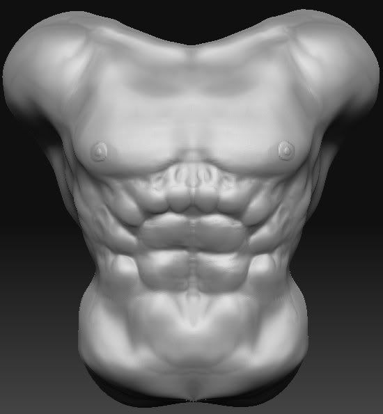
Doodle torso done at work (had nothing to do) made from a cube
The clavicle is flatter now, by the way
Zombie sculpt I started working on, figured I'd give it a quick pose for fun. I'm currently retopologizing it (the actual sculpt isn't finished yet, though)
Done from super average man
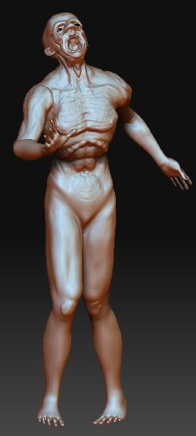
It's kind've iffy at the under arm I think, but it seems to deform fine
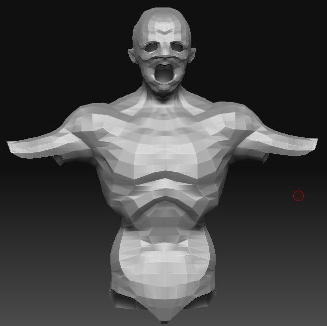
Doodle torso done at work (had nothing to do) made from a cube
The clavicle is flatter now, by the way

Zombie sculpt I started working on, figured I'd give it a quick pose for fun. I'm currently retopologizing it (the actual sculpt isn't finished yet, though)
Done from super average man

It's kind've iffy at the under arm I think, but it seems to deform fine

Replies
Are you going for realistic anatomy or a stylized/exaggerated look to it....right now its hard for me to tell. After about 5 plus years of lifedrawing and studying human anatomy I can say Ive never seen a single ribcage that looks like that in my entire life. It looks more like something out of Blade....which as I said if you're going for that look then by all means I guess it works. My only suggestion would be to find some better reference and or get your hands on a couple good anatomy books....ie hogarth, bridgeman, or loomis are all good starts
Thanks for the input and I'll take a gander at those books
Found an online scan of a book, skimmed through all of it, seems pretty interesting
http://www.scribd.com/doc/334333/Constructive-Anatomy
Still have quite a bit of work to do
And there's a reason he has 4 fingers
Behold, yee old cartoon (it wasn't an independent one, it was kind've a branch-off of Dexter's Laboratory)
looks like you completely ignored the concept as well!
it looks much more like just a goofed up hulk model now. with 4 fingers,, you've lost all the cartoony to it. head should be lower than his back, wider crazy jaw. you can make something realisticly cartoony if you want to, but you are not achieving this currently.
i would be far more impressed if you modeled him nice and smooth and cartoony
http://zbrushcentral.com/zbc/showthread.php?t=039886
sure that was started in LW, but still. everything you do in zbrush does not have to be ultra real muscles sinew and junk.
http://zbrushcentral.com/zbc/showthread.php?t=038304
branch out
Krunk mainly just gave me the idea for doing this. I'll make a cartoon version along to go with this, but I want to make a more realistic version of it as well (which is this current one).
This is an experiment for work. We're thinking (as in we might not do it) of optimizing it for milling, milling it out, piecing it together, hard-coating it in plastic, priming it, and then painting it. So seeing how much detail we can fit in is part of this experiment
We're hoping to make it 6 feet tall... but I'm not sure we will, as that'd take up some resources
Thanks for the suggestions and critique!
And how would I make a "realistic" cartoon? I'm guessing that'd mean like over exaggerated, stylized proportions and stuff (like with what you said about the jaw)
Does this, so far, look better?
Right now it looks like he is bending forward.
His upper arms look really short.
TBH i think this would look better i you would just make a low poly version with a simple diffuse and without normal maps. On your reference he doesn't seem to have detail that would need a normal map.
Just a quick paintover, with the proportions I would do.
Hope you find it usefull.
Rota
More noobness from me
Update on the torso thing
Spud Man
Early WIP
I'll get working on Krunk again soon
And sorry about not posting in awhile. I was at band camp
Edit...
Well, in this chatroom over at another site, I got engaged in a discussion with another modeler about anatomy. They thought that if something didn't match up with human anatomy, it was just wrong. In other words, my models were just wrong. In my opinion, it depends. Was the difference intentional or unintentional? What was the person trying to achieve? Etc.
Just thought I'd vent that out :P