The BRAWL² Tournament Challenge has been announced!
It starts May 12, and ends Oct 17. Let's see what you got!
https://polycount.com/discussion/237047/the-brawl²-tournament
It starts May 12, and ends Oct 17. Let's see what you got!
https://polycount.com/discussion/237047/the-brawl²-tournament
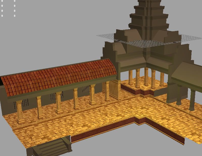
WIP Stylized Temple Environment
Hey guys,
Been lurking around here for a loooong time, never really felt like I had anything worth posting I guess. I'm in my last quarter of school and working on portfolio work, with this piece hopefully making it in.
I've been wanting to do a WoW style environment for a while now and after seeing the screenshots from Diablo 3 I decided to do something like that. I figure it will help broaden my skill set and since working at Blizzard is kind of a dream job for me. I've done photo sourced textures and realistic painted textures, but never really dedicated my time to stylized work like this. hopefully you guys can provide me with some tips on this stuff because I'm just kindof fumbling around in the dark.
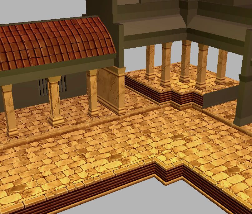
Anyways, I've only gotten a little bit done so far, but I feel like I'm starting to get a better grasp on it. The pillars need to be completely redone and after I finish up the textures for the architecture I plan to add some vines and trees growing into the ruins. Anyways, that's enough blabbing, here's the work.


Replies
My monitors aren't calibrated correctly right now, I wasn't sure which one was off so I just guessed, that's why it's so bright. I'll try shifting around the colors on some of them to break it up. I'm going to add in some vines and plants too which should bring some green into the scene.
Anyways nice to see some classic non photo filter sourced texture work. Keep working
don't listento that, you're heading for a great direction, this is like telling blizzard to do more phototexturing
grunge and photosource might be the easiest way to increase detail but it's also only the cheapest when you go for a specific style.
There's an amazing amount of skill that can be learned by doing what you're doing. I think it should be a required course at all "game art" schools and for anyone trying to get into the industry.
One thing to keep in mind is that plant life, has a life cycle. I see you fleshing out those ideas on the wall textures, but it really needs to come through on the ground and on the roof as well.
It's looking good, keep at it!
Wouldnt mind seeing it lit..
Any plans for torches or light sources.... or this mostly outside?
Love it tho... keep up the work
You need props like large clay pots, maybe stacks of wood or something (firewood). That's all I can think of for now.
I agree your tex are a good base. The thing I've found CGtex most useful for is overlays. You could pick a rust, desaturate it and do a very minimal overlay onto the stones and gice them alot more natural 'grainy' look and it's very easy.
You can get really creative with overlays. I made a believable leather texture out of overlays/noise and the 3dsMax hamburger bun
Oh and one last thing, I would seriously consider upping the size of your floor tiles a bit, it would make it appear a bit more grand and "solid" if it looked like it was made out of much larger stones, would suit the temple look much better I think?
It'd be nice if the bricks at least turned around at the corner instead of everything being well.. as it is now. I think that'd add A LOT and it'd cost you very little I believe.
Like Vig said... those plants look like you kind of made a rope out of plants on tossed them randomly on top of the roof.
Also... not sure what the part is called but the texture with very horizontal elements... well.. you need to break it up with either geometry or texturing. I tried to mark the texture on the image below.
It's been really tempting to photosource, but I'm really trying to push away from it, I've already been down that road.
Going to work on some torches and the tree, thinking of adding some sort of statue /fire pit thing. Also working on breaking up the tiling of the ground.
I know that the vines don't really make sense and they still need some lovin', but I not really sure what to do about it. I got the idea from these vines in WoW...
They're just kinda hanging out, I don't know, maybe I'll just have to replace them with something else.
I'll see what I can do about the horizontal texture, maybe add some vegetation to it.
Okay, well.. gonna go get a pizza and get back to work, I'll post more soon!
I thought the the issue was that the vines didn't make sense where they were (which they don't), but that's sort of what I had in mind, just hadn't given them that extra lovin' yet.
Instead, they should start at the base of some pillars, grow up, and then outward from the top of the pillars, (sideways along the edge of the roof, and up and over the roofline. If they reach down far enough on the other side, they should follow the roofline again, rather than loop back around.
But I think that red/brown horizontal lines look irritating and may not look good from far by creating an annoying pattern. I would just place another stone block or ornament texture on that place.
Keep it up.
Realized the screenshot isn't really from the best angle right after I uploaded it. Next on the block is some statue things and fixing that horizontal texture.
and this shot should show the changes to the other stuff a little better.
http://newd2event.net/img/maps/act3/Travincal.jpg
Big trim shapes modeled in should do the trick, similar to what you're doing on the tower. Good start though, I like the brick.
The in addition to the tweaks you have planned, its time to refine the lighting a little bit.
Torch light needs another color to contrast against for it to have real impact. The absence of light can imply more detail then a full bright scene.
Since it looks like you might be going for a dusk/night set up. Use soft blue and purple as an ambient light. It helps me to do lighting in stages. Ambient light > key lights.
Kind of like this: http://www.vigville.com/forum_images/SewerPaintOver.gif
More lighting Info: http://boards.polycount.net/showthread.php?t=51209 (Caution, long read...)
edit:
http://www.strengthandhonour.co.uk/images/060402GAngkorJungleTempleTree.JPG
see? that bastard ain't going anywhere
Thanks Vig, I have the sewer paintover, it's pretty sweet. The lighting was just kinda tossed in there quick to get a quick feel for it. I'll work on it a little more today.
Yeah, that temple was one of the inspirations for the environment. The tree is still pretty early, I was just trying to get a feel for how I was going to texture it, I'll try to make it look like it's stuck on there a little better because right now it's just kinda sitting there and abruptly stuck into the roof.
Thanks for the crits guys, keep em coming.
The new tree root textures are really helping to sell the trees a lot better now, but still need some work.
I like the little statues too.
I'm not sure if you're already aware of it but Thomas Luft put together an awesome procedural ivy generator that if you set the leaves to low levels you can get some really great vines or roots.
I wouldn't suggest using the geometry it creates, but it could make for some interesting textures and overlays.
http://graphics.uni-konstanz.de/~luft/ivy_generator/