High poly environment
polycounter lvl 16
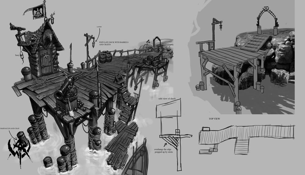
I made this environment based off of one of the Warhammer concept art. It is suppose to be a simple dock scene. I wanted to make this a high poly scene. This environment is about half a million polys. For this project i didn't make it exactly as it is in concept art but i got a lot of ideas from this picture.
This is my first high poly environment for my portfolio.
Brijesh Patel
Warhammer Concept art
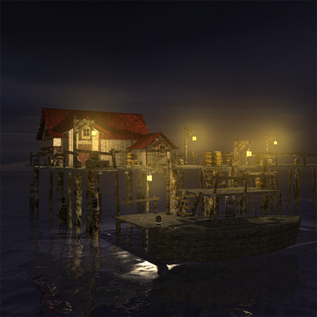
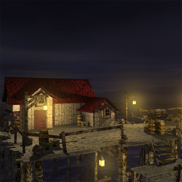
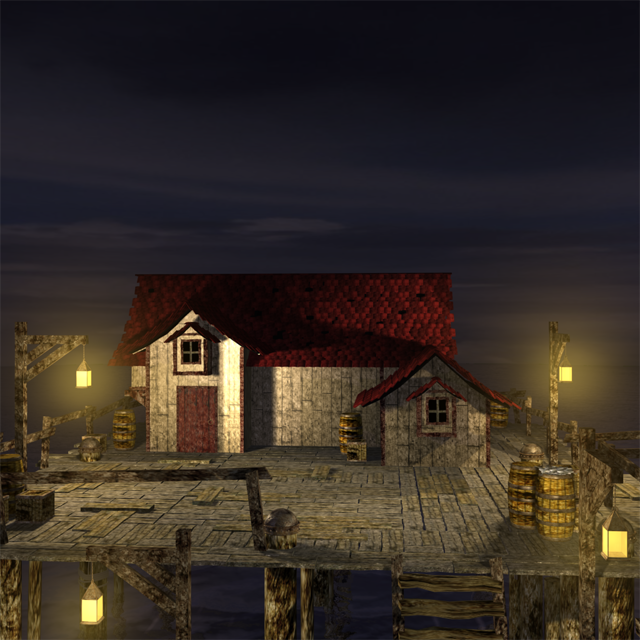
This is my first high poly environment for my portfolio.
Brijesh Patel
Warhammer Concept art
Replies
The texture work is killing it and I personally think the lights are a bit overpowering, all the deck details are lost in a sea of brown. Add more individual features and pay more attention to how you are applying the textures, looks like you've just slapped some on for most of the deck + light supports.
It's a nice idea, you just need to look at the concept more and see why it works so well.
Look forward to updates
It looks like your stuff could be around the same 'time period' as Warhammer, but it doesn't remind me of the same universe at all. Introduce off-kilter angles to everything; tweak verts that usually wouldn't be tweaked. Warhammer is interesting because nothing is perfect in it - things are almost always skewed in some manner or just look plain unsafe.
It's not that you've done it all for nothing; don't get me wrong - I just think that if you're shooting for that stylized look, it needs some more attention. I have to agree with BrodyB, as well; I don't think it would be hard to reduce this to game poly count with almost no reduction in perceived detail.
- texture colors have to much contrast - red looks like RGB red (full red), yellow like full yellow ect. no harmony at all
- The building looks to new and right angled,- add some loop cuts in the house and make a bend towards the ground slightly so that it looks like the building sank a little bit to the ground within the time.