I live in Vancouver BC CAnada, Im trying to find work here as an environment modeler but I have not been able to. Perhaps you guys can respond to my work and let me know how and where I can improve. I know I have the chops to do the work, but something is wrong. From what I have seen here you all have no bones about telling people straight wtf is wrong.
Don't take this the wrong way, but it looks like the work of someone just starting out in 3d, and thinking you "have the chops" is a bit delusional.
Most of your stuff looks like it's really basic with blurry textures. You can go for a simpler/toony style, but everything should still look sharp and well designed.
My first thought is that you don't spend time to plan out what you're doing, and probably aren't using much reference/concept art, or using crappy concept art. Nothing really has a cohesive look or feel to it.
It looks like default lighting on everything. There's no contrast, no color.
Compare your stuff to what's currently out there, and realize you have a long way to go. Maybe try doing some smaller scenes with props. Try to get a particular style/theme/mood/etc going. Find some nice professional concept art if you can't do it yourself.
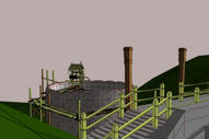
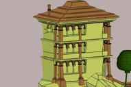
Right. My usual questions. For the images you posted. Any reference images? What game are you aiming for? Cause it looks like you put in detail for a more zoomed out view but then you could remove quite a few details from the model. If it is supposed to be viewed close up then I wonder how close up. Like there's a lot more details on that top tower than any other place and usually that's the place you won't get close to. So I have a hard time seeing the application.
Looking at your blog... well.. uhm. I don't know how to put it. But first off the blender game engine isn't the best place to show off your stuff. If I were you I'd try to get it into a proper engine at least for some decent lighting. Actually you can get some decent lighting with shaders for Blender.. I did when I tried Blender out a year ago but.. uhm.. I wouldn't recommend it. In fact you don't really need to bring it into a game engine. Normal renders should do fine.
Oh.. while we are on the subject. Everyone here is probably going to recommend you to change from Blender to something else. Not because Blender is totally crap.. but because they do it in their own way and if you want to get a job they will most likely never use Blender and you'll have a hard time catching up.
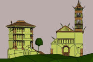
If we get back.. another thing would be textures. You don't seem to have some kind of concept/reference to work from so your textures are all over the place... and very dull and boring. Like.. orange ground, rocky rocks and gray sky looks reeaallly weird. Feels really inconsistent.
Uhm...
Ok.. let's do it like this. Get a game you like and study their art. Get some art you like and study it. Personally I got a copy of UT3 and the amazing editor that comes with it. you can look at all the art from the game and see how they did things.
Cause your stuff looks like something that was made the last decade (on your blog) and it isn't even on par with the stuff back then... and THAT won't impress anyone.
I hope I'm not sounding too harsh but it seemed like you wanted it Also I'm sorry if my critique is.. uhm.. all over the place. Cause I didn't really know where to start.
Dude Vancouver is one of he industries hotspot when it comes to video game studios you have world class developers such as Next level games, EA sports, threewave software, slant six games the list goes on.
And because of this the competition is stiff, I have yet to even to hear back from anyone here except for when they reply with: your works not good enough.
You need to step up your game when it comes to level art right now i dont see any pieces that would grab my attention as a developer. i would suggest learning to normal map with simpple object and work on your texturing and remember what kind of games these companies make diversify your portfolio.
like threewave they usually work on the multiplayer portions of games such as Army of two, Turok, Doom III. if you wanted to apply to them i would make two different environments a street environment and a sci-fi environment.
luckily most game companies have art tests on there sites like next level games.
and remember its always good to join a mod team as you'll see how a game comes together. even then you might have to really push yourself to make some quality art. it also helps to get an art degree so you can get an internship one thing that sucks about not going to school is i cant get an internship but hey im not 35,000 in debt :P
anyways thats what i think you should do and by no means do you have to listen to me
Also to display and pimp your pictures i suggest photobucket.com
Have you done any research in to the Canadian games industry and spoke to people in those studios? Have you also looked at the recruitment ads also, they tend to demonstate exactly what they are looking for? Also it might be worth joining societies like the Vancover chapter of IGDA (http://www.igda.org/vancouver/). They should have industry links and talking to the people that you want to be hired by should be a valuable source of information.
I C, that makes sense actually. My concept art is just a bunch of photos from my vacation. I just pulled down some nice sci-fi art ect from Deviant art right now, ill try to work some of that art and post again.
haha, my work does look like it was made a decade ago, lol thats great. man. ok ok sounds good. ill try again...
The textures are just one second procedural textures, like a wireframe composite with ink and paint color so I can show the mesh, or the sculpt of the buildings, but I guess the employers want textured models in an environment modeler reel.. ok, ill work on that.
Thanks for the crits, I think I see a few (hundred) places i can improve.
EDIT: i love how JMYOung's post here was his first. lol!
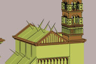
I'm not sure what I'm looking at? I see a bunch of edges added for a "pretty effect" when edges are turned on... in the 3D app... Those edges aren't actually doing anything and no one will see them in game so they don't need to be there. The only time I add extra edges like that would be to block in details for when I start painting textures. But the over use of poly edges for "detail" shows me that isn't really the case.
This looks half finished, and not just because the back half of the building is missing. I see way too many polys in the tree, and only a handful on the rock structures? You really have to learn to use polys effectively.
Way too high poly for game art, not even all that detailed for high poly. I really think you are reading more detail into all of your stuff because of the edge line detail. Remember to turn that off and view the models like they are going to be viewed in the game. When you turn off edges if suddenly your models become uninteresting then you have some work to do.
(Do not read this if the above info was at all painful to read)
I also see zero textures, zero uv-layouts and zero lighting. Those are all basic things you should demonstrate when applying for jobs. You don't need to be AAA in all three but I don't even see hints of that stuff. If you're going for just modeling positions know that it normally entails unwrapping. If you're not familiar with unwrapping know that a lot of doors will be closed to you.
Knowing those three things impacts the way you model structures. People are looking for hints of that knowledge in your modeling and when they don't see it, they won't call.
I think with some work and some more learning you could pull off some great stuff. But I think a reality check is in order if you think these images are game art. Compare your stuff to screen shots. When you apply at a company, take a look at the games they've made and honestly ask yourself, "can I do that?" "If I sat down right now and spent the next 4 weeks could I make this screen shot that I'm looking at?" If the answer is "well there are other people on the team I would need them to really help me out" then the answer is you're not an asset they would want to pick up, you'll be a drain on the company instead of a positive addition.
Make sure you're using the right measuring stick when evaluating your art.
You can't expect a company to hire you because you can push a few primitives around in a 3D app. Maybe you have more skills you aren't showing but right now, based on these images I understand why you would be frustrated that places aren't calling.
sorry to be a dick, but this is the nicest way I can think of to get this kind of harsh info across.
Thats great information Vig, its a shame that I cant convey any type of solid modeling skill. But soon I will. I really appreciate everyones help. I dont see the comments as being that of an asshole, or a dick, like you say, in fact it kind of shows that you guys care and dont want to see shitty modeling from people. Its appreciated. I think people must have taken offence in the past though since you seem to suffix everything with "im a dick, sorry ect".... that blackout paragraph to save me from further bruising of my ego is funny... it contained all the stuff i needed to know... it should have been highlighted not "redacted". lol
I am glad that someone who's art is craptastic can come here, smear it around, and get an honest opinion. It doesnt help if you tell the person his shit is a nice shade of brown and just leave cause you cant stand the smell, or worse ignore the smell and smile crooked at him. I think it much better to point and say, "that is shit. and that shit stinks, it stinks cause i can clearly see what you eat, ect ect i wont go too far into that analogy i guess... haha
anyway this is great information, when i sit at home until 4am modeling away its amazing what BS you can start filling your own mind with. I think everyone can learn more always, but myself more than most others it appears! cool, I guess I have farther to go before I get jaded...
Yeah some people freak out when you don't blow smoke up their ass like other boards. When I'm not sure how the person will react, I make sure to soften the blow. Of course if they can't take good critism with a grain of salt like you are doing, and god help them if they toss some venom back at the board... The world shows up to drill some new holes. Those are the same people that never really go anywhere.
You've got the right attitude I'd be happy if you stuck around, theres a lot of great info floating around on this board. I know I have it to thank for a lot of what I know.
Keep the attitude and keep at it and you'll go places
I'd suggest looking at good artists work to learn from them, lucky you, polycount is hosting an environment design competition atm, you should have a look, plus Ror posted his UT3 and gears of wark work samples. Also, training is key, again, lucky you, the unearthly challenge is due to start very soon and is environment based, all the best environment artist (and also all the ones willing to learn) that have the time are going to enter this, which would be a great way for you to improve your skills, get awesome feedback and look how AAA artists are working.
keep it up dude, good attitude is the biggest step forward to improvement, and you already passed it
Yeah, always refreshing to see a good attitude. Definately look at the unearthly challenge, I learn a lot every year with Dominance War thanks to all the guys that take the time to critique and offer advice. I am sure the unearthly challenge will be the same.
Replies
http://www.animashun.blogspot.com/
Most of your stuff looks like it's really basic with blurry textures. You can go for a simpler/toony style, but everything should still look sharp and well designed.
My first thought is that you don't spend time to plan out what you're doing, and probably aren't using much reference/concept art, or using crappy concept art. Nothing really has a cohesive look or feel to it.
It looks like default lighting on everything. There's no contrast, no color.
Compare your stuff to what's currently out there, and realize you have a long way to go. Maybe try doing some smaller scenes with props. Try to get a particular style/theme/mood/etc going. Find some nice professional concept art if you can't do it yourself.
Looking at your blog... well.. uhm. I don't know how to put it. But first off the blender game engine isn't the best place to show off your stuff. If I were you I'd try to get it into a proper engine at least for some decent lighting. Actually you can get some decent lighting with shaders for Blender.. I did when I tried Blender out a year ago but.. uhm.. I wouldn't recommend it. In fact you don't really need to bring it into a game engine. Normal renders should do fine.
Oh.. while we are on the subject. Everyone here is probably going to recommend you to change from Blender to something else. Not because Blender is totally crap.. but because they do it in their own way and if you want to get a job they will most likely never use Blender and you'll have a hard time catching up.
If we get back.. another thing would be textures. You don't seem to have some kind of concept/reference to work from so your textures are all over the place... and very dull and boring. Like.. orange ground, rocky rocks and gray sky looks reeaallly weird. Feels really inconsistent.
Uhm...
Ok.. let's do it like this. Get a game you like and study their art. Get some art you like and study it. Personally I got a copy of UT3 and the amazing editor that comes with it. you can look at all the art from the game and see how they did things.
Cause your stuff looks like something that was made the last decade (on your blog) and it isn't even on par with the stuff back then... and THAT won't impress anyone.
I hope I'm not sounding too harsh but it seemed like you wanted it Also I'm sorry if my critique is.. uhm.. all over the place. Cause I didn't really know where to start.
And because of this the competition is stiff, I have yet to even to hear back from anyone here except for when they reply with: your works not good enough.
You need to step up your game when it comes to level art right now i dont see any pieces that would grab my attention as a developer. i would suggest learning to normal map with simpple object and work on your texturing and remember what kind of games these companies make diversify your portfolio.
like threewave they usually work on the multiplayer portions of games such as Army of two, Turok, Doom III. if you wanted to apply to them i would make two different environments a street environment and a sci-fi environment.
luckily most game companies have art tests on there sites like next level games.
and remember its always good to join a mod team as you'll see how a game comes together. even then you might have to really push yourself to make some quality art. it also helps to get an art degree so you can get an internship one thing that sucks about not going to school is i cant get an internship but hey im not 35,000 in debt :P
anyways thats what i think you should do and by no means do you have to listen to me
Also to display and pimp your pictures i suggest photobucket.com
haha, my work does look like it was made a decade ago, lol thats great. man. ok ok sounds good. ill try again...
The textures are just one second procedural textures, like a wireframe composite with ink and paint color so I can show the mesh, or the sculpt of the buildings, but I guess the employers want textured models in an environment modeler reel.. ok, ill work on that.
Thanks for the crits, I think I see a few (hundred) places i can improve.
EDIT: i love how JMYOung's post here was his first. lol!
This looks half finished, and not just because the back half of the building is missing. I see way too many polys in the tree, and only a handful on the rock structures? You really have to learn to use polys effectively.
Way too high poly for game art, not even all that detailed for high poly. I really think you are reading more detail into all of your stuff because of the edge line detail. Remember to turn that off and view the models like they are going to be viewed in the game. When you turn off edges if suddenly your models become uninteresting then you have some work to do.
(Do not read this if the above info was at all painful to read)
Knowing those three things impacts the way you model structures. People are looking for hints of that knowledge in your modeling and when they don't see it, they won't call.
I think with some work and some more learning you could pull off some great stuff. But I think a reality check is in order if you think these images are game art. Compare your stuff to screen shots. When you apply at a company, take a look at the games they've made and honestly ask yourself, "can I do that?" "If I sat down right now and spent the next 4 weeks could I make this screen shot that I'm looking at?" If the answer is "well there are other people on the team I would need them to really help me out" then the answer is you're not an asset they would want to pick up, you'll be a drain on the company instead of a positive addition.
Make sure you're using the right measuring stick when evaluating your art.
You can't expect a company to hire you because you can push a few primitives around in a 3D app. Maybe you have more skills you aren't showing but right now, based on these images I understand why you would be frustrated that places aren't calling.
sorry to be a dick, but this is the nicest way I can think of to get this kind of harsh info across.
I am glad that someone who's art is craptastic can come here, smear it around, and get an honest opinion. It doesnt help if you tell the person his shit is a nice shade of brown and just leave cause you cant stand the smell, or worse ignore the smell and smile crooked at him. I think it much better to point and say, "that is shit. and that shit stinks, it stinks cause i can clearly see what you eat, ect ect i wont go too far into that analogy i guess... haha
anyway this is great information, when i sit at home until 4am modeling away its amazing what BS you can start filling your own mind with. I think everyone can learn more always, but myself more than most others it appears! cool, I guess I have farther to go before I get jaded...
woot! onward!
You've got the right attitude I'd be happy if you stuck around, theres a lot of great info floating around on this board. I know I have it to thank for a lot of what I know.
Keep the attitude and keep at it and you'll go places
keep it up dude, good attitude is the biggest step forward to improvement, and you already passed it