Home 3D Art Showcase & Critiques

Dead space like level

polycounter lvl 17
Offline / Send Message
Armanguy polycounter lvl 17
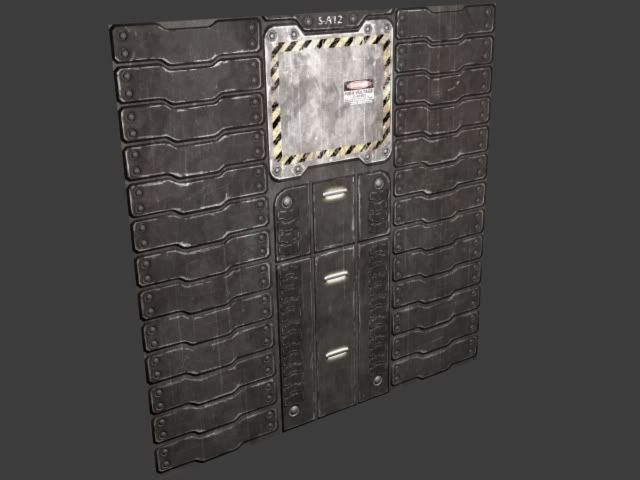
Hey guys i've been looking to do a scnene to round out my portfolio for a loooooong time now got some inspiration to do a dead space style sci-fi level i finished the first wall texture still need to do several variants also need to start working on some modular pieces:

Wall1.jpg

Replies

  • Jeremy Lindstrom
    Offline / Send Message
    Jeremy Lindstrom polycounter lvl 18
    I like it, but it looks like a floor texture with the wear and traction....
  • IronHawk
    Offline / Send Message
    IronHawk polycounter lvl 10
    Dekard wrote: »
    I like it, but it looks like a floor texture with the wear and traction....

    agreed. That was my first thought as well.
  • Armanguy
    Offline / Send Message
    Armanguy polycounter lvl 17
    thanks for the crit guys i also see it , never noticed that :P the floor is going to be made out of grates mostly with piping running underneath.
  • Pope Adam
    Offline / Send Message
    Pope Adam polycounter lvl 11
    I agree on the floor look, but I think it would contrast well and read better as a wall when there is grated floor beneath. Who knows, you could even convert this into a floor tile as well in another part of your scene if you needed any variations on platforms or something.
  • Kawe
    Offline / Send Message
    Kawe polycounter lvl 8
    it'd look more like a wall if there was some kind of "trimming" down there. not sure what those panels are for but it'd make sense if they wouldn't go all the way down to the floor. humans don't like bending their knees.
  • Armanguy
    Offline / Send Message
    Armanguy polycounter lvl 17
    worked on a pillar and a different wall variant, just put them together real quick:

    Wall1-1.jpg
  • Flewda
    Offline / Send Message
    Flewda polycounter lvl 17
    That is repetitive as all get out. My eyes bounce around all over when I see that. There's no real focal point for my eyes to rest on. And in general, the walls seem to be fairly uninteresting to me. There's not much contrast, it's all really brown.

    My primary focus would be getting rid of the repetition of the shapes. Just doesn't work imo, especially having it only divided by a pillar with equally as much tiling going on.

    Then add some more interesting details, and some more contrast.
  • Armanguy
    Offline / Send Message
    Armanguy polycounter lvl 17
    thanks for the pointers i think i should try to change up the colorscheme in some of the objects as for the scene itself it wont look like that in the end as i stated i just put it together to show what i have so far.

    edit: the brown is my fault also i put in a brown omni lights :P ill try to get rid of the browns and grays as much as i can when i light the scene:P
  • Armanguy
    Offline / Send Message
    Armanguy polycounter lvl 17
    Just to note this is just a quick mock-up to show what ive done so far i still have alot to do:

    - Roof
    - light terminal/banners/signs
    -Computer terminal that hangs off wall(s)
    - Key pad for main door
    - Main door
    - Pipes and wires running along the walls and beneath the floor
    - Lighting!!!!!!!!! boy do i need to work on lighting :P

    Wall1-2.jpg
  • odium
    Offline / Send Message
    odium polycounter lvl 18
    Scales dude, I would fall right through that!
  • Xaltar
    Offline / Send Message
    Xaltar polycounter lvl 17
    The most important part of any art is thought. Before you even begin on a piece like this you should sit down and figure out what function the prop/wall etc will serve. Will it have pipes running along it transporting fuel/steam/water. Will the pipes need to be insulated. What kind of electrical cables/equipment will be attached to it. Basicly figure out its function and decide what it would need as a functional piece. Think about the materials it will need for the various components. Only then should you start to model it.
  • Sayanora
    Offline / Send Message
    Sayanora polycounter lvl 11
    To elaborate on what Xaltar said:

    After you've bounced those ideas around inside your head, you should hash out a couple quick sketches (at the very least) to better plan this project out. If you're willing to start over, you should experiment with as many ideas as time permits to find out what you really want to accomplish. Just 'wingin' it' rarely ever works. I've done this before and it almost always fails.

    Your work isn't bad, it's just fairly generic. Most of the others have commented on why this is the case. With some planning, you could come up with an interesting design and blow the collective polycount socks off. Do it!

    Edit

    Also wanted to say, good source of inspiration! If you're set on doing the derelict spaceship thing, go watch Event Horizon! Pretty sure Dead Space took some cues from it.
  • Armanguy
    Offline / Send Message
    Armanguy polycounter lvl 17
    not much of an update just a quick paintover to show what i want to do, back walls are just there as place holders so the gate didnt look out of place:

    Wall1-3.jpg

    Paintover:
    http://img.photobucket.com/albums/v92/armanguy/Wall2.jpg
  • Joao Sapiro
    Offline / Send Message
    Joao Sapiro sublime tool
    i think that if you swap the ground texture with the walls you would get a much more interesting result :)
  • System
    Offline / Send Message
    System admin
    Looks promising, I like it except for the wall texture, the seams in the panels are a similar size to the pillars so it blends in too much. I would reduce the number and make the seams alot thinner/try adding a different style. There might be something of interest here?
  • Flewda
    Offline / Send Message
    Flewda polycounter lvl 17
    Seriously?

    Dude, those floors are retarded. I'm going to apologize for any offense I may cause, but I am going to be 100% blunt right now, as being nicer in my critiques has yet to get you to listen.

    You're floors look like they were designed by a moron! Could you imagine walking down the hallway with big gaping holes like that? You'd be tripping every step of the way. Not to mention trying to wheel any sort of cart down the hall. I'm sorry, but it's just not a very flattering design (aesthetically and practically).

    So my next question is - was the intent of the ship to make its crew want to commit suicide? Because day after day of seeing nothing but redundant crap colored walls, floors, doors, and ceilings? I know you haven't done the ceiling yet, but knowing your pattern, I expect the ceilings to follow suit with the rest of the scene. Let's get real, this is not interesting in terms of color, or design. It's an eye sore, and makes my eyes want to bleed. Just because it's going to be a dark/desaturated atmosphere doesn't mean it can't have colors thrown into it. I'm watching a dead space video right now, and despite the overall tone of the game being darker gray/desaturated, there are still pops of vibrant colors here and there (whether it be FX/lighting, monsters, or just signs and crap hanging up). There's nothing interesting in your scene thus far, and even though I know you aren't done yet, there's nothing really telling me that there will be anything interesting.

    I know you will tell me that there are a lot of things you plan to add, like computer panels, etc. That's all fine and good, but you need a solid base to work with, and until you have that, I don't think it matters how much and what kind of detail you put into it, it will look like crap in the end.

    So I suggest to you, for once, listen to what people on the forum are saying. Take your time, really think about it, plan, implement some ideas, tweak/iterate, and then execute. Because right now, this looks like just a big hodge podge of randomness.
  • Armanguy
    Offline / Send Message
    Armanguy polycounter lvl 17
    Changed the floors :) also working on a new color scheme for the ship. atm
  • Mark Dygert
    Awesome tank treads, where's the tank?

    The treads don't blend behind the door that well.
    The gaps in the floor are too big to be part of a useable floor. So much stuff would fall though, get caught or just plain break the weak metal. It looks wierd to have heavy duty armored walls with a frail weak floor. Think about pushing a service cart over that? Floors have to support a lot of different types of loads. Your chainlink floor looks like it would support about as much as a chainlink fense. Theres a reason its used as a fense not a floor...

    C+ for effort.
    F- for functionality.
  • Armanguy
    Offline / Send Message
    Armanguy polycounter lvl 17
    Hey vig thanks for the post man, didnt see it until now though so heres an update but reading the 2 other post i think i should try to not make this thing just look like a generic sci-fi scene. i might be getting rif the pillars :)

    Wall1-4.jpg
  • Joao Sapiro
    Offline / Send Message
    Joao Sapiro sublime tool
    i like the angle and lightning but right now the textures are too muddy and undefined i recomend making some good high rez for the normals and at least put glass ontop of those railing, with those things that look like arms connecting the glass, cant remember the name, they have some round shape.
    The scene itself looks reeeeeaalallyy boring :(
  • cholden
    Offline / Send Message
    cholden polycounter lvl 18
    please use a ref

    for the love of crap, use a concept you think is great:
    http://imagethread.com/wordpress/?p=57
    http://www.beyondunreal.com/articles/unreal-tournament-3-concept-art/
    http://www.conceptart.org/forums/showthread.php?t=118126
    http://warhammeronline.com/conceptart/index.php
    http://www.freakygaming.com/gallery/concept_art/quake_4/

    There is simply no sense in you trying to randomly build things unless of course this is your "I'm just playing around thread"
  • Armanguy
    Offline / Send Message
    Armanguy polycounter lvl 17
    Hey cholden Thanks for the Links man ill give them a look and see how i can use those concepts to help me form my piece, Im sorry if i come off a little dimwitted about taking peoples crits ive been trying my best to fix my bad habits anyways i appreciate everyones help even if you hate me :P Believe it or not i have been using some concepts from dead space and other shooters like halo to help memake this piece:

    http://ll-100.ea.com/cem/u/f/GPO/ea.com/deadspace/Behind_the_Scenes/Concepts/concept_ship_security_hall_download_021208.jpg

    http://ll-100.ea.com/cem/u/f/GPO/ea.com/deadspace/Behind_the_Scenes/Concepts/concept_tram_hall_download_021208.jpg

    at one point i even used some of your art as inspiration:

    http://chrisholden.net/hall2.jpg

    http://chrisholden.net/dm_02_02.jpg
  • cholden
    Offline / Send Message
    cholden polycounter lvl 18
    Those concepts are good, you should be following them. I'm not sure how you got any of what you posted above from any of these.

    Try blocking one of them out. Get the basic shapes down, then take sections and make high detail meshes.

    I know you're capable of doing all this stuff.
  • Armanguy
    Offline / Send Message
    Armanguy polycounter lvl 17
    hey choldon thanks for you help although im not gonna scrap the entire piece i will get rid of the pillars and try to rework the scene so it resembles thos concepts a little more :)
  • IronHawk
    Offline / Send Message
    IronHawk polycounter lvl 10
    yeah it looks nice man. but the real question is what do you think? do you want to own it and dedicate the time to doing it right?
  • Thegodzero
    Offline / Send Message
    Thegodzero polycounter lvl 18
    ...There is concept art made for dead space?? News to me. I figured from the screenshots that they didn't have any concept art and that's why it looked so generic.

    That concept art is pretty sexy. Id go with the second one you posted, but both are great choices. Just try and recreate the shot in 3d, blood, signs, lighting and all.
  • Armanguy
    Offline / Send Message
    Armanguy polycounter lvl 17
    I removed the pillars and i think it looks alot better imo right now im just gonna plan it out beofre i do any work as choldon said i need to use more ref to make this look more interesting i would also appreciate any pain over from anyone with ideas but right now the paint over i have done seems more like something out of dead space. what i didnt inlclude is the blood :P

    Wall1-5.jpg

    Paint over:

    Wall2-1.jpg
  • Armanguy
    Offline / Send Message
    Armanguy polycounter lvl 17
    Wall1-6.jpg

    just one question the floor is really blurry how would i go about fixing that?
  • Joao Sapiro
    Offline / Send Message
    Joao Sapiro sublime tool
    i dont understand if this is supposed to be game art or a "still" if it is a still i would make it all high rez etc and with nicer lightning etcetc , because right now for game art this would be unusable :(
  • Armanguy
    Offline / Send Message
    Armanguy polycounter lvl 17
    my computer sucks it took 4 hours to put three objects into place and put in the lighting i cant believe how slow my computer is argghhhhhh! anyways :

    Wall1-7.jpg?t=1217619364
  • odium
    Offline / Send Message
    odium polycounter lvl 18
    Johny wrote: »
    i dont understand if this is supposed to be game art or a "still" if it is a still i would make it all high rez etc and with nicer lightning etcetc , because right now for game art this would be unusable :(

    Thats a little harsh, and not true either.
  • Xenocidex11
    your lighting is off. you have square lights and round beams. and they kind of are flat. you can see it really bad on the left side. looks good though :thumbup:
  • Ajax
    Offline / Send Message
    Ajax polycounter lvl 18
    It's getting better, as the next step maybe try adding a colored under lighting somewhere to give it a more sinister look? The lighting feels a bit static, and doesn't really carry across any mood or focus. :)
  • Ajax
    Offline / Send Message
    Ajax polycounter lvl 18
    Yeah and something weird is going on with the lighting hitting your upper-floor on the left there. I'm guessing your rendering these out, and that's a flat plane. Depending on what your using to render, you might need to add a bump/normal/height/lighting map to that texture to properly light the depth on the plane, otherwise it will just stay flat (because that's what the renderer thinks it is without additional per-pixel lighting information to go with).
Sign In or Register to comment.