The BRAWL² Tournament Challenge has been announced!
It starts May 12, and ends Oct 17. Let's see what you got!
https://polycount.com/discussion/237047/the-brawl²-tournament
It starts May 12, and ends Oct 17. Let's see what you got!
https://polycount.com/discussion/237047/the-brawl²-tournament
DJ Graffiti Room WIP - Looking for Critiques
This scene is meant to be the primary focus of my demo reel, for graduation as an Environment Artist at the Art Institute of Vancouver. The focus of the scene is of the bedroom of a DJ and Graffiti artist. The feel of the room is very urban modern, with DJ and graffiti equipment, and graffiti art on the walls.
I am going for a high denisty, photo realistic look to the environment, make it look like a place where somebody would actually live in, not just a set. This is meant to be a high poly scene, currently about 20,000 tris.
I am currently done most of the modeling, and have started UVing. I have preliminary cameras in (would like to post the playblasts for critique, but I am not sure how, or where to host the videos). The biggest issue I have had is how to easily and efficiently model the many cords that would naturally be connecting all the speakers and equpiment (with a minimum of polys). I tried using curves, but found them too difficult to manipulate to get the precise curves I wanted. I settled on using a low poly cube (4 sided), stretched out long and then divided up with edge loops, which I bent to get the desired shape. This would be very time consuming to UV, and the texture wouldn't be very visible due to the small width of the cords, so I just placed a flat colour on them.
If anybody has a quick, efficient way to model/uv curved cords, I would greatly appreciate some advice.
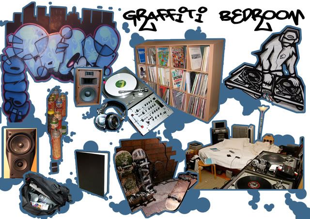
The Style Guide for the scene:
Screenshots of the scene;
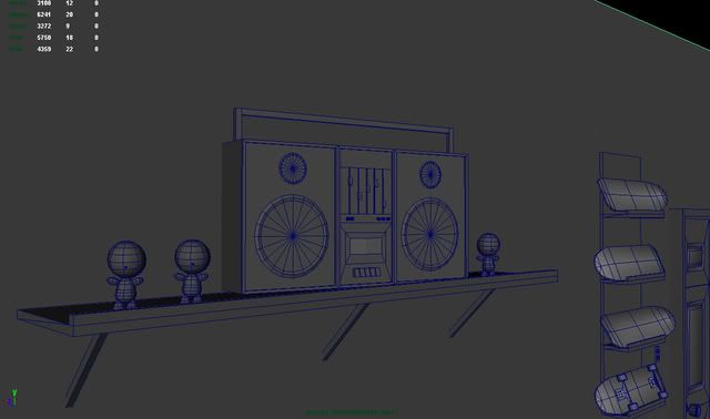
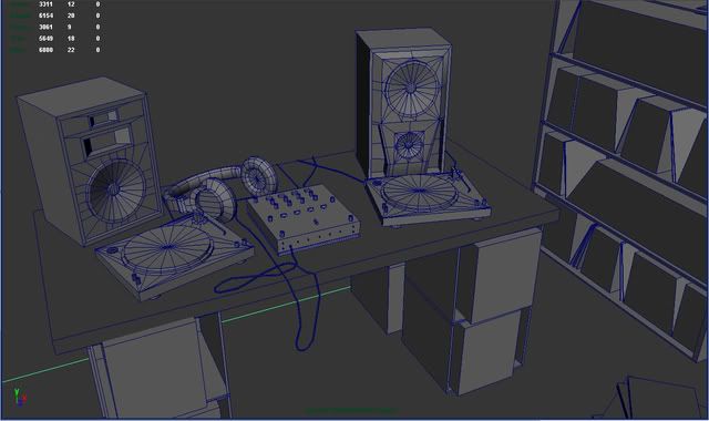
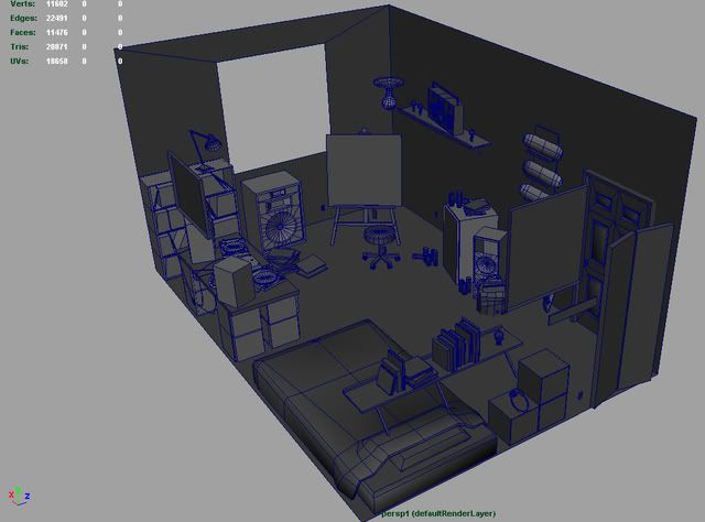
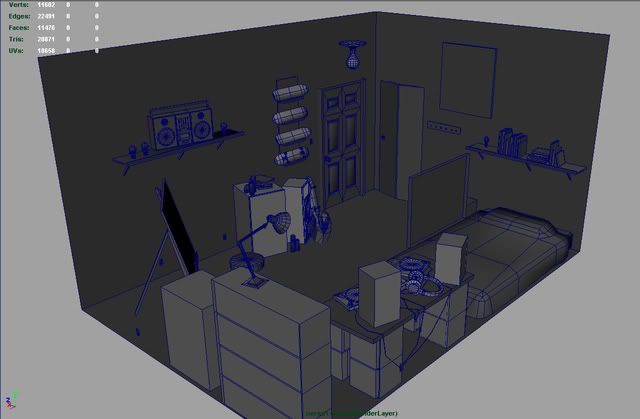
Any and all comments and critiques are welcome and appreciated.
I am going for a high denisty, photo realistic look to the environment, make it look like a place where somebody would actually live in, not just a set. This is meant to be a high poly scene, currently about 20,000 tris.
I am currently done most of the modeling, and have started UVing. I have preliminary cameras in (would like to post the playblasts for critique, but I am not sure how, or where to host the videos). The biggest issue I have had is how to easily and efficiently model the many cords that would naturally be connecting all the speakers and equpiment (with a minimum of polys). I tried using curves, but found them too difficult to manipulate to get the precise curves I wanted. I settled on using a low poly cube (4 sided), stretched out long and then divided up with edge loops, which I bent to get the desired shape. This would be very time consuming to UV, and the texture wouldn't be very visible due to the small width of the cords, so I just placed a flat colour on them.
If anybody has a quick, efficient way to model/uv curved cords, I would greatly appreciate some advice.
The Style Guide for the scene:

Screenshots of the scene;


Any and all comments and critiques are welcome and appreciated.
Replies
I was thinking about baseboards, but I want to go for a rough, painted brick wall surface, so there wouldn't be baseboards in that case, I thought. Would it look alright against the brick if I added them in, do you think?
Here is the style of wall I am going for
With an old worn an scratched hardwood floor:
Try maybe redoing the top of the turntable. Delete all the edges on top creating triangles, and use the split polygon tool to turn them into polys instead. To me its more efficient.
A buddy of mine I went to school with at VanArts did something similar to this, except it was of his apartment downtown. He had turntables in there and everything too, came out pretty well. Wish I had pics to show you.
Thanks for the advice, I went ahead and optimized the surface of the turntable, as you suggested. I am going to be adding baseboards in as well, they should work alright, even with the brick.
pitch control slider on the right
Otherwise seems to be going pretty well so far.
Good start, not much more to crit on a this stage.
-caseyjones
Katsuya Terada, if anyone is interested.
http://artbookarchive.blogspot.com/2007/09/katsuya-terada-artbook-and-art.html