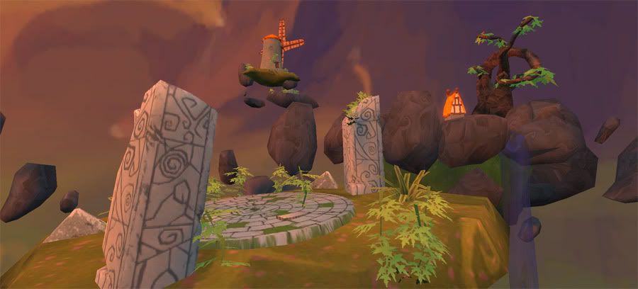
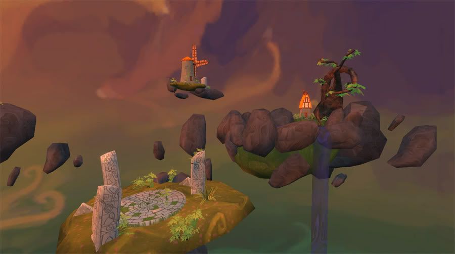
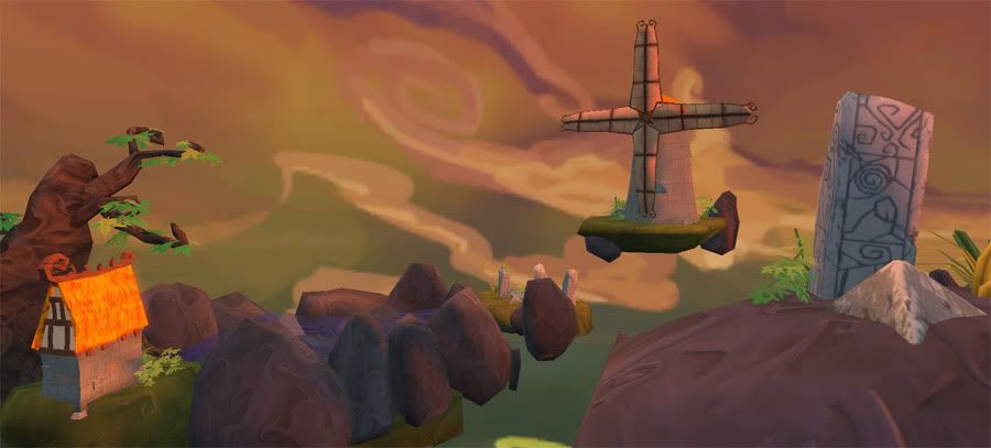
I love that rock texture, the normals are fantastic.
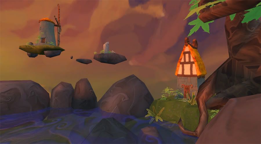
My only real crit is that the scene sort of blends into the backdrop in some of the shots (rocks are a similar shade to the dark bits of the sky and the windmill is a similar shade to the light parts).
You've got a great style going, but I feel like there's something missing in the execution. . . sadly that's as far as I've gotten with that thought, so I'll let you know if I come up with anything concrete.
This looks pretty good at a glance. Interesting colours and shapes.
However I think it starts to fall apart as you look closer.
What's the reasoning behind the intensely low-res sky? That disparity in resolutions between the objects and the sky is VERY noticeable, surely you can have the sky at double the res?
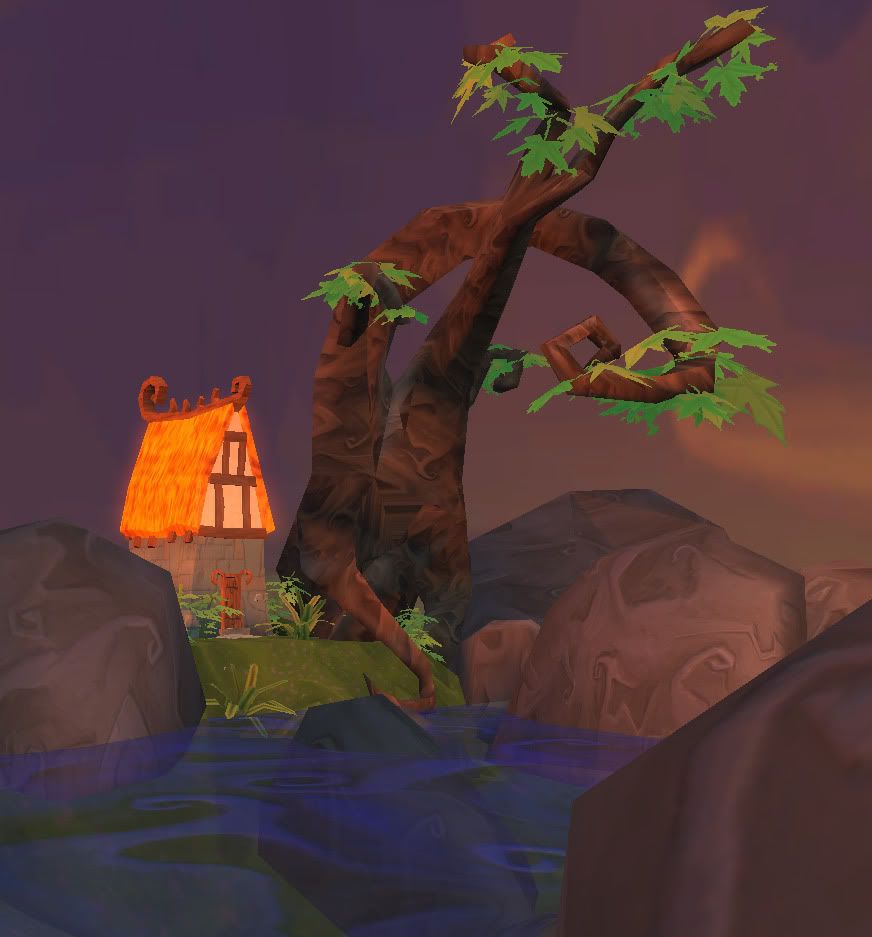
The UVs on the tree trunk are pretty weird. I see a lot of seams and HUGE stretching. If you have to have that, try to hide it better, rather than on a big triangle facing the view.
The tree leaf textures don't seem to match the tree at all. They look un-lit, and way too bright, and don't connect to the tree in any meaningful way - some are floating above branches, others clip through. Would be worth shuffling the meshes around a bit there to make them more consistent, and darken the leaf texture (or get it lit properly, should be possible with alphatest anyway).
Also, I agree with warby that the spirally textures work well for the sky and water, but they look a tad strange on rock and wood (although I think you can get away with it).
Yeah, so in general I'd spend a tiny bit more effort tying the whole scene together and getting rid of the "technical" errors that are causing this to look worse than it should. Artistically it's nice, but it's just lacking a bit of quality of execution.
As others have said, you've got the start of something really nice, but it just needs some significant polishing. One thing that would halp is getting some stronger shadows and a better sense of directional light. If you're using vertex lighting which looks like it might be the case, don't just try to get by on a light bake. Cut some more edges and hand place some shade in under objects, overhangs and wherever else it seems necessary. It'll make a hell of a lot of difference to how solid the scene looks
Jackablade: So should I make meshes for shadows? I'm still really learning lighting, so here I just have a basic light setup in UT3. I've been reading tutorials but haven't found a whole lot of help for environments.
MoP: The sky is a 4098x1024, but I don't know how to make it look crisper. I'll try making the skydome smaller, and maybe there's a setting I'm missing?
I'll see what I can do about the tree, it's a pretty crazy shape to unwrap, but I should be able to hide the seams a bit better, and I'll fix up the leaves.
Thanks again for all the crits, guess I'm not quite done
Hmm, the sky looks way lower than the resolution you stated. I guess you're bringing it into UE3? Seems like it might be getting screwed by heavy compression. Maybe there's a flag you can set on the material to use "high quality" or "less compression" or something - also, since it's a non-square texture, and one side is 4096, there's maybe a chance that it's being down-sized.
Yeah, turns out the sky was being compressed (I actually found the answer in a thread started by Warby in some other forums ) Still working on the lighting.
Here's where I got today; I figured out how to get the shadows working how I want, but I think I need to fix a few normals and UV's still. I tried cleaning up the tree a bit, blah blah :P
I did a quick paint over of something things I would suggest:
First, I think the biggest thing would be to add a 'bottom' to the floating islands...maybe some 'fur like plant life' to go with the painterly feel you have going on...maybe they can be blowing in the wind? Or maybe just add some rocks to show that maybe this island was once connect to the ground or maybe a bigger island....and so the underside would be less 'unrefined'. Also, if you think of the rain the erosion and stuff like that...all the water runs off of these islands from the top and so the bottom would be pretty eroded on the sides.
Also, another thing would be how people get from one island to the next? Maybe they're flying people? If not, you could add like some pulley system (spelled wrong on the image) or maybe add some 'floating stairs'....
Also, on the background I would add a distinct 'layer' to the colors...because the sky is pretty much layered and it helps the eye find the horizon and separate up from down.
Also, not that it really matters but if the water is falling from the one island...where is that island getting it's water from? It looks cool and that's mostly what matters, but just something to think about.
Hawken: I'm glad it reminds you of Roger Dean, he's definitely been one of my biggest inspirations.
Aldo: Those are all great suggestions. I purposely didn't show a way of getting around the islands because I wanted to keep that a mystery for the viewer, and the same with the water (maybe a water crystal, who knows? )
I LOVE your ideas for the bottoms of the islands, wish I had thought of it and I'll definitely be adding to the sky, as well.
Justin: Thanks, I was gonna do that but forgot, fixed it now I'd like to add the stuff growing off the bottom and whatnot but I don't really have the time now, just a few tweaks but I'm gonna leave this for now, may make more related environments in the future... thanks again for all the help, everyone!
This looks great. The only thing I'd say is... judging from the shadows, it looks like the sun is at too high an angle for such an orange/pink sky and lighting.
Replies
I love that rock texture, the normals are fantastic.
My only real crit is that the scene sort of blends into the backdrop in some of the shots (rocks are a similar shade to the dark bits of the sky and the windmill is a similar shade to the light parts).
I'd say the tree texture looks a bit too random
You've got a great style going, but I feel like there's something missing in the execution. . . sadly that's as far as I've gotten with that thought, so I'll let you know if I come up with anything concrete.
Til then, keep it up, it's looking great.
Kinda reminds me a bit of Wind Waker. Which is a very good thing! ^_^
Only crits I have are that the hay roof looks a bit too orange on some pictures and the leaves on the tree don't really fit in.
Keep up the good work!
However I think it starts to fall apart as you look closer.
What's the reasoning behind the intensely low-res sky? That disparity in resolutions between the objects and the sky is VERY noticeable, surely you can have the sky at double the res?
The UVs on the tree trunk are pretty weird. I see a lot of seams and HUGE stretching. If you have to have that, try to hide it better, rather than on a big triangle facing the view.
The tree leaf textures don't seem to match the tree at all. They look un-lit, and way too bright, and don't connect to the tree in any meaningful way - some are floating above branches, others clip through. Would be worth shuffling the meshes around a bit there to make them more consistent, and darken the leaf texture (or get it lit properly, should be possible with alphatest anyway).
Also, I agree with warby that the spirally textures work well for the sky and water, but they look a tad strange on rock and wood (although I think you can get away with it).
Yeah, so in general I'd spend a tiny bit more effort tying the whole scene together and getting rid of the "technical" errors that are causing this to look worse than it should. Artistically it's nice, but it's just lacking a bit of quality of execution.
Jackablade: So should I make meshes for shadows? I'm still really learning lighting, so here I just have a basic light setup in UT3. I've been reading tutorials but haven't found a whole lot of help for environments.
MoP: The sky is a 4098x1024, but I don't know how to make it look crisper. I'll try making the skydome smaller, and maybe there's a setting I'm missing?
I'll see what I can do about the tree, it's a pretty crazy shape to unwrap, but I should be able to hide the seams a bit better, and I'll fix up the leaves.
Thanks again for all the crits, guess I'm not quite done
looks like a cool worms3d level
I did a quick paint over of something things I would suggest:
First, I think the biggest thing would be to add a 'bottom' to the floating islands...maybe some 'fur like plant life' to go with the painterly feel you have going on...maybe they can be blowing in the wind? Or maybe just add some rocks to show that maybe this island was once connect to the ground or maybe a bigger island....and so the underside would be less 'unrefined'. Also, if you think of the rain the erosion and stuff like that...all the water runs off of these islands from the top and so the bottom would be pretty eroded on the sides.
Also, another thing would be how people get from one island to the next? Maybe they're flying people? If not, you could add like some pulley system (spelled wrong on the image) or maybe add some 'floating stairs'....
Also, on the background I would add a distinct 'layer' to the colors...because the sky is pretty much layered and it helps the eye find the horizon and separate up from down.
Also, not that it really matters but if the water is falling from the one island...where is that island getting it's water from? It looks cool and that's mostly what matters, but just something to think about.
Anyway, hope that helps some.
Hawken: I'm glad it reminds you of Roger Dean, he's definitely been one of my biggest inspirations.
Aldo: Those are all great suggestions. I purposely didn't show a way of getting around the islands because I wanted to keep that a mystery for the viewer, and the same with the water (maybe a water crystal, who knows? )
I LOVE your ideas for the bottoms of the islands, wish I had thought of it and I'll definitely be adding to the sky, as well.
Thanks for the inspiration, guys.