Sketchbook: Ian Snyder
Hey everyone, we're finishing up our game Gammon Trigger, and I'm starting concepts for our next game. Right now I'm just working on my concept skills and trying to get a feel for the world.
Crits are definitely expected!
For now I'd also like responses as to if my concepts are giving you any sort of feeling of a place, or if they're just too empty now. Blah blah, anyway, here's what I've got so far
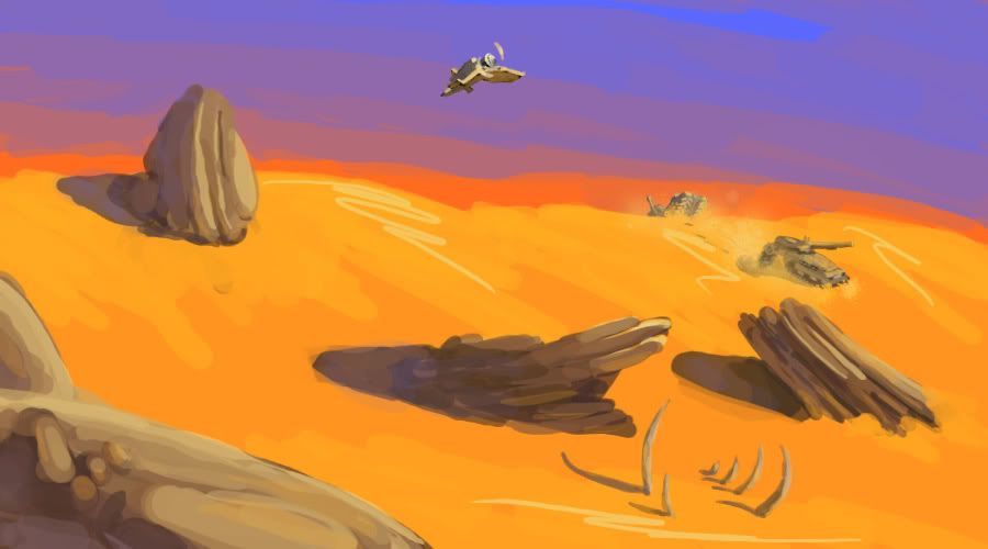
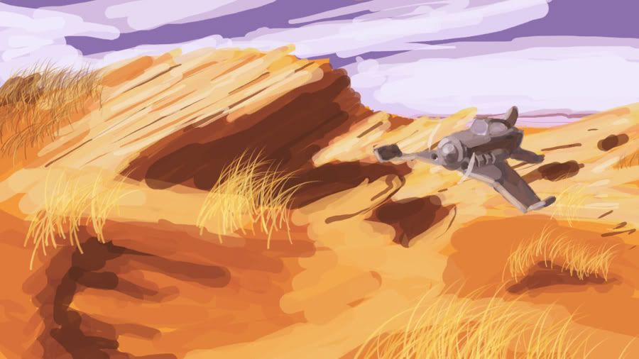

Here's one of my first concepts, probably won't be using it but I still kinda like it :P

Right now I'm focusing on developing two distinct cultures, and what I'm showing now is what I have for one of them, so let me know if these guys don't feel cohesive to you. I've got a story brewing around, I'll post some details when I have some more interesting concepts to go with it
Crits are definitely expected!
For now I'd also like responses as to if my concepts are giving you any sort of feeling of a place, or if they're just too empty now. Blah blah, anyway, here's what I've got so far


Here's one of my first concepts, probably won't be using it but I still kinda like it :P

Right now I'm focusing on developing two distinct cultures, and what I'm showing now is what I have for one of them, so let me know if these guys don't feel cohesive to you. I've got a story brewing around, I'll post some details when I have some more interesting concepts to go with it
Replies
anyways, I really like your use of colors and overall brushwork. The environments would benefit greatly from some atmospheric perspective though.
something you might want to take into consideration as far making cohesive designs, is the silhouette is easily the most important part. Before color, paneling details etc, try and get some shared forms in the silhouette and you`ll be solid.
Silhouette is important because its what the brain recognizes before all else, so no matter how cool your details are. If your silhouette is wak it`ll hurt the entire piece.
Awesome work though. keeping my eye on this one.
keep up the great work.
Here's a practice sketch for the Gameartisans treehouse comp going on:
Starting on a stylized Viking-esque landscape, kinda mulling over a back story.
that thing that looks like a waterfall could use some work. at elast from the image you posted. in fact the whole last image is rather unimpressive compared to the earlier ones.. I was expecting a whole village. like.. 3-4 more buildings and maybe a town hall on another island.
maybe try turning up the lightmaps a little? see how it looks with shadows that is.
I'll see what I can come up with to make it more like a whole village!
EDIT: Any tips on lighting are appreciated
Also might want to try playing the the shape of the windmill sails where they intersect in the middle, for some reason the overlapping squared edges don't quite look right... maybe if they were all cut so they tapered in at the center and didn't overlap?
My 2 cents.... cool project man, def be watchin it progress
I'm ready to call this finished, but any crits are welcome.
Messing around with making an old friend, still a lot of work to do:
Might do some poses later.
Here are some concepts I've been working on.
This is just waiting to ooze with cool, if only you developed it more
More practicin'
EDIT: One with less zany proportions:
but i've seen that exact presentation elsewhere... by another artist. (can't find the image right now though
ok found it: http://www.bryancavett.com/wip/merc_concept_ver1.jpg
i thought that his had the same background color as yours, but apparantly it didn't... :poly131:
Razor: I figured it was pretty common but I definitely got the idea from Byan's concept
Here's a new dude:
another good site for unreal tutorials is http://udn.epicgames.com/Main/WebHome.html if you have any other questions i might be able to help. three levels that i made are simulations at a hospital and the other one is a simulation at the carnegie museum of natural history.