The BRAWL² Tournament Challenge has been announced!
It starts May 12, and ends Oct 17. Let's see what you got!
https://polycount.com/discussion/237047/the-brawl²-tournament
It starts May 12, and ends Oct 17. Let's see what you got!
https://polycount.com/discussion/237047/the-brawl²-tournament
Character :: project 01
Ye, well.. random character project for my dusty portfolio, and I better !%&# finish this one x(¨
Did some thumbs and doodles today, picked a design and did a sketch. Probably gonna do a few more concepts, but its a start.
--
Update 21-6-08 - New arms.
Update 23-6-08 - Legs adjusted.

Update 21-6-08
Well, since this project might acually lead somewhere, I might aswell write the acually diear behind it.
Hes a fireman, well sorta... A heavy armed unit whos brute force allows passage to otherwise unreachable areas. In other words, hes the smashing! While others take care of wounded etc..
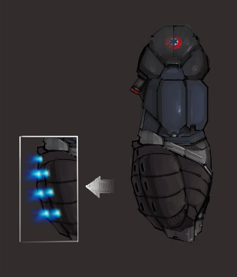
The suit is a mixture of steel and keramic plating, which both ensure strength and resistance to the high temperatures. The backside of hes arms are fitted with plasma cutters, which will allow him to either cut or weaken materials who doesnt subdue to a mean left hook ^^.
Now, I know someones gonna point and say "but hes not RED! and wheres the horn lol.". I realize it might have been a more obvious choice, but I really wanted the suit en a warm hue. Replacing the blue parts with red simply made him too warm overall.. imo anyway.
No more babble! Here be an arm.

---
Update 23-6-08
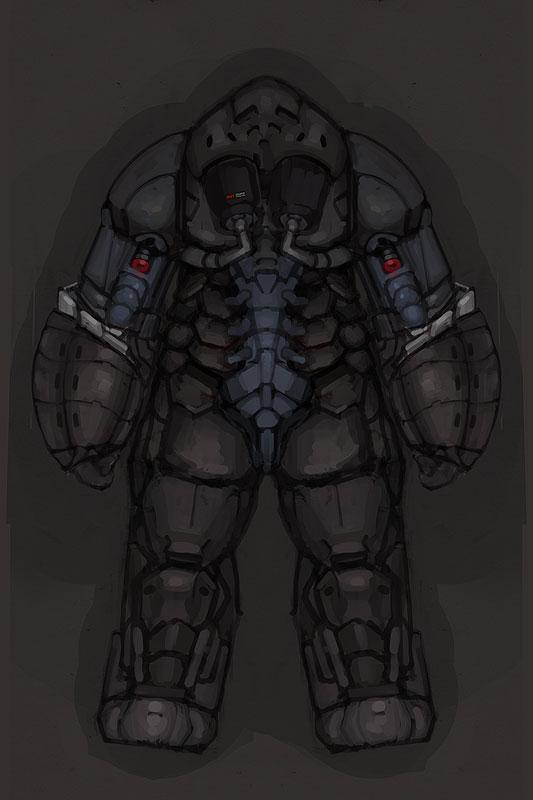
Did some work on hes backside. Some of the lines deviate from previous images, but im still just trying to get a grasp of the concept.

Did some thumbs and doodles today, picked a design and did a sketch. Probably gonna do a few more concepts, but its a start.
--
Update 21-6-08 - New arms.
Update 23-6-08 - Legs adjusted.

Update 21-6-08
Well, since this project might acually lead somewhere, I might aswell write the acually diear behind it.
Hes a fireman, well sorta... A heavy armed unit whos brute force allows passage to otherwise unreachable areas. In other words, hes the smashing! While others take care of wounded etc..
The suit is a mixture of steel and keramic plating, which both ensure strength and resistance to the high temperatures. The backside of hes arms are fitted with plasma cutters, which will allow him to either cut or weaken materials who doesnt subdue to a mean left hook ^^.
Now, I know someones gonna point and say "but hes not RED! and wheres the horn lol.". I realize it might have been a more obvious choice, but I really wanted the suit en a warm hue. Replacing the blue parts with red simply made him too warm overall.. imo anyway.
No more babble! Here be an arm.

---
Update 23-6-08
Did some work on hes backside. Some of the lines deviate from previous images, but im still just trying to get a grasp of the concept.

Replies
perhaps some more unique patterns in the arms (like getting smaler round the fingers and thumbs).
can´t wait to see more
Thanks man. Ye, wasnt very pleased with the arms either. Hope I can do some mo' sketching tonight.
go build!.. gogogogogo!
Might be a little more wide in shoulders. And try to thing aobut this, when he need to get the arms up? I'm talking about joint in the shoulder and head/neck area...
But the model could be awesome;)
Updated the first post with a pix and a wall'o'txt.
@Levus
Hehe ye, I need to keep in mind how it works in movement. Been awhile, im still in 2d wonderland where everything is possible.
He's got lots of nice flowy lines all over the rest of him, but it the plates down his front look a little flat to me. It looks like you started breaking them up, maybe do a bit more of that?
Also you might want to chew up the silhouette a bit more around the knees and elbows to suggest joints. The inside of the knees already looks like it will work well.
As others have said, he seems like he'd make a good model
@Blue
Youre right, hes chest does seem abit flat. I acually wanted a kinda "fat" bulgy shape, but the pattern and lines where messed up. I'll fix.
Hes legs in front view where kinda old. Worked all night on the back view, and was too tired to start on the front again. These have been changed and updated today.
Im still juggling whether to make him "next gen", or just stick with some regular texures and specs. My laptop is pre-historic, and dont really handle highres models very well ;(¨
Anyway, cheers.