Warhammer Building
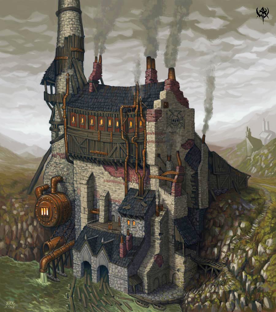
Here is an environment I am working on for a class. I am working from a concept from Warhammer.
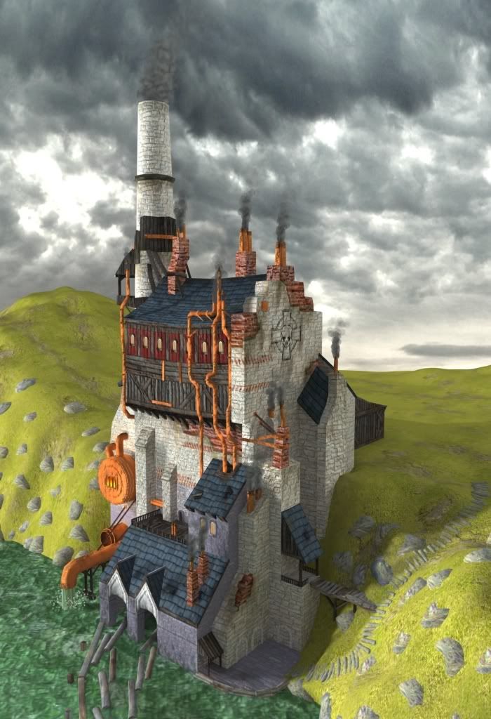
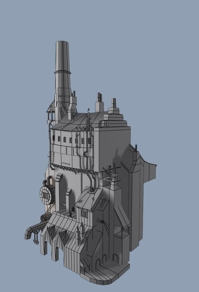
The building is 3100 Polys. Any critiques are welcome, I am trying to make this a good portfolio piece.
The building uses two 2048x2048 diffuse, spec and normals. I could prolly go to 1024x1024 and not lose any quality (from this distance), but because i am going to be doing an animation with close up zooms I am keeping them high Res.
Replies
The materials need to be gone back over as everything looks very new. The photochopped sky looks pretty bad in with all the hand painting.
In the concept the smoke choking out of the stacks looks to be contributing to the overall environment haze, not so in the scene. In fact very little haze at all. The sky even reads as non hazy and the 3D part definite has zero haze to it. Read up on Z-Depth Maps and try to work some of their common uses, into your scene.
The water color is off, in the concept its a putrid green, you have a color closer to what you'd see in the NE or NW of the united states.
There is very little dilapidation in your scene. Most of the lines except for the roof are straight and pristine. The pieces of dilapidation you do have, lack weight. The concept has things clearly braced as if they are about to topple over, beams and support straining and buckling to hold the weight. What you have looks like it would be fine without the support.
You've got some work ahead of you if you want to turn this into a portfolio piece. Best of luck, hope that helps!
It is a little flat looking though. The concept got a lot more contrast.
In your render it looks like you just have your diffuse showing Im not seeing any benefits of a normal or spec map. Also I think you could push the colors a lot more follow the concept at least for the copper pipes and fixtures that orange color bothers me.
Good luck it looks like it has a lot of potential.
Keep pushing.
The Terrain still needs plenty of work and I think I will go about making the rocky shore a different way because the way I have it now just doesn't look right at all. The texturing is still in progress on the copper parts there are details I have yet to add there. And I am working on getting a specular map for the copper areas that will make it look more like metal. I will post my texture flats in my next post.
And here are the texture flats, these are a scaled down version so i didn't take up too much space on the page.
The second texture was tough to arrange the UV's to make use of the whole UV space, So it has some noticable wasted space.
This is why I asked for your flats from the start. I thought I saw this coming and I could have saved you a lot of wasted time earlier one. Don't give up though, it can still work! Also model in a LOT more detail, you're going to have to. Think of this piece from a player's scale, NOT recreating the concept angle only.
Well It isn't really a big deal for me I have enjoyed working on this, and if I have to redo it to make it right then it lets me work on it more.
Good attitude to have. Redo's can suck but when the final result looks better its always worth it.