Modularity
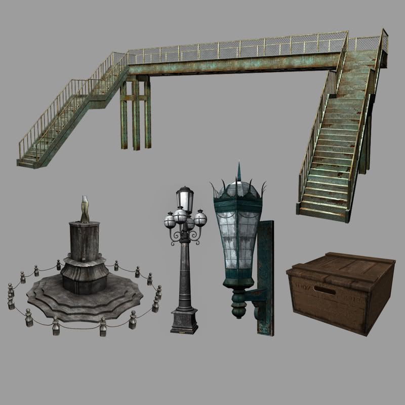
Hey everyone! Im currently attending the Art Institute of California-OC. This is my first post here. I've been working on this piece for a class. This is my first attempt using modularity. This is still a work in progress. I also includeda render of the props I put in this scene. All feedback is welcome.


Replies
A couple things stand out at me.
Lighting is very basic, and doesn't sell the scene very well. I say this first, as the next couple could probably be helped tremendously by simply updating the lighting.
It's very monotone. Everything feels like it's the same color/tone. While there are points of interest, they tend to get lost in the sea of grey/brown.
It doesn't feel big. It feels very much like a miniature scale model of a real place. Impressive, but I'm guessing that's not what you're going for. Things that would help sell the scale, include lighting, life (plants, people, etc.) and pretty much anything that is recognizable as a standard size.
I'd say the props, out of context, look good, but the scene as a whole needs a shot in the arm.
Keep it up, good stuff.
Can you post your modular pieces when you have a chance, I'm interested in seeing how you used them.
Texturing is nice and clean as well, keep up the great work
I agree with what have been said. But there is one thing that really catch my eye - that one odd angled pillar segment. I don't see how it could possibly break/tilt like that, since it would still have contact point at it's top and bottom no matter what. I would say, break the pillar completely OR simply shift that segment sideways, like what could happen during an earthquake - without a tilt.
Or maybe you have a ref pic to prove me wrong :P In any case, looks odd to me...
you could use the "thirds" principal on the walls. and build modular sections of unbroken and half broken up floor panels for the ground, leaving the current texture as a base, as more damage would occur to the floor in open areas than around protected parts like corners and near walls.
Ill not repeat what others have said, though I do agree with it all.
Your individual props are looking nice, too, but a couple of things:
Maybe the metal on the lamp post could be sold a little more as metal? A smaller spec spot perhaps. It just looks to be absorbing a lot of light, almost like rubber.
And on the stairs, one thing I learnt off here, is that the risers are never the same size as the tread depth.
http://www.sandstonedesigns.com/home_files/images/image057.gif
Your steps all look like they are just cubes that have been elongated, whereas they should be a little flatter, thus making tread depth larger. This just acts to make steps a little more comfortable to use.
It might also be nice to make the center of your steps a little more worn than the outer corners of them, and make the outer corners have a little repository of dirt that always seems to gather in steps, to break up flat tone. Also, the very edge of each step always gets the most wear, so take from that as you will.
Oh its hard making stairs itd seem :P
Also, a more dynamic scene render would be nice, particularly one that shows off that metal stair bridge (i seem to be in love with it.) It adds a nice bit of interesting colour and I dare say it'd cast nice and interesting shadows. I think its a bit of a shame its left hiding in the background.
Now, sorry for the long post, but hopefully some of that helps. Its really quite solid work though, looking good.
Or, if you REALLY like the angle youve got for some reason, then put a small balcony/railing around the camera, to give some sense of perspective.
Ya, now that I see the broken pillar, I can't believe I didn't notice it the first time!
You need to decide whether you want to stick with warmer or colder tones. The wall texture with the dripping water doesn't mix well with anything else around it, looks out of place.
Given that the floor has a sandy warm feel to it i'd try to add a dust layer or dust trim on all textures/skins touching the ground to ease the transition.
There's a lot of tiling going on.
It looks like you're going for hires texture projection with sharp tiny texture details sacrificing the character of the whole scene for it. The textures repeat a lot which might look good when you're hugging a wall, but bad when you try to look at a bigger picture.
There's no global solution for that, it would depend strongly what type of game you'd have in mind for your work... FPS or top down etc.
Right now the tiling is pretty bad for any game and makes everything look bland and plain.
The statue in the center is the only thing that looks good.
The white window/lamp glass must be still WIP, looks bad. Make glass in such situations ALWAYS dark. If you have a light inside, give it the usual warm light tones.
Other than that, seriously: DARK GLASS.
Personally, I think most of your textures are great - Except the floor one that is on the edge of the stairs and the upper level wall. They need more dirts and be more dirty like other stuff.
Also, if the scene has been there for a while, you might want to add some yellow tone to the concrete and some vines or weeds to break the grey tone a little.
Lastly, like the others already mensioned, if you can create a more dynamic lighting and camera, among with a sky dome, it will look FANTASTIC!
Keep up the good work!