The BRAWL² Tournament Challenge has been announced!
It starts May 12, and ends Oct 17. Let's see what you got!
https://polycount.com/discussion/237047/the-brawl²-tournament
It starts May 12, and ends Oct 17. Let's see what you got!
https://polycount.com/discussion/237047/the-brawl²-tournament
Replies
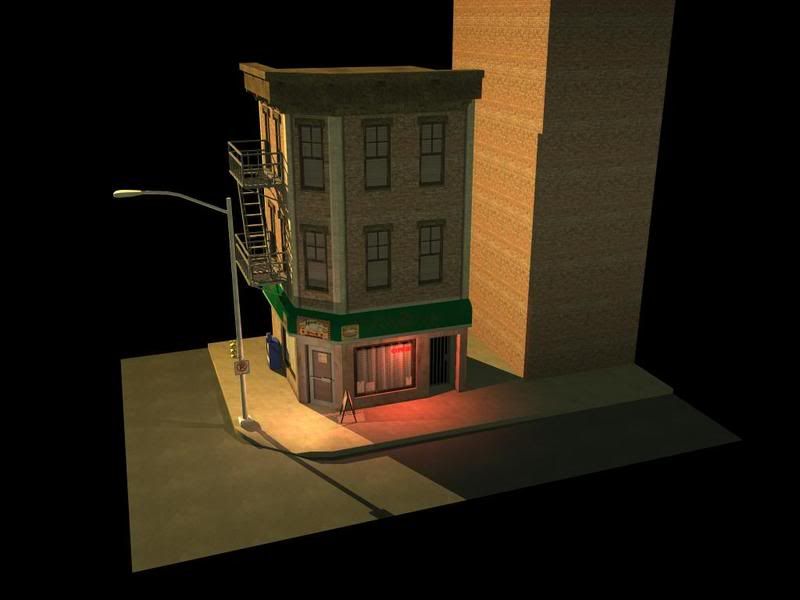
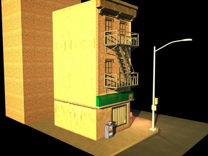
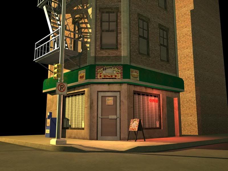
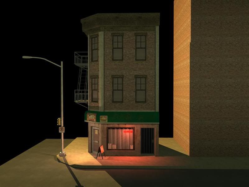
The texturing and ground floor design is impressingly boring and plain for an FPS or 3th person game.
It would work for a classic top-down game (RTS or something like Freedom Force with a more realistic look) but then it's missing the details where you'd see them more, in the form of roof objects and nicer street textures.
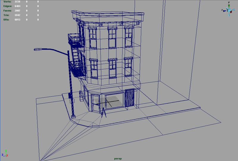
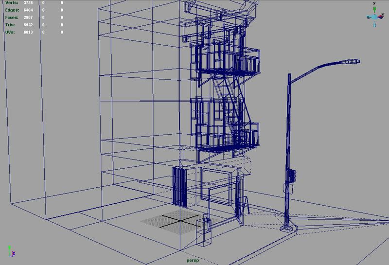
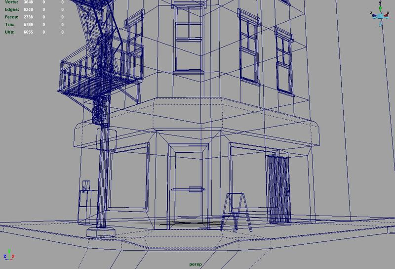
For a grander similar game in style like GTA4 it seems to be using too many separate materials (window glass, window frame ?) to be efficient and i would probably expect to see some kind of simple baked AO in the more unified UV you'd have in such cases.
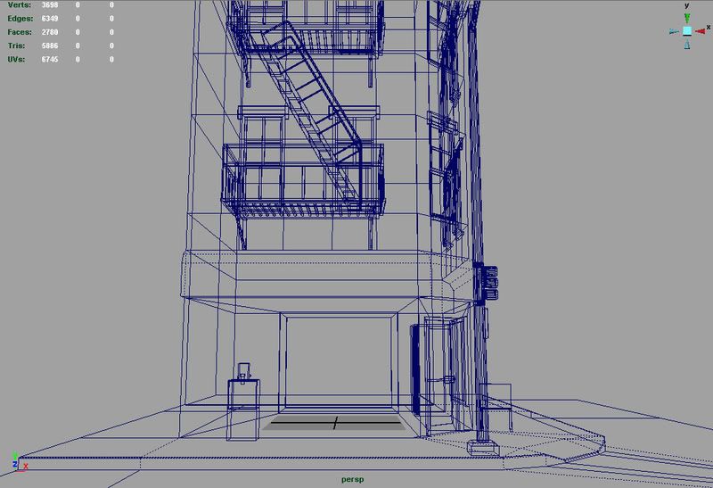
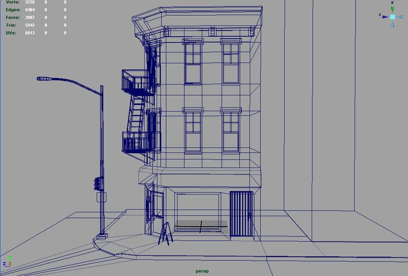
Also, the use of polygons would be kinda off for such a game, with modeled window frames and a streetlight that seems to almost match the building as far as polygon count goes.
It seems to be stuck inbetween worlds without being really usefull for either.
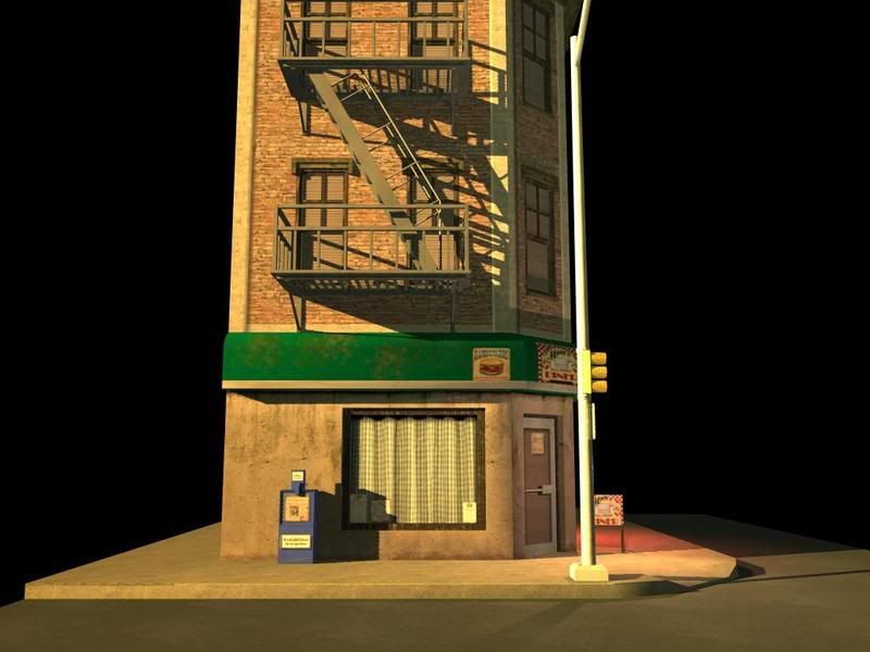
If you really want to go with it tho, I'd say to make proper street textures, the lack of them is making the building look worse than it really does. Then i would change the dirt on the bottom of the wall texture to something brighter and more gray that matches the pavement for a softer transition. Add the same dirt/dust to the bottom of the door.
The street corner that's lowered looks rather harsh, i'd also lower the next row of points a little to soften the transition.
The top trim of the building is screaming for some detail, you have some modeled detail but just a tiling texture on it and as you can see yourself in your renders, all the geometry there is almost invisible unless directly lit.
If you're gonna do something, do it right or just let it be. Either look at photo references and skin that area properly, either painting it or reusing photo sources (the top of the trim area by the roof could really profit from a nice material with proper weatheration anyway) or just simplify it so it doesn't look unfinished.
Right now all it tells me is that you can't pull off anything more complex than a flat wall properly.
It's hard to tell, but i dont think i like the dark wood or metal (?) texture you're using on the window frames one bit. On the windows in the bottom floor i'd expect to see the same material on the frames as the door is made of.
Some simple props to make it less plain would be nice too, AC units sticking out of a few windows, a bent pipe coming down one side of the building etc.
...and whats up with the material on the fire stairs, still WIP ?
http://www.gnome.org/~federico/photo/street/2002-07-sidewalk.jpg
The sidewalk looks like one big piece, there are no separations. Usually sidewalks are made up of big concrete slabs.
http://www.enewsonline.org/images/565_Sidewalk_1.jpg
Since I see you have a stoplight, some lines on the road would be good, like crosswalk, center line, or the white line you are supposed to stop at.
http://www.maestravida.com/blog/crosswalk.jpg
Maybe another window texture so they aren't all the same? Agreed that you should dirty everything up more, and also some trim on the bottom of the building? Other than that, not bad for a first go round. Post your texture flats if you want some more crits. Is this just a diffuse texture?
Keep at it. It's a good start, keep posting progress.
I would definitely make the ground a bit more interesting. It's very clean and uninteresting. Not to mention your sidewalk has no lines cut out of them. You wouldn't see solid concrete just sitting there. Same thing with the street.
I would add a chamfer to the curb, maybe add a storm drain on the curb/asphalt as well. Add a manhole in the road as well.
However, for the limits that I am sure they gave you, the building is looking decent. The very top of the building with the brownish concrete is not really doing it for me, but that's just my opinion.
Keep going man!