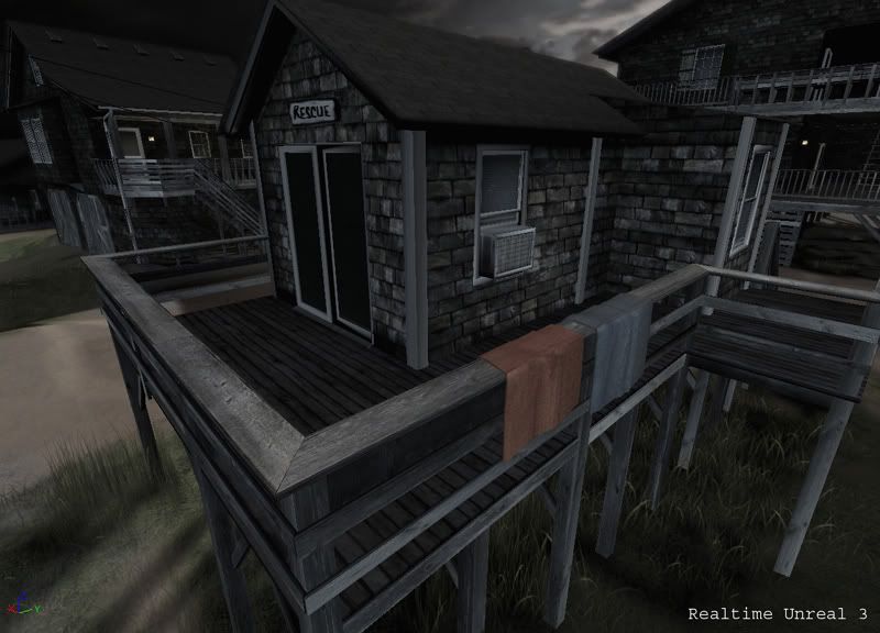
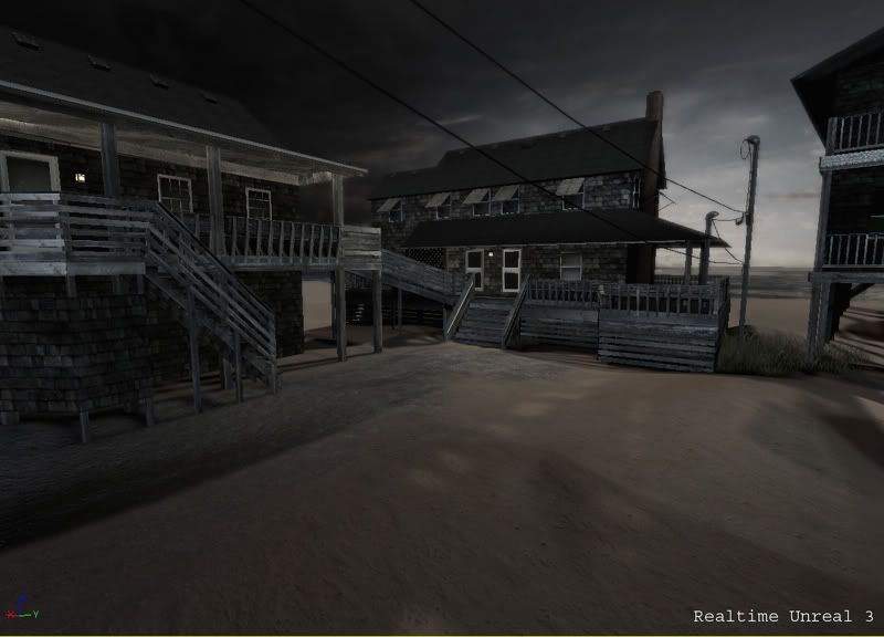
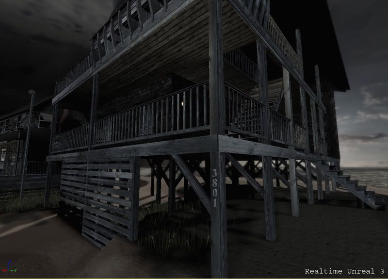
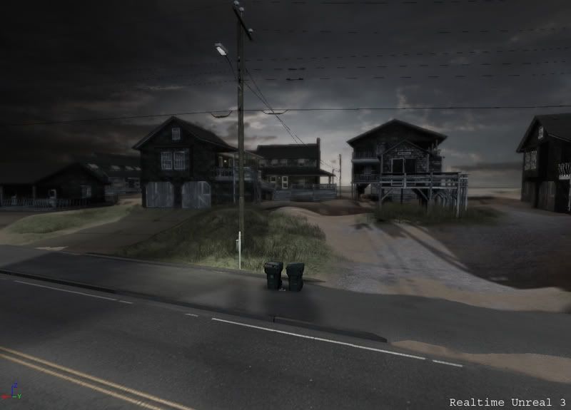
I just recently completed a scene i've been working on for a while now and was wanting some outside c/c. All modeling/mapping was done in 3dMax, texturing in photoshop and brought into the unreal 3 editor. The scene was taken from a snapshot my gf took on our vacation in Cape Hatteras NC. Thanks, and i look forward to posting future work.
Oh this is very nice The texturing looks great man, and there is a lot of cool little details that really help sell this as a real place
I think my only crit right now is colour wise, its a little un-appealing. I mean I know its a dark scene, but right now there is no visual interest for me, nothing is drawing my eye to a key focal point (if you have one that is). It would be cool to try and geta little colour in there... easiest thing is instead of putting the towels on the side of the beach house, maybe try putting 1 in the front?
That may actually mess up the flow, but it seems to me the beach house would be your main focal point, and I think just adding that red towel to the front could draw the eye where you want to lead it.
I really like the shadows, looming over the viewer, but it may be a bit too exaggerated, either way I like it
(just had another idea) If you want to add a bit more colour to the scene, why not hang some porch lights, or those party lights (http://www.parteemarquee.co.uk/lights/images/party_lights1.jpg - a bit extreme) but that may be a bit too much, and probably obvious.
Anyways, awesome work man, by any chance do you have a portfolio site? I would love to see some more work from you.
The mood I'm getting from the images is as if this area is a bit aways from a city that recently suffered a severe zombie outbreak, and there's only a matter of time before they run out of food downtown...
What I'm getting at is that it does have a depressing and "something's out there", horror kind of feel to it (especially the last picture) which I actually like a lot, but if that's not what you're going for, then definitely liven it up as Jason suggested.
While it's great and certainly has the mood you're trying to pull off, as a scene I also think it lacks color. It has that typical brownish/desaturated "next gen" look to it. Kind of bland.
yeah to add to what vassgo pointed out i think your shadows are too de-saturated. your sky should give the shadows a slightly bluer purply colour, atm it looks like your shadows go to black through grey.
also it looks like you have a lighting issue on the bottom of the wooden fence thing of one of the houses as its completely black
One thing from me, thats its looking little sad (but its my own opinion of course), bricks are little boring, maybe some tweaks with color (all is gray-looking).
Everywhere is the same gray wood.
Maybe special features somewhere? Like "rescue" sign or house number or the towels? Some more of it and we have a more interesting scene, with some color accent somewhere.
But technical job and both scene looking is realy realy cool for me!
I once stayed at a friend's beach house down in Myrtle Beach, I feel like I've been exactly there! Really amazing quality art, does give me the heebie jeebies though (zombies!!!)
Reminds me of Florida, before a hurricane hits. Nobodies out side and the sky is black.
You have signs of human life, but it's not enough to be convincing that humans do live their. If it's deserted, then more deserted "things' should be their. If it's lived in, more lived in "things" should be their. Basically agree with what Levus said.
Like everyone else I think this is good. Here's some comments though cause I like to practice.
First image.. I doubt you'll see it like this in-game so you shouldn't care about this crit but the roof has this repeating pattern with a dark spot. Doesn't matter much though cause you'll prolly never see the roof unless you plan on having a cinematic with a flyby. Cause it really isnt noticable from far.
Second image. It feels a little too empty. I'd try to toss in a few rock meshes maybe. Possibly some more items the humans left. Like a bucket filled with sand or something. Maybe add some more vegetation out in the sand.. like.. a few patches here and there. Not entirely sure.
Could always go the cheap way and add some crates. hah. But ya.. maybe some random debris somewhere.
Third image. Only thing I can really think of is that the number signs are too clean.
Fourth image. I like this image. It really shows off the mood. Still a little bit empty. Where do people park their cars? Is it possible to show that in some way? Maybe a cover that you can cover the car with to protect from sand that lies? Uhm.. well, not the best suggestion I guess.
Wow, I like this a lot. I looked at the images before reading your post, and the last image made me think "hmm...that looks familiar". Your post says your reference is from Cape Hatteras. I have family nearby that I often visit. And from what I see, your work is perfect. When I was a kid, to visit the best beach areas, you'd have to drive past hundreds of homes just like this. Each with unique names and colors on them.
My only crit is the atmosphere is not the same. There is too much dark greyscale lighting. It needs the right colors to set the mood. A nice calm sunrise would really make this piece shine. :P
It would also show the Unreal3 Engine in a new light, if it's possible. One that's appealing.
I'm going to be making some changes to the scene pretty soon but here is the reference photo that i was working off of. I haven't modeled a car since i was in school (which was pretty crappy) but i'm thinking about giving it another try to help out with the scene. when i was working in max the sky/lighting were a lot closer to the reference pic but when i moved everything into unreal i desaturated it quite a bit and used one of the stock skys (i haven't learned to make skydomes yet).
I looked at your images first, before reading anything, and I thought, damn those houses look just like the ones I've seen in Cape Hatteras or Nag's Head, when I went there for vacation back in '00. So all I got to say is that you captured the likeness perfectly I'd leave the night lighting, it looks much more interesting than in your reference photo, and I think it works great and emphasizes the notion that most of those houses look like they're haunted (and to me most did look like that). I like the lighting in terms of the mood it sets, but can't tell if it's moonlight or sunset or sunrise, even though for the last two I would expect a lot more color in the clouds.
Hah, now I've read Elysium's post and now I know I'm not the only one to whom those houses looked familiar
Replies
I think my only crit right now is colour wise, its a little un-appealing. I mean I know its a dark scene, but right now there is no visual interest for me, nothing is drawing my eye to a key focal point (if you have one that is). It would be cool to try and geta little colour in there... easiest thing is instead of putting the towels on the side of the beach house, maybe try putting 1 in the front?
That may actually mess up the flow, but it seems to me the beach house would be your main focal point, and I think just adding that red towel to the front could draw the eye where you want to lead it.
I really like the shadows, looming over the viewer, but it may be a bit too exaggerated, either way I like it
(just had another idea) If you want to add a bit more colour to the scene, why not hang some porch lights, or those party lights (http://www.parteemarquee.co.uk/lights/images/party_lights1.jpg - a bit extreme) but that may be a bit too much, and probably obvious.
Anyways, awesome work man, by any chance do you have a portfolio site? I would love to see some more work from you.
What I'm getting at is that it does have a depressing and "something's out there", horror kind of feel to it (especially the last picture) which I actually like a lot, but if that's not what you're going for, then definitely liven it up as Jason suggested.
also it looks like you have a lighting issue on the bottom of the wooden fence thing of one of the houses as its completely black
other wise very nice scene
One thing from me, thats its looking little sad (but its my own opinion of course), bricks are little boring, maybe some tweaks with color (all is gray-looking).
Everywhere is the same gray wood.
Maybe special features somewhere? Like "rescue" sign or house number or the towels? Some more of it and we have a more interesting scene, with some color accent somewhere.
But technical job and both scene looking is realy realy cool for me!
cheers!
Otherwise it's really nice you can take this in either direction, hope to see more soon.
I'll repost when i make a few changes.
- Cheers!
You have signs of human life, but it's not enough to be convincing that humans do live their. If it's deserted, then more deserted "things' should be their. If it's lived in, more lived in "things" should be their. Basically agree with what Levus said.
Good job over all though mate.
First image.. I doubt you'll see it like this in-game so you shouldn't care about this crit but the roof has this repeating pattern with a dark spot. Doesn't matter much though cause you'll prolly never see the roof unless you plan on having a cinematic with a flyby. Cause it really isnt noticable from far.
Second image. It feels a little too empty. I'd try to toss in a few rock meshes maybe. Possibly some more items the humans left. Like a bucket filled with sand or something. Maybe add some more vegetation out in the sand.. like.. a few patches here and there. Not entirely sure.
Could always go the cheap way and add some crates. hah. But ya.. maybe some random debris somewhere.
Third image. Only thing I can really think of is that the number signs are too clean.
Fourth image. I like this image. It really shows off the mood. Still a little bit empty. Where do people park their cars? Is it possible to show that in some way? Maybe a cover that you can cover the car with to protect from sand that lies? Uhm.. well, not the best suggestion I guess.
My only crit is the atmosphere is not the same. There is too much dark greyscale lighting. It needs the right colors to set the mood. A nice calm sunrise would really make this piece shine. :P
It would also show the Unreal3 Engine in a new light, if it's possible. One that's appealing.
Thanks again for all of the feedback.
Prost!
is it just polymodeled with normalmaps from photoshop? or you made some hipoly models?
The first one. Modeled everything out, mapped it then made normals w/ photoshop/crazybump.
Hah, now I've read Elysium's post and now I know I'm not the only one to whom those houses looked familiar