Necromundan Environment
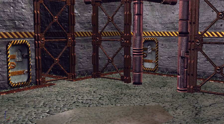
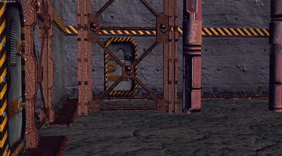
Hey everyone, I'm working on getting some environment pieces together, but I wanted to get some critiques before I go much further with this one. Also any help as far as lighting the scene would be appreciated; I didn't put any light sources actually in this scene because I want to make it just lit from above, but I'm not sure how to make that look the best.


Replies
Looks like you've based yours largely on the old click together card buildings... It can be hard to track down the old artwork from the game but if you have the rulebooks or anything like that, check out some of the sketches. They're generally a lot more interesting than those cardboard buildings which are simplified to make gaming on them and assembling them easier. They don't look that cool though in my opinion..
Heres a cool pic I found;
Ditto on the concept.
ask yourself:
*if you stand 10 feet from a wall in your home do you see all the minute texture of the paint/wood/brick/drywall?
*how close do you have to get to the wall to see that texture?
*is that the average view distance a player will be seeing your textures from?
*if that was a real wall/girder how deep would those dents/cracks be?
*how large would those bumps be?
i don't think people have gotten past the 'just because you can put all that detail into a normal map doesn't mean you should' phase of the new technology.
I also notice that the textures don't match 100%. If the metal is that beat up and worn out, why isn't the paint on the walls? The saturation levels are a little high. And the wall texture seems to be scaled a little too large. Stretch out those UVs just a little bit more perhaps.
Just my two cents.
You should download the lastest official necromunda and inquisitor rulebook at the "specialist games website" for more env. referencies.
http://www.specialist-games.com/
Try to keep in mind that the world of Necromunda is verry typic, so you really can't make something as generic.
Keep it up!
Don't worry, next I'm planning some of the bigger environments
Thanks for the crits on the detail of the maps, that was something I wasn't really sure about, so I'll be sure to tone them down and play around with them some more.
ScoobyDoofus: I've still got my original models
I tweaked the textures some, but here's where I think I'll leave this stuff for now; I'll definitely work on all the crits you guys gave me for my next environments.
I wasn't talking so much about open spaces, simply more interesting shapes. Have walkways and girders connect on something other than right angles. I find yours too square right now, like the old card and bulkhead buildings.
Everything looks like it is made of a similar material, really think about the roughness of the surfaces, concrete isn't normally very specular unless its really smooth or painted and even then it has a low gloss.
Also, it kinda looks like you ran all your textures through crazybump, this isn't a bad thing to do but try not to go overboard, the caution strips don't need bump for example.
TheSplash: Yeah, I finally caught the scaling issues, I'm fixing that now. I'll work on balancing the textures out to make the materials read better.
I've already made some changes but I'll wait until tomorrow when I've got some more stuff done. Thanks everyone!
I found these, they're from india. Soon as I saw them I thought "hive city"