Furniture.
Concept- Someone else's
http://img246.imageshack.us/img246/4361/hammerfellcommonfurn2so6.png
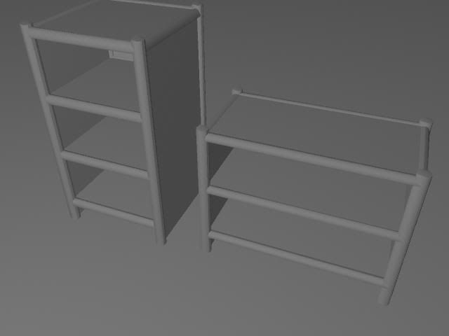
1.
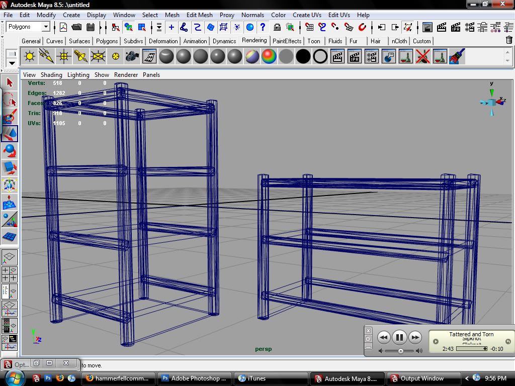
2. Wire frame
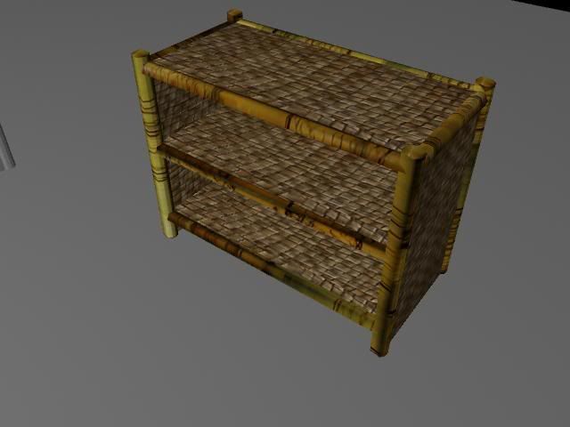
3. First color variation of the texture. I did not like it, it all blended together too much.
4.
5.
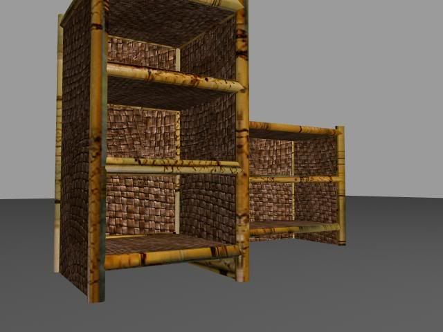
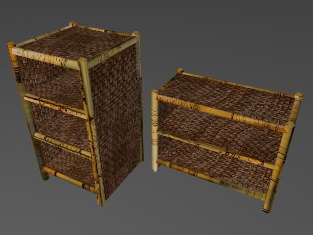
Yep. I worked a lot more on the textures. I used the full 512x512, and think it looks pretty good. Comments and crit please!
http://img246.imageshack.us/img246/4361/hammerfellcommonfurn2so6.png
1.

2. Wire frame

3. First color variation of the texture. I did not like it, it all blended together too much.

4.

5.

Yep. I worked a lot more on the textures. I used the full 512x512, and think it looks pretty good. Comments and crit please!
Replies
Delete the end caps off the cylinders that are inside the frame geometry and not being seen. Maybe try to create some ties for the corners of the frame it might make the piece a bit more interesting.
Also the texture on the larger frame in shot 5 looks kind of blurry and odd like low resolution. Especially the line on the second shelf makes it look like its two pieces of bamboo from that angle. There is also a weird bluish green smudge that looks blurry it's really distracting. You could adjust the UV's or the texture to fix this.
Good to hear youre using all the space in your texture maps. It looks like your learning from doing these quick props. Try making something a bit more complex next time.
Texture map.
I think I need more things like the big middle bamboo part. Might play with it some other time.
Try painting some more, man.
its called photo manipulation...play with those channels. overlay is your friend.