Quick Fast Detour Sign
polycounter lvl 16
I woke up this morning and wanted to model something quickly and texture it quickly as well. I spent about an hour and this is what I finished.
1.
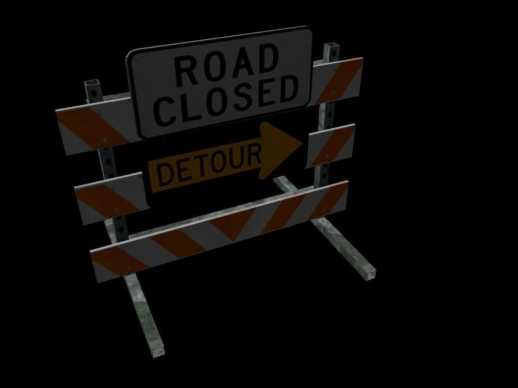
2.

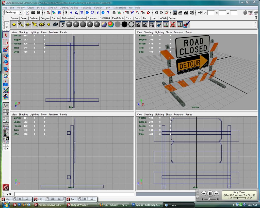
3. Wire frame and poly/tri count
opinions and crits?
1.
2.
3. Wire frame and poly/tri count
opinions and crits?
Replies
Don't render on a black background.
Give it a couple lights and some shadows when rendering.
More scratches, worn paint, specularity, dings, and imperfections.
If you didnt know how to change the background color, you go to the Environment section of the cameras Attribute Editor you can set the Background Color attribute to whatever you want.
Let's see your UV setup maybe you could make your color map look a little higher res if you had sections that tiled nicely. Also everytime you bring in any type of texture map into maya it creates a file node that for some reason by default has a quadratic filter set instead of being set to off. You can also change this in the attribute editor.
Good practice but lets see those changes and make them a habbit it should improve your work flow.
Found it, whats a good color to render in white?
edit: oops Wilex beat me to the punch
there is now ground, but 2 lights in front set at .like .40 intensity and one in back at .50. Also the the filter turned off pixel-ated the texture horribly, so I played with the different settings and this one is Gaussian. It looked the best.
fix the things already mentioned, like the dirt overlay stuff, and it will look quite nice.
texture density?
I used like a quarter of a 512x512. Also I could also probably find a better picture of the stripes.
Looks good. Only thing that stands out to me, and I'm being picky here, is on the bottom panel where your orange texture forms a triangle... it looks like one side of the orange texture is lighter than the other, almost forming a seam. Maybe you textured one side in PS and then duplicated, transformed onto the other side? Do one more pass on your textures, and make sure they blend well.
Also, when showing your wireframe, zoom in on the persp view, turn on "wireframe when shaded" and do a screen grab from there.
If you're up to it you could try to third your texture so you can utilize the tiling but it may be hard to get that candy stripe pattern to tile the way you need it. You would place your signs in one third your stripes in the second and make them tile then your generic metal and make it tile as well. This way you don't have to fit everything inside the 512 texture you can cheat it a little and gain some resolution through the tiling. It would be easier to see whats going on if you posted your texture though.
As for the image of the candy stripe you don't really need it just make some nice selections and paint your own using the image as a quick guide.
I was thinking of just making the stripes my self, Might be easier and make it look cleaner.
Trim down the metal part, add the flashy light stuff, sandbag texture in there * to hold the sign down*. Break the signs up a bit.. not so straight and clean fit. Plan on doing a normal map? Some cool dings and folds in the signs could be cool. Just a thought, hope that gives ya some ideas.
found this?
http://www.bencloward.com/tutorials_normal_maps4.shtml
if you're putting lights in the scene, make sure your textures aren't at 100 self-illum
your metal texture looks slapped onto all the bars. looking at your texture - it is. take the time to define the edges of the sides - these might be a bit lighter, as they'd get scuffed and scratched the most. same goes for the rest of the diffuse - there's no texture to it. the only thing defining edges is where colors stop. road signs take a tremendous amount of shit from everyone. they don't even get conveyor belts in factories, they get booted out a window and down some stairs and through a pit with lava pissing alligators. so give it some scratches and some weather stains and maybe some protein stains if you're feeling cheeky.
it's easily recognizable, so it's a success in that regard. but time to make it awesome
Here's an image of how I would handle that texture if I was going to crop it to 512x256. You want to scale your UV's up so they are as tall as the section and then the can scale as wide as you need because the texture repeats forever but keep it proportional you don't want the texture to look stretched. The tricky part is making it look seamless use Filter>Other>Offset to check if it tiles. You'll gain a lot of resolution if you do this. Also show off your photoshop skills with your texture re-create or heavily manipulate those images. Here's my example, just to be clear i marked how your UV's should stretch and how you should tile the texture.
Also look at this article by Ben Mathis, http://www.poopinmymouth.com/process/tips/thirding.jpg.
and check out the rest of his tutorials for more info on 3D stuff.
http://www.poopinmymouth.com/tutorial/tutorial.htm
Orly?
??? I just played with the setting until i got something i liked. A lot of the renders were coming out very bright. so I have an ambient light kind of far away from it at like .75 intensity.
Lay off the bump mapping. Get the basic unwrap / texture / model done first. You've gone from bad to worse.
damnit. I am trying to take it off? and found the settings to adjust how much displacement it gives the objects...
I think I need to redo the texture...LMFAO
To get rid of the bump just open the hypershade right click on your shader and graph the network then select and delete the bump node.
Get your color map to look nice and then maybe do a bump after but i really don't think you need one on this piece.