Home 3D Art Showcase & Critiques

Air race craft

polycounter lvl 15
Offline / Send Message
c0ldhands polycounter lvl 15
Hi everyone,

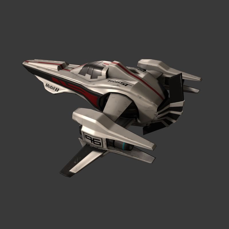
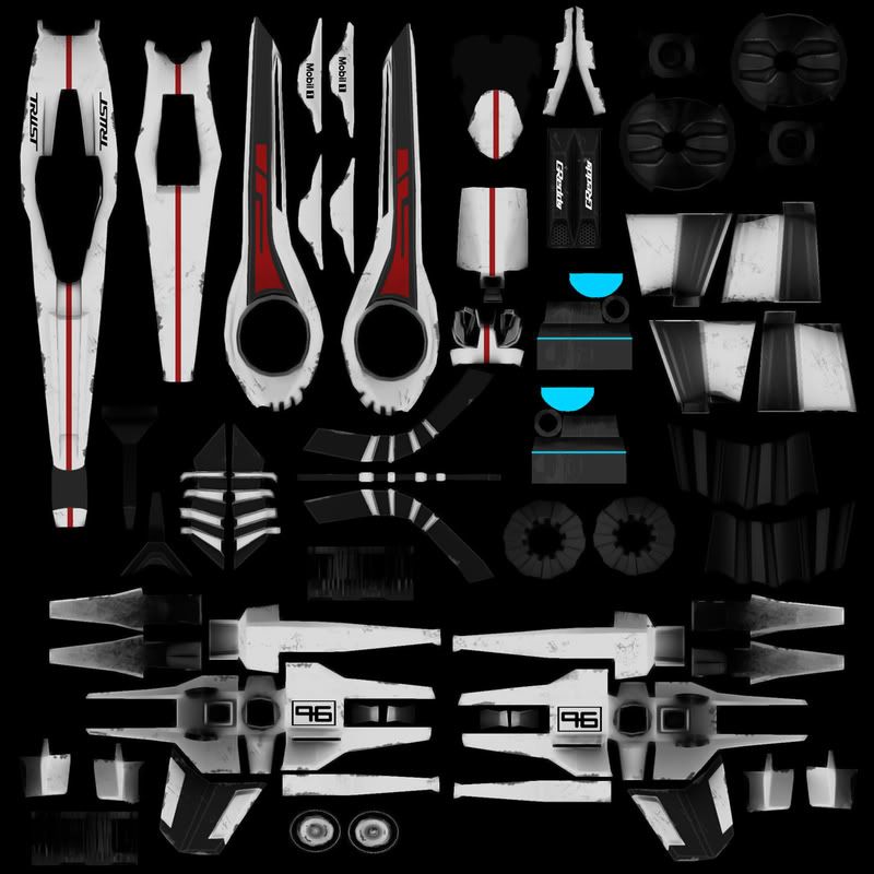
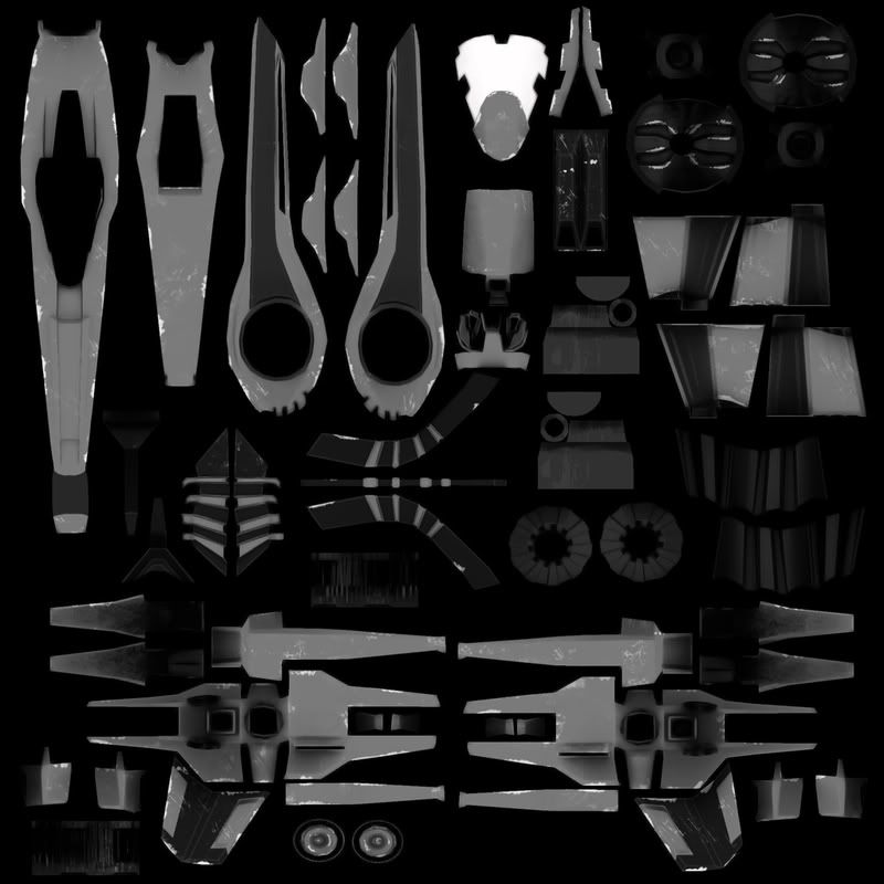
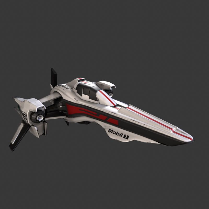
Just uploading some pictures here of my craft. Its supposed to be a high velocity air craft, in this case its also race modified. I am hoping that you guys here at polycount can give me some advice/ideas and crits on the texture(bear in mind that its far from finished). Right now maybe it seems a bit flat, but if i rough it up more it will look like a flying junk.

Just think of Formula 1, the cars really do not look dirty and scratched and worn out (well after they crash they do) so I am trying to achieve the same thing, but having in mind that these things fly really fast trough the air there should be some scraps and smoke/ dirt on them. I'm thinking of Jet fighters meets Formula 1 texture, don't actually know if that is possible...

polys: 7400 (diffuse/normals/specular map)
pictestfrontcopy.jpg

pictestbackcopy.jpg

texture.jpg

specularity.jpg

Replies

  • adam
    Offline / Send Message
    adam polycounter lvl 19
    Hey man this looks awesome. Kind of like a MkII from BSG with racing stripes...
  • Jesse Moody
    Offline / Send Message
    Jesse Moody polycounter lvl 17
    really cool but i think the uvs could have been arranged much better and more efficiently
  • Jaco
    Offline / Send Message
    Jaco polycounter lvl 17
  • c0ldhands
    Offline / Send Message
    c0ldhands polycounter lvl 15
    Thx guys for your replies. Guess your right JesseMoody, the uvs could have been done better, but this was the third time i have uv mapped anything seriously so I'm still learning, i promise its gonna be better the next time.
  • Wilex
    Offline / Send Message
    Wilex polycounter lvl 16
    Nice work. Yeah you could have overlapped your uv's at least. Cool design, keep posting.
  • marq4porsche
    Offline / Send Message
    marq4porsche polycounter lvl 9
    I like it. But I would add more decals to make it look racier, remember F1 cars have lots of sponsors on them and you have lots of empty space.
  • Firecracker197
    Offline / Send Message
    Firecracker197 polycounter lvl 11
    Yeah, my only crit so far is that in order to get that racing car feeling you need a lot more sponser logos, I mean have you seen some of those things? Theres stickers for everything! Big, small, anywhere they can sell space on the car the better! But the texturing is awesome so far! A lot better than Ive seen in awhile! Your doing very well so far!
  • c0ldhands
    Offline / Send Message
    c0ldhands polycounter lvl 15
    I have made some minor updates on the ship now. I think Im happy the way it looks now, i really don't want to overdo the texture either. Right now Im gonna work on some podium or some background scene. Thx for the comments so far people. BTW some people pointed to the fact that some textures are not overlapped but thats because of the normals.

    Rev-8.png

    and t3h normals:

    normalpsd.jpg
  • Peris
    Offline / Send Message
    Peris polycounter lvl 17
    doesnt have to do with the normals, you can have overlapping textures with normal maps too. The parts look exactly thesame on teh normal map aswel. It looks cool but you could have achieved thesame result with only a 4th of the texture space i think.
  • Michael Knubben
    Just make sure the normals aren't overlapping while baking the normalmap. Move the overlapping uv-islands by 1, bake, move them back by -1, and you should be set.
    I like the results a lot, though. I would've gone for less clinical materials, or at least greater contrast between materials. Something you could try is to add some contrasting texture to the specular map, that would make it a lot more interesting to look at already. Right now the specular behaves like it would on very clean, dull plastic. adding some splotches of black in there would help, as would adding some noise. Oh, and you seem to have taken logo's out of your specmap, but wouldn't it be cooler if those would actually be less (or more, ofcourse) reflective than the surrounding materials? That might really help sell them as being printed on/stuck on.
  • c0ldhands
    Offline / Send Message
    c0ldhands polycounter lvl 15
    Thanks guys for the comments, i really appreciate the advice. Gonna be more carefull with my Uv map next time.

    MightyPea> Thanks for the advice, Im think Im gonna play with the texture and come up with a better contrast between the colors. Maybe that white/grey is a bit boring...
  • Pedro Amorim
    what you should do now is make a new set of uvs and bake the maps from the current uvmaps to the new ones :)
  • adam
    Offline / Send Message
    adam polycounter lvl 19
    Get this sumbitch in an engine that supports environment maps and show some reflectivity on the surface of the racer.
  • c0ldhands
    Offline / Send Message
    c0ldhands polycounter lvl 15
    That would be a great idea dude, problem is that i don't have much experience with game engines. But maybe I can get a friend of mine to help me. Unreal Engine 3 anyone?
  • Foxco
    I really like the concept. I would not mind racing this ship around town.

    My only comment would have been about overlapping textures, but that has been covered :)
  • Wilex
    Offline / Send Message
    Wilex polycounter lvl 16
    Fix your UV's man it won't take that long. You have multiple elements with the same color and normal repeating 4 times in your maps its just lazyness it looks like an auto-unwrap. All you would have to do is overlap the repeating UV's and then pack them back in and then cut the elements in your maps up and rearrange them to match your new UV's. No repainting or re- baking involved.

    I don't have experience baking maps to a new UV set but you could do that to and it might be faster than adjusting your maps in photoshop. Also you would gain a lot more texture resolution. It looks like you're using a fairly large map but your images say 800x800. What size are they?

    If you want to take this into Unreal 3 you should check your geometry and make sure you don't have any N-gons hiding. Importing stuff into Unreal 3 is really easy as long as you export your mesh correctly and it's clean. What program are you using to make this? It may also be an issue if you want to import this into Unreal.
  • marq4porsche
    Offline / Send Message
    marq4porsche polycounter lvl 9
    if you're going to make a scene why don't you make a few other versions like a Ferrari and a BMW and have them racing each other.
  • WipEout
    Offline / Send Message
    WipEout polycounter lvl 15
    In doing your decals, I would suggest choosing one major sponsor and painting your ship according to that sponosr's main color scheme, a la F1. For instance, Ferraris are Ferrari Red (duh) but the main sponsor is Marlboro-- whose colors are white and red; Lucky Strike/ Honda-- the car is white overall, with the white/gold/red Lucky Strike logo stamped prominently on the side; Red Bull McLarens are a dark blue with the logo stamped in a couple places-- but Dark Blue is the background color for the original Red Bull can.

    I bring this up because right now your decals look like stickers put on a toy or a NASCAR stock car-- there is not much rhyme or reason to their placement, and if you want the craft to look more F1, you should look more into the F1 cars' paint jobs and why the cars are painted those particular colors (wouldn't it have been awesome if Honda had stuck with the all-black, sans-decal car they had unveiled during their tests?). And while Firecracker makes a good point about the great ad space on a car's body, F1 is FAR more tasteful in painting sponsor decals than other race car series (especially the boring ones that drive in circles for hours on end... :P)

    Also, look at the WipEout ;-) series of games-- they did exactly what you are attempting in ship design, and exactly what I am suggesting in paint schemes. If I were doing what you are, and wanted to include more of an F1 element in the paint scheme, I would try to take something like the Coca-Cola logo and "futurize" it-- make it look more like the label has grown with the times. That's something else that makes your sponsors look like they're just stickers-- they don't look like they're from the same year as the vehicle.

    I do, however, enjoy your ship design. It definitely looks fast and has that sleek-yet-utilitarian look of an F1 car. Can't wait to see where you end up with this.
  • c0ldhands
    Offline / Send Message
    c0ldhands polycounter lvl 15
    Thx guys for the replies. There has been a lot of comments on the issue of the texture uv sets. Well i just thought that if I overlap the uvs then both sides of the ship will look the same. I was hoping to have more variation on the ship and some asymmetries on the texture, so now that I'm gonna head with the texture in the Wipeout world direction i think there would be nice if I had some asymmetric variety.

    Wilex> The model was made with Maya 2008 and the resolution of the maps are 1k.(the model is also clean of N-sided faces)

    WipEout> Thanks for the tips man. Yah you are right, it looks like NASCAR, and we don't want it to look like NASCAR don't we. Guess Im taking this to a more future racing level. Maybe come up with my own scheme colors and logo...a scheme that would fit with brands and the racing team. NOt gonna use this time "real life brands" because it looks silly. Im gonna come up with my own logos and brands...but maybe a "coca cola of the future" race craft isnt so bad....

    Thanks ppl so much for the comments so far, it has really been helpful, now i have to get to work...
  • Wilex
    Offline / Send Message
    Wilex polycounter lvl 16
    Cool, i can't wait to see that asymmetric detail and texture redesign, as long as you justify your UV layout with the detail there's no problem. Just in case you didn't know you can set the Mesh>Cleanup tool to select faces with more than 4 faces kind of handy for giving your mesh a quick once over before you import it. Ive watched people import meshes with N-gon's and it looks like it exploded once they get it into the engine.

    Also i've never heard of anyone using a 1k size map for textures, do you mean 1024x1024? I'm not sure why but game textures are always in powers of two IE (256,512,1024,2048...etc) just the way the game engines work. Just as a rule of thumb you should work within in powers of two for your texture maps.

    Keep up the hard work and keep posting your progress.
  • c0ldhands
    Offline / Send Message
    c0ldhands polycounter lvl 15
    Oh sorry Wilex, what i meant is 1024x1024 maps^_^
  • c0ldhands
    Offline / Send Message
    c0ldhands polycounter lvl 15
    Well I followed your advice people and this is what I came up with. Even tough I don't have much more time now to work on it because I'm gonna be away for a while, i hope i can get back at it and fix the small stuff, plus that the specular map still needs work, but for the time being this will do. Thanks to the polycount community once again for helping me out guys, I really appreciate it.

    composition.png
  • digital boy
    Stunning work dude, would love to see this with a .CgFX shader and some env reflections in realtime. The only thing that's left me wondering is if the cockpit slides forward and how would the pilot reach it?
  • c0ldhands
    Offline / Send Message
    c0ldhands polycounter lvl 15
    Well, the way i have imagined it the cockpit will slide backwards. Each one of the sections wil descend under each other and the they slide under each other to the back. If anyone has a better idea then feel free to share it!

    One more thing what is a .CgFx shader?
  • WipEout
    Offline / Send Message
    WipEout polycounter lvl 15
    rather than try to explain it, here's a link to Brice Vandemoortele's free Maya cgfx shader.

    Basically, it's a custom shader that will allow all kinds of different maps from diffuse to normal and everything in between. Usually visible in the maya viewport if your video card allows it in Hardware rendering, but can especially make for some awesome renders in Mental Ray-- sort of like a modern game engine's shader for Maya. (I think he's worked it into Max as well, but check that link for details.

    And the ship is looking awesome-- glad I could help out, and keep up the good work!
  • dippingsauce
    The new paintjob looks really sweet! Giving less area a white finish really makes your design pop.
Sign In or Register to comment.